
This case study is for adults only.
It shows work for nicotine products and is intended for people aged 18 or over.
AIS Grup
Rebranding, Brand identity, Website
One crest, nine divisions: AIS Grup now speaks as one group.
A crest-led identity, a branch system for nine divisions, a brand book and print for AIS Grup, a medical group founded in 1990. Websites in build.
The challenge
AIS Grup has been building a medical-pharmaceutical group since 1990: clinics and a day hospital, accredited laboratories, pharmacies, distribution, production, construction and a foundation. A group this broad needs one name people trust and a clear way to tell its parts apart. It also wanted a modern, unified digital presence, so patients, lab clients and job candidates each find their way quickly.
The insight
A group this broad is trusted through its parent: one crest carries the heritage, each division speaks through one icon and colour.
The approach
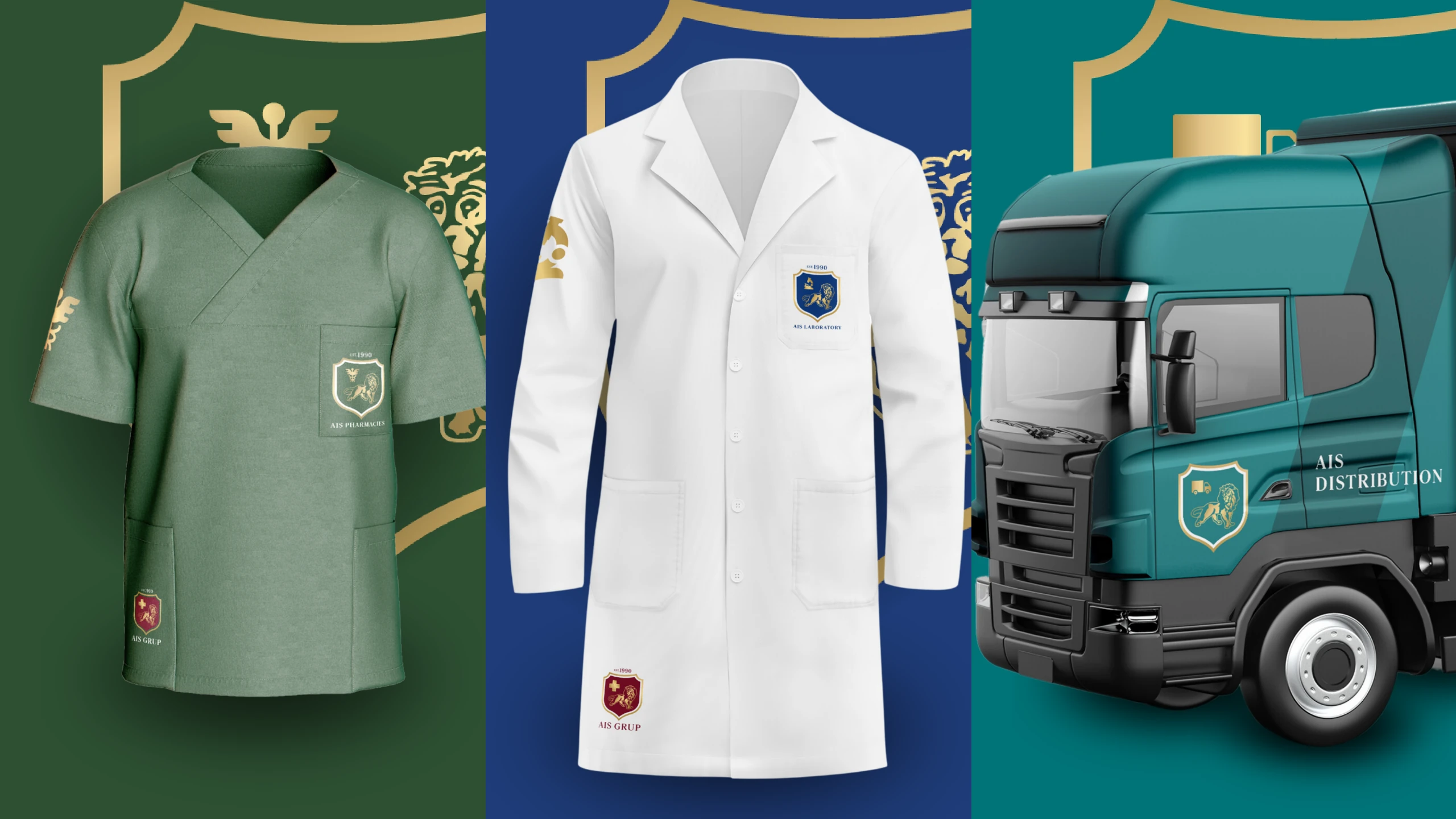
The identity centres on a heraldic crest with the founding year, a burgundy-and-gold palette and an editorial serif. Our designers built a branch system that changes only the icon and the colour, from the Rod of Asclepius for pharmacies to a tooth for dentistry. The brand book turned it into rules, and the print system applied them everywhere the group meets people, colour-coded by division. Our web team is extending the same logic online with a hub-and-satellite architecture for the group's websites, now in build.
The project
A crest-led identity, a branch system for nine divisions, a brand book and print for AIS Grup, a medical group founded in 1990. Websites in build.
What we delivered
- Master identity around the crest, est. 1990
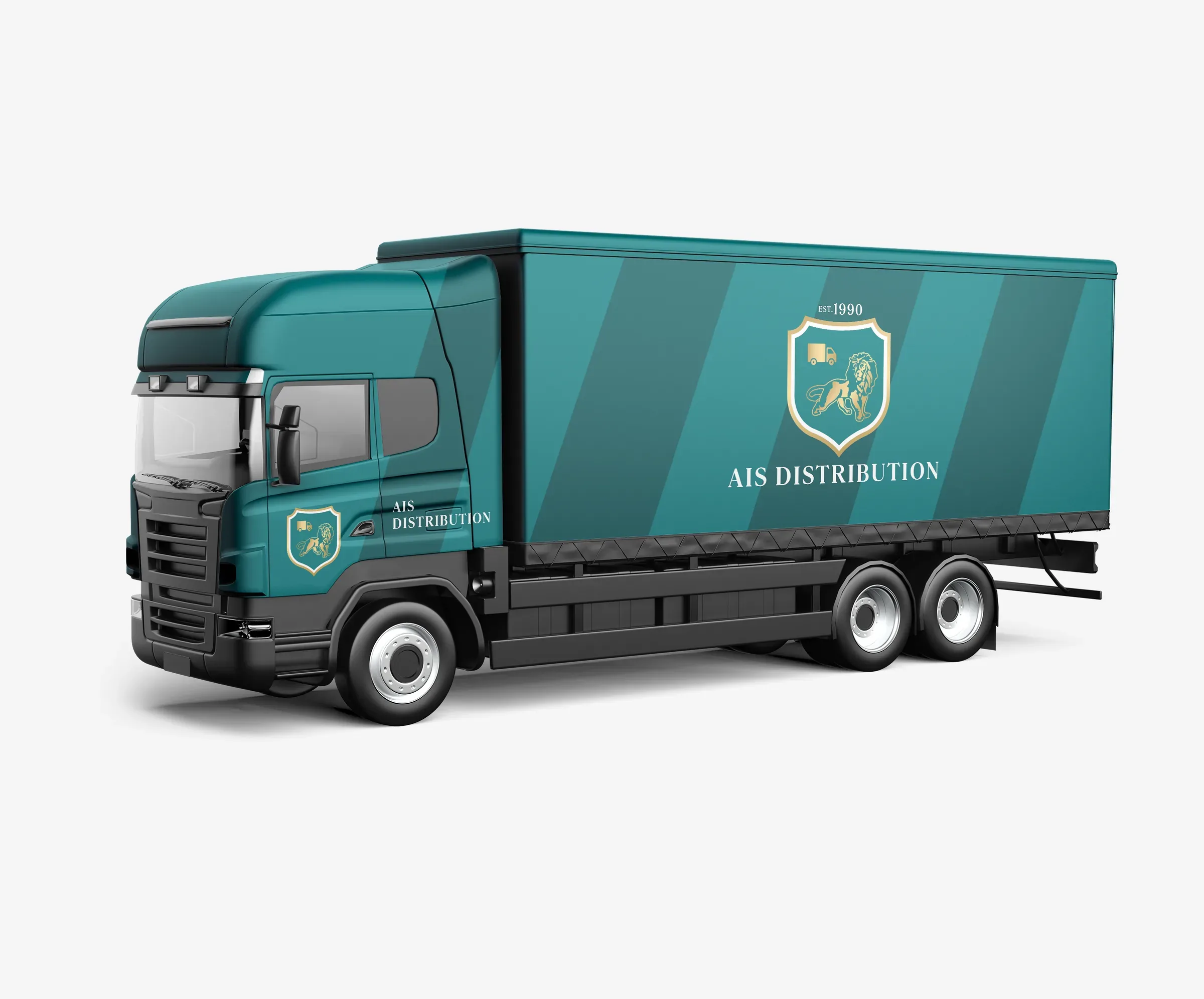
- Brand architecture: branch identities, each with its own icon and colour
- AIS Grup brand book
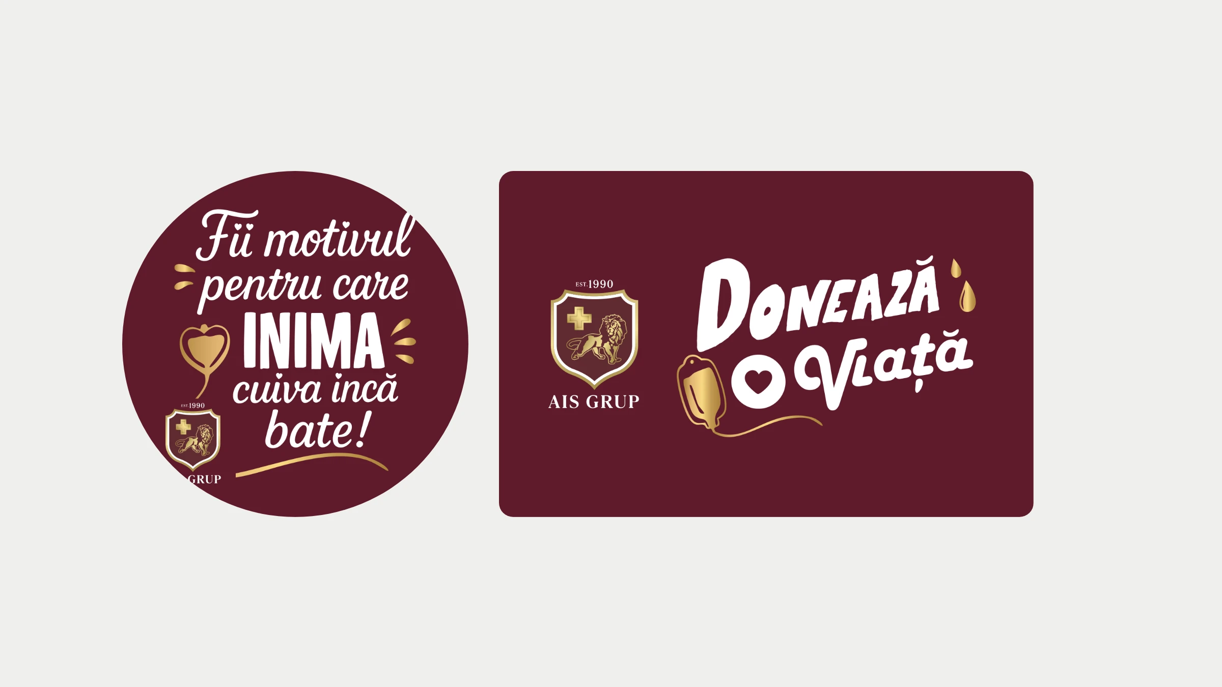
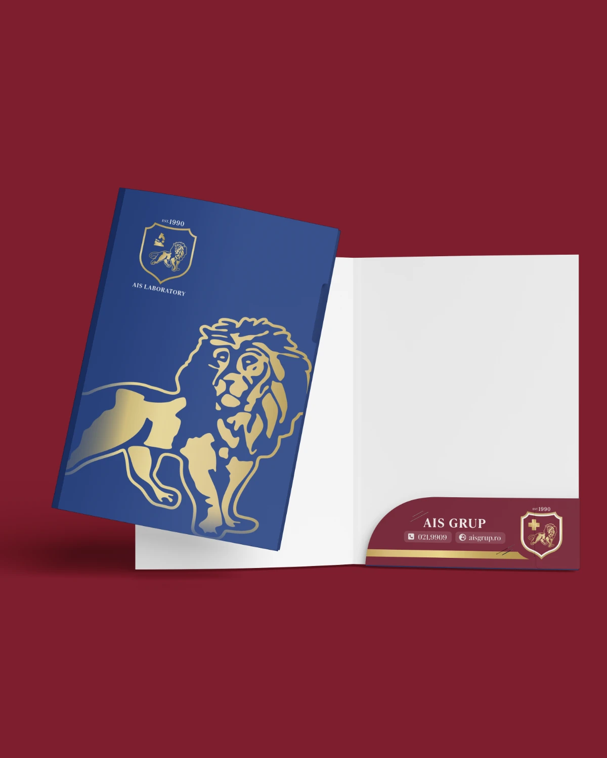
- Print system: business cards, letterheads, staff badges, presentation folders, roll-ups, pens, pharmacy envelopes, flyers and banners
- Conference brochure, campaign flyers and event materials
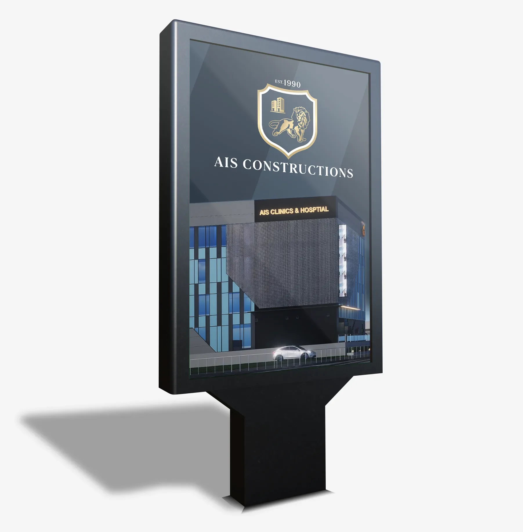
- Building signage renders
- Presentation templates
- Webflow sites for the group (in build)
Discover — Mapping the group
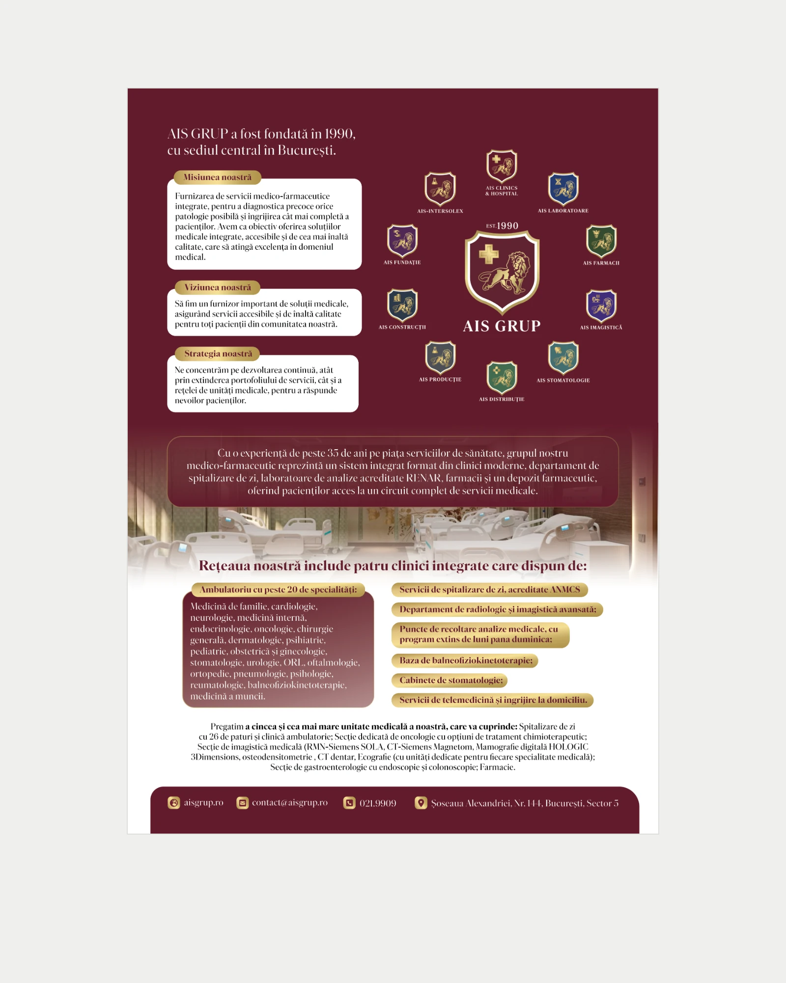
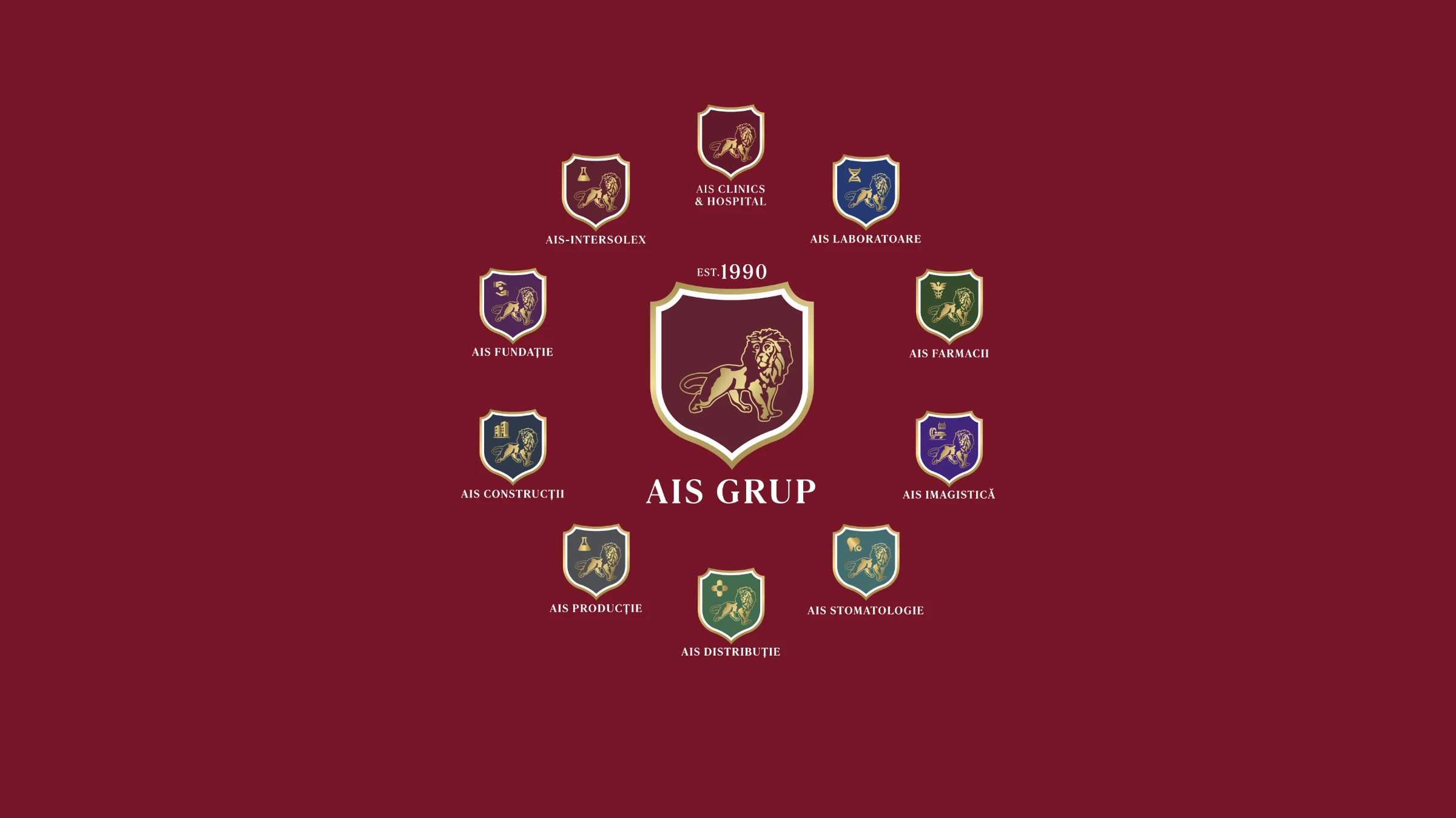
We mapped every division, from clinics and laboratories to pharmacies, distribution, production, construction and the foundation, to decide what the parent brand carries and what each branch needs.
Group structure: nine divisions
Design — The crest
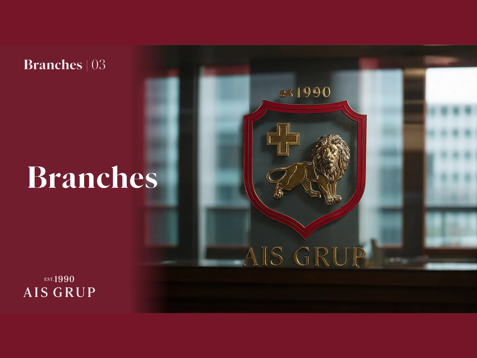
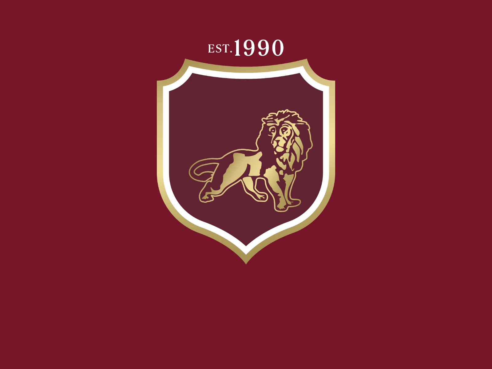
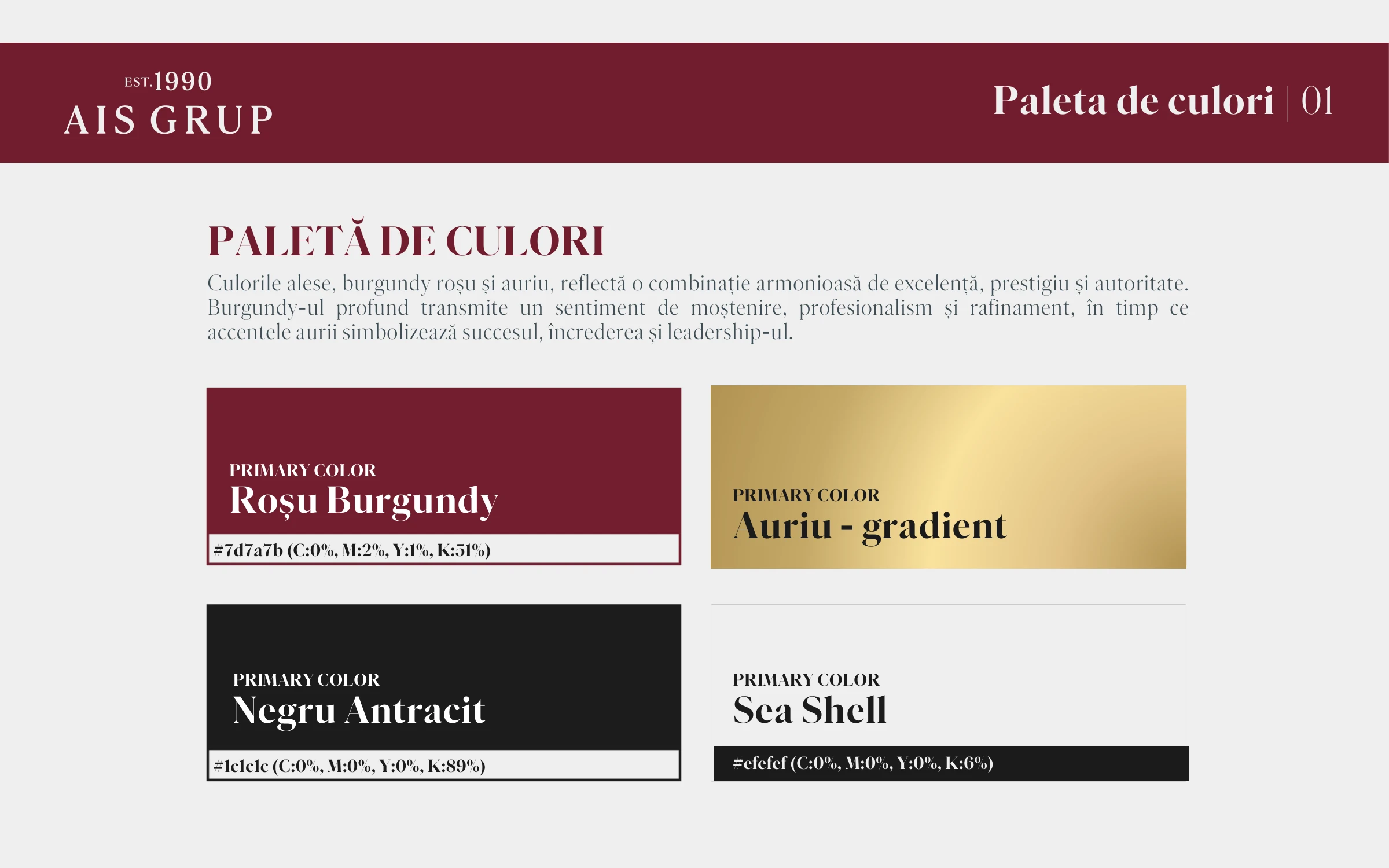
A heraldic shield with a lion and the founding year, in burgundy and a gold gradient with anthracite and sea shell, set in Parnaso Display: heritage, prestige and authority in one mark.
Crest, est. 1990; burgundy, gold, anthracite, sea shell
Design — Branch system
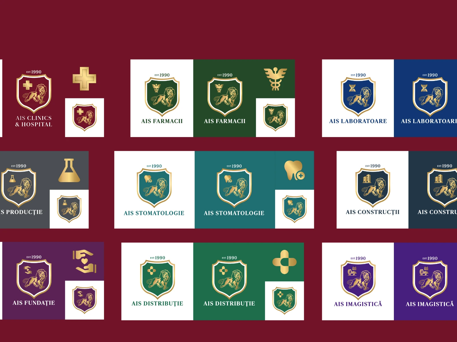
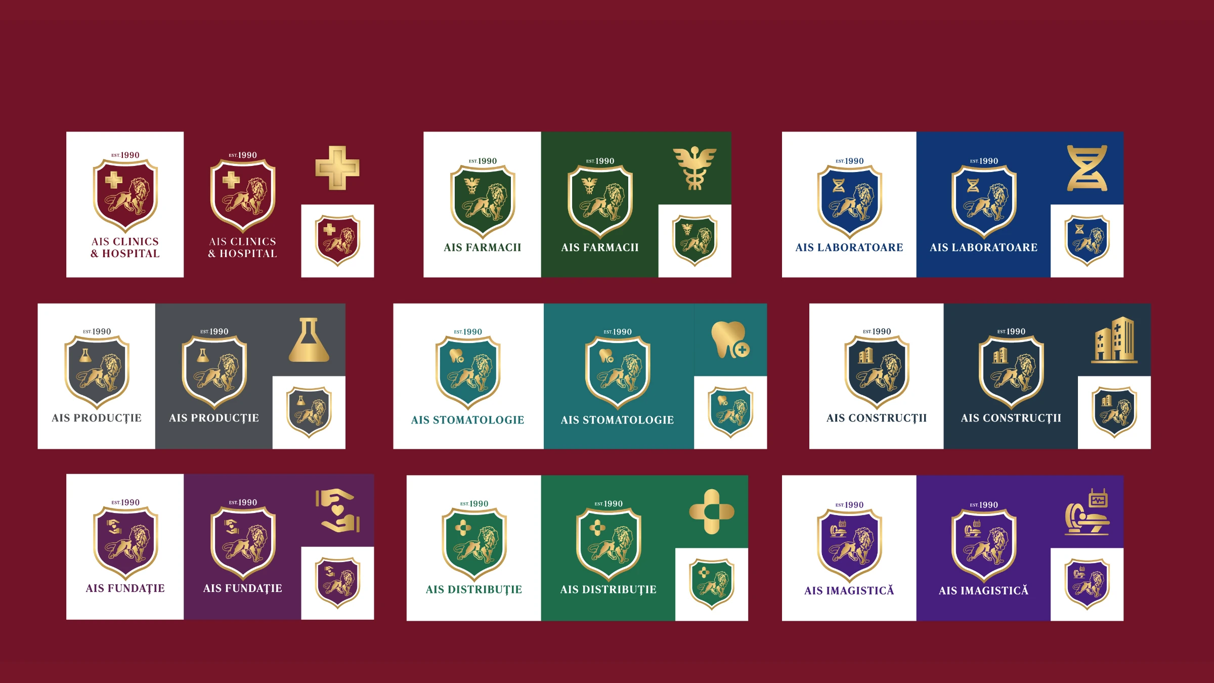
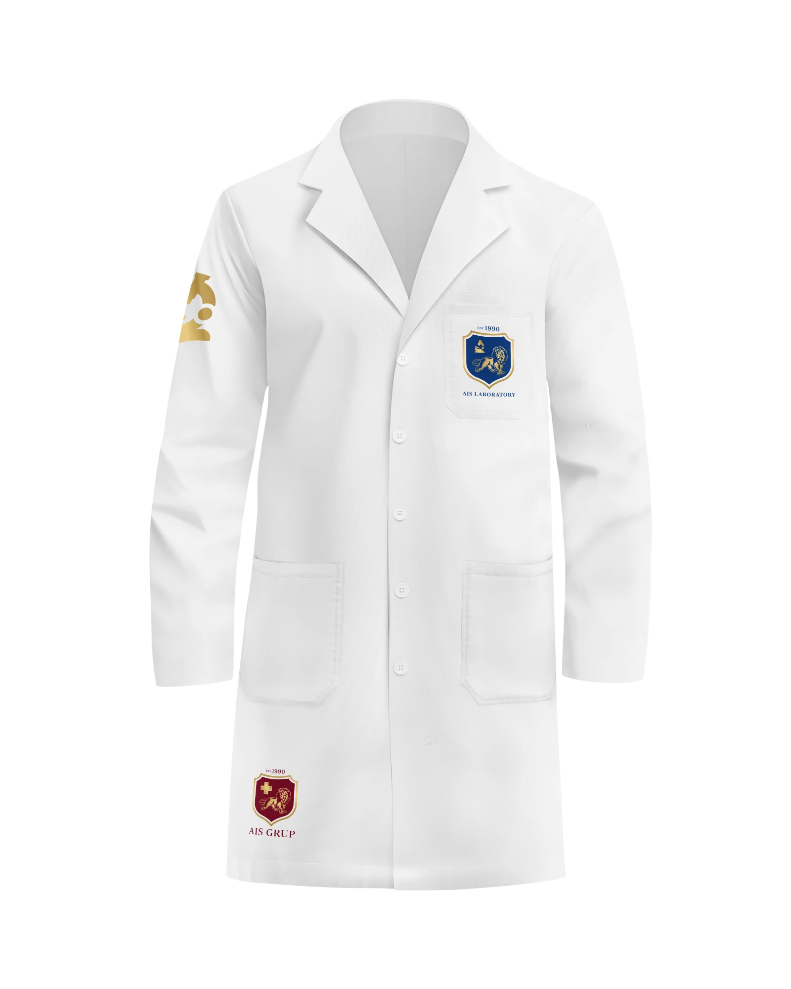
Every branch keeps the crest and changes only its icon and colour, from the Rod of Asclepius for pharmacies to a tooth for dentistry, each in light, colour and icon versions.
Branch system in light, colour and icon versions
Define — Brand book
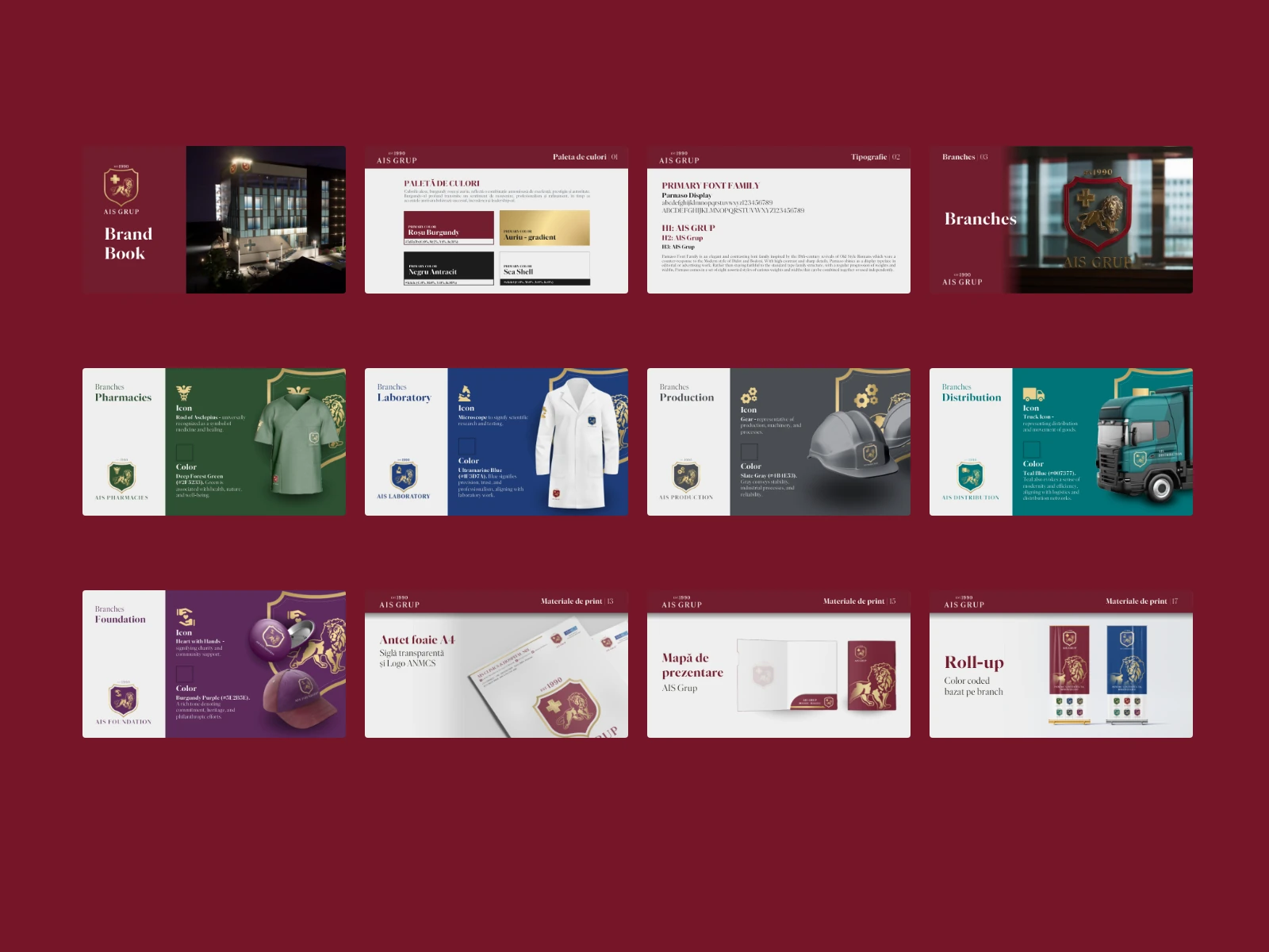
The system turned into rules: palette, typography, branch icons and colours, and every print application.
The AIS Grup brand book
Deliver — Print system
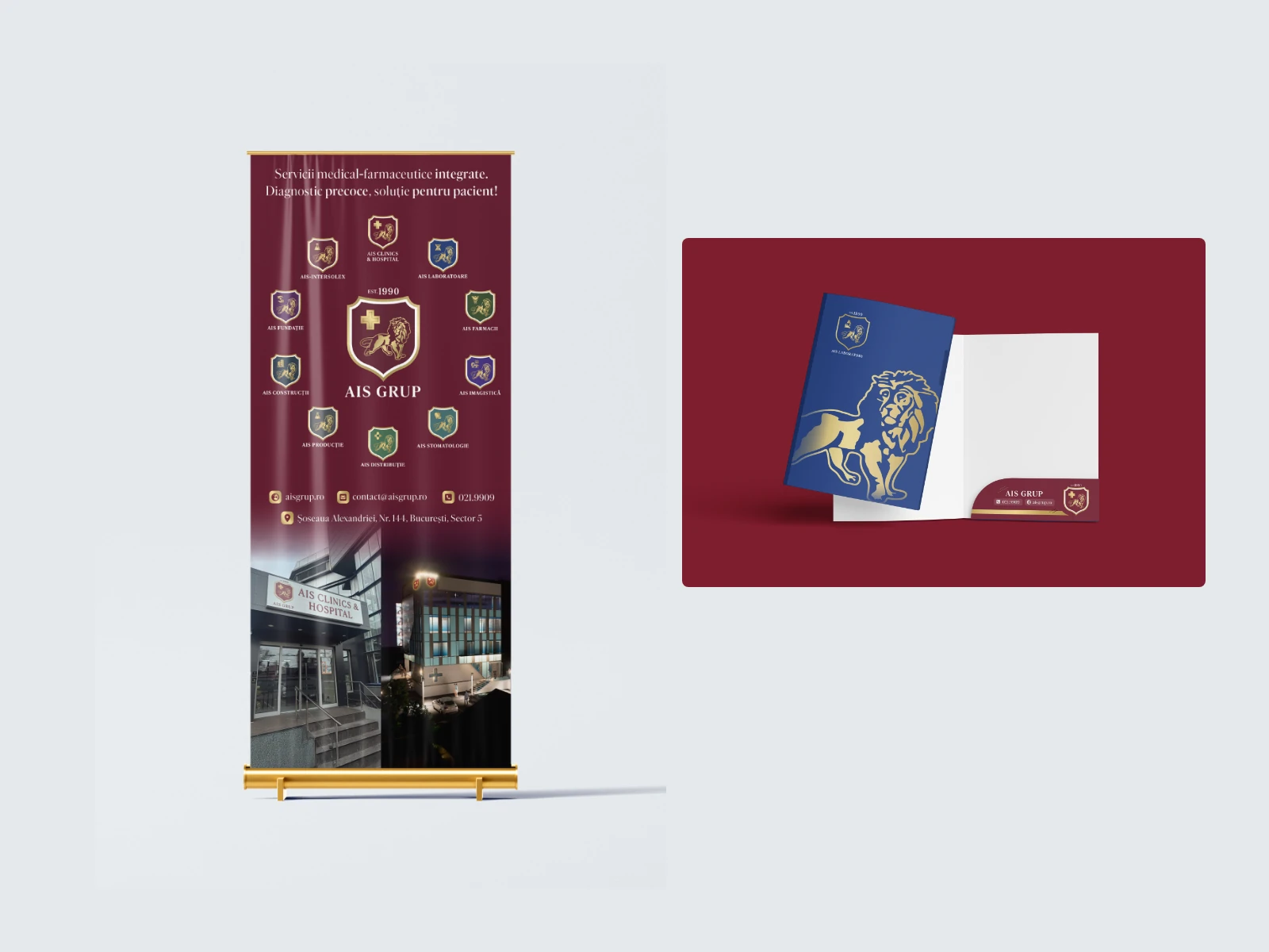
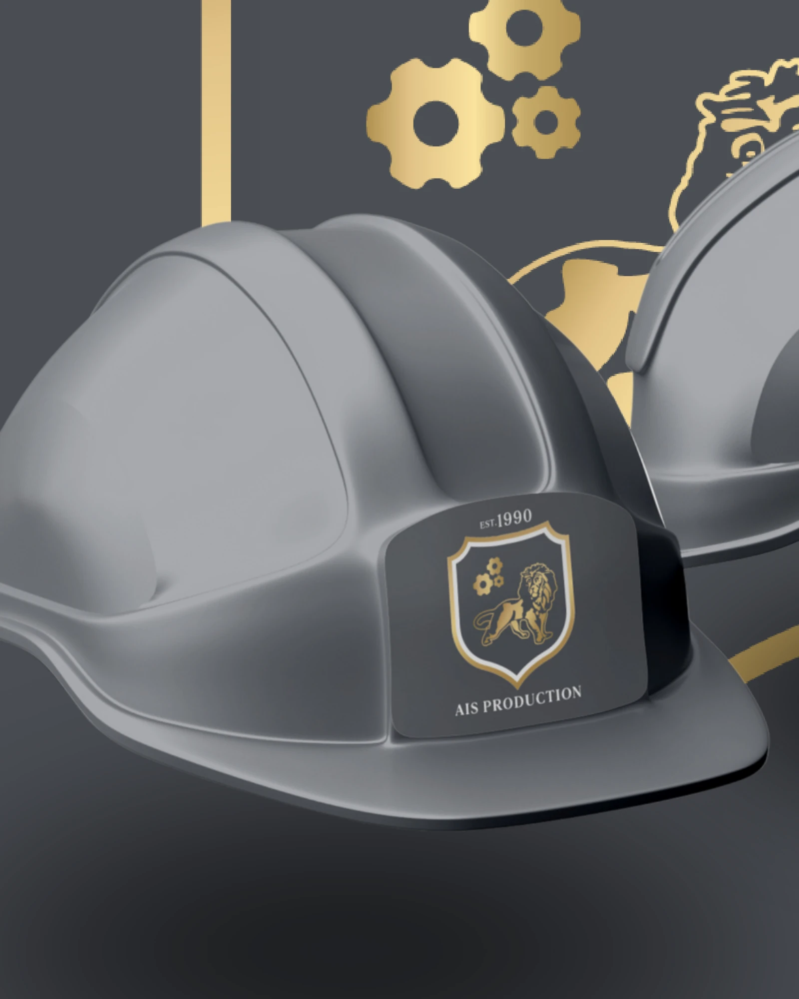
Business cards, letterheads carrying the accreditation mark, presentation folders, roll-ups and pens colour-coded by branch, pharmacy envelopes, flyers and banners, tracked item by item.
One print system, colour-coded by division
Define — Hub and satellites
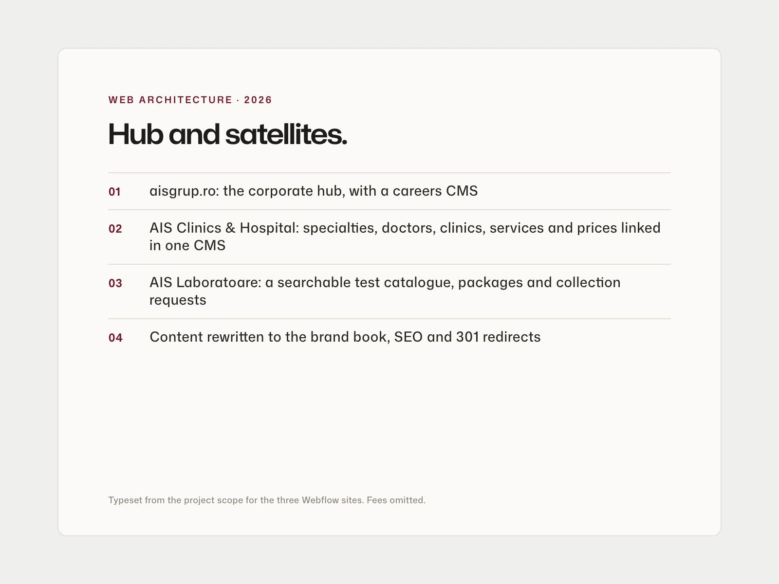
The web architecture puts aisgrup.ro at the centre as the corporate umbrella with a careers CMS, linked to a patient site for AIS Clinics & Hospital and a site for AIS Laboratoare, each with its own relational CMS. The sites are in build.
One ecosystem, in build


Results
What it added up to.
The crest and the branch system now carry the group across print, from flyers, banners and roll-ups to staff badges, folders and presentation templates. The group's websites are in build on the same system, so its digital presence will match everything it already prints.
9
divisions of the group, from clinics to construction, under one crest
1990
the year AIS Grup was founded, carried in its crest
The outcome
What the work changed.
The crest and the branch system now carry the group across print, from flyers, banners and roll-ups to staff badges, folders and presentation templates. The group's websites are in build on the same system, so its digital presence will match everything it already prints.
A note from Alex
AIS is a group you can't brand one logo at a time. Clinics, labs, pharmacies, production, construction, a foundation: nine branches under one name people already trust. So we kept the crest constant and let each branch speak through one icon and one colour. Everything after that, from the brand book and the badges to the roll-ups and now the websites, is the same rule applied with patience. In healthcare, people should know they are at AIS before they read a word.
Alex Codreanu
Founder and design lead
What the client said
Credits
FA Studios: brand identity, brand architecture, brand book, print design, web strategy, UX/UI design and Webflow development.
Related work.
More work in this field, then projects with the same services.


















































Want a project like this one?
Tell us what you’re building. You’ll hear back within one business day.
Prefer email? contact@fastudios.co