
This case study is for adults only.
It shows work for nicotine products and is intended for people aged 18 or over.

Bucharest Padel Tour
Brand identity, Social & content, Campaigns & events
One tour, many clubs: an identity that ranks every stage.
Identity, tiered stage badges, posters for feed, print and TV, trophies and season-long social content for an amateur padel circuit in Bucharest.
The challenge
Bucharest Padel Tour runs a season of amateur tournaments across several partner clubs, and not every stage carries the same weight. The brand had to feel like one competition while letting each club and each level stand out. The feed also had to keep moving between tournaments, not only on match weekends.
The insight
Treat the tour like a league: one emblem, and a medal-style tier system that tells players at a glance which stage they are entering.
The approach
Our designers built the identity first, a trophy-shaped emblem and wordmark, then everything that repeats around it: Gold, Platinum and Bronze badges per host club, a poster that adapts from Instagram to A3 print and TV screens with a QR code, and trophy artwork for every stage. Our content team set a posting rhythm tied to the tournament calendar, so the tour stays visible all season.
The project
Identity, tiered stage badges, posters for feed, print and TV, trophies and season-long social content for an amateur padel circuit in Bucharest.
What we delivered
- Tour emblem and wordmark
- Gold, Platinum and Bronze stage badges for every host club
- Launch, recap and winners carousels
- FAQ and sponsor posts
- Stage posters for social, A3 print and TV with QR
- Acrylic trophy artwork in two sizes
Define — Proposal and benchmark
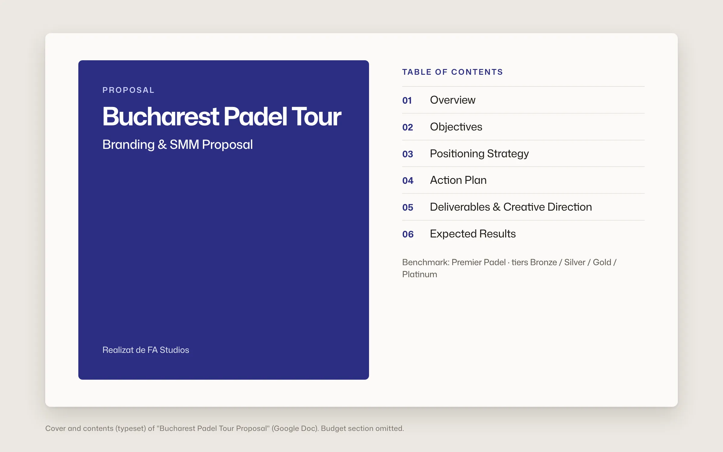
A branding and social proposal, benchmarked against Premier Padel, set the scope: identity, usage kit and a monthly content plan tied to the season.
Branding and social proposal
Design — A tiered identity
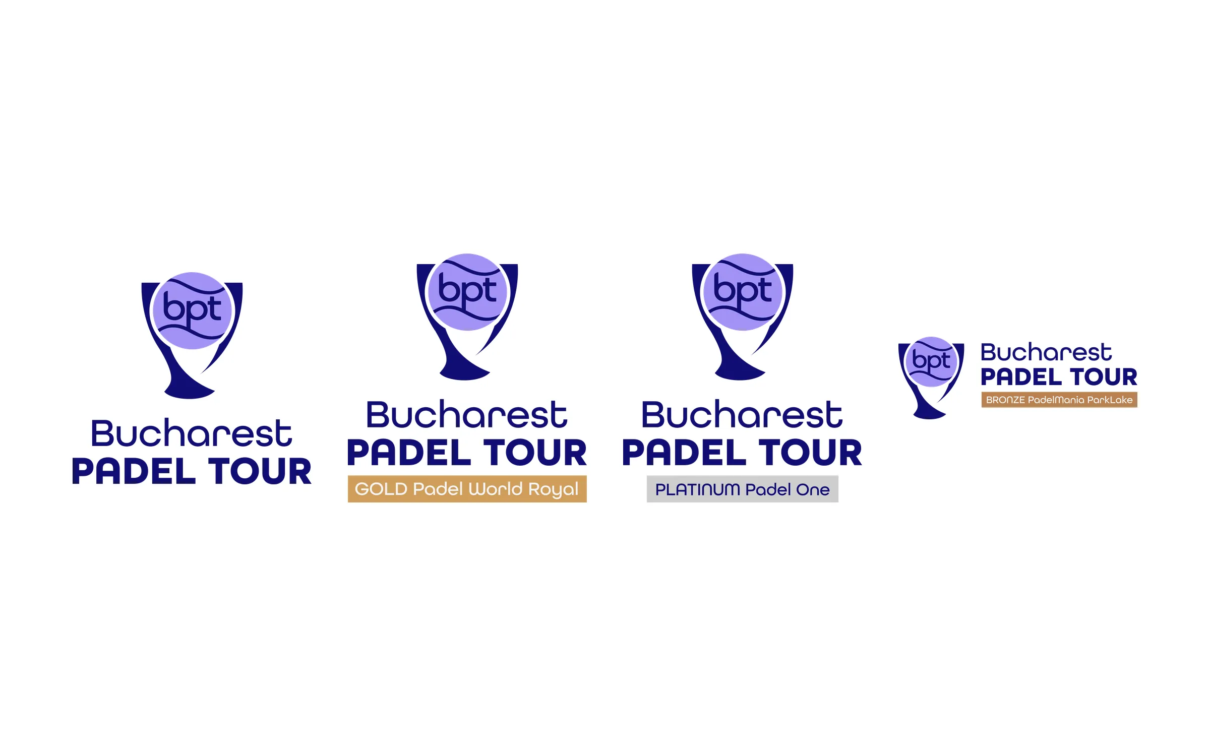
A trophy-shaped emblem and wordmark, then Gold, Platinum and Bronze badges per host club, each with versions for light and dark backgrounds.
Main identity and the three tiers
Deliver — Stage kit
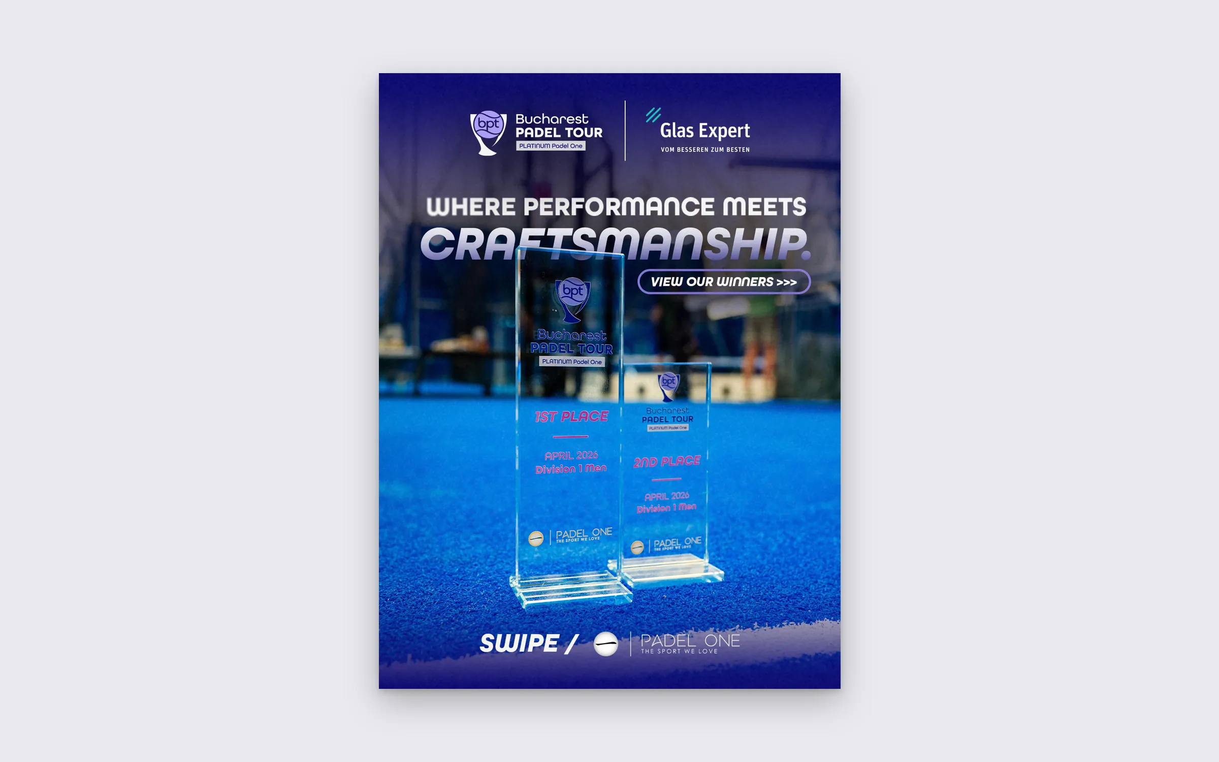
For every stage: a poster in three formats, from Instagram to A3 print to a landscape TV version with QR, plus acrylic trophy artwork in two sizes.
Stage kit: posters and trophies

Grow — Season content
Launch post, weekend recaps, winners per division, an FAQ carousel and sponsor features, published on a rhythm agreed per tournament level.
Season content, on the tournament calendar


Results
What it added up to.
From the first round in March 2026, every stage shipped with its own badge, poster set and trophy artwork, and the feed kept a steady rhythm before, during and after each tournament. Players read the tier of a stage from its badge alone, and partner clubs each get their moment in the same system.
The outcome
What the work changed.
From the first round in March 2026, every stage shipped with its own badge, poster set and trophy artwork, and the feed kept a steady rhythm before, during and after each tournament. Players read the tier of a stage from its badge alone, and partner clubs each get their moment in the same system.
A note from Alex
A tour lives on rhythm. Players need to know what's next, partner clubs need to be seen, and the feed can't go quiet between weekends. So we wrote the rhythm down before designing a single post. The tier badges were the fun part: a compact system that explains a lot without a word of copy.
Alex Codreanu
Founder and design lead
What the client said
Credits
FA Studios: identity, social content, poster and trophy design.
Related work.
More work in this field, then projects with the same services.













































Want a project like this one?
Tell us what you’re building. You’ll hear back within one business day.
Prefer email? contact@fastudios.co