
This case study is for adults only.
It shows work for nicotine products and is intended for people aged 18 or over.
CMIB
Rebranding, Brand identity, Website
Trusted since 1999, now warmer: one mark and one site for two clinics.
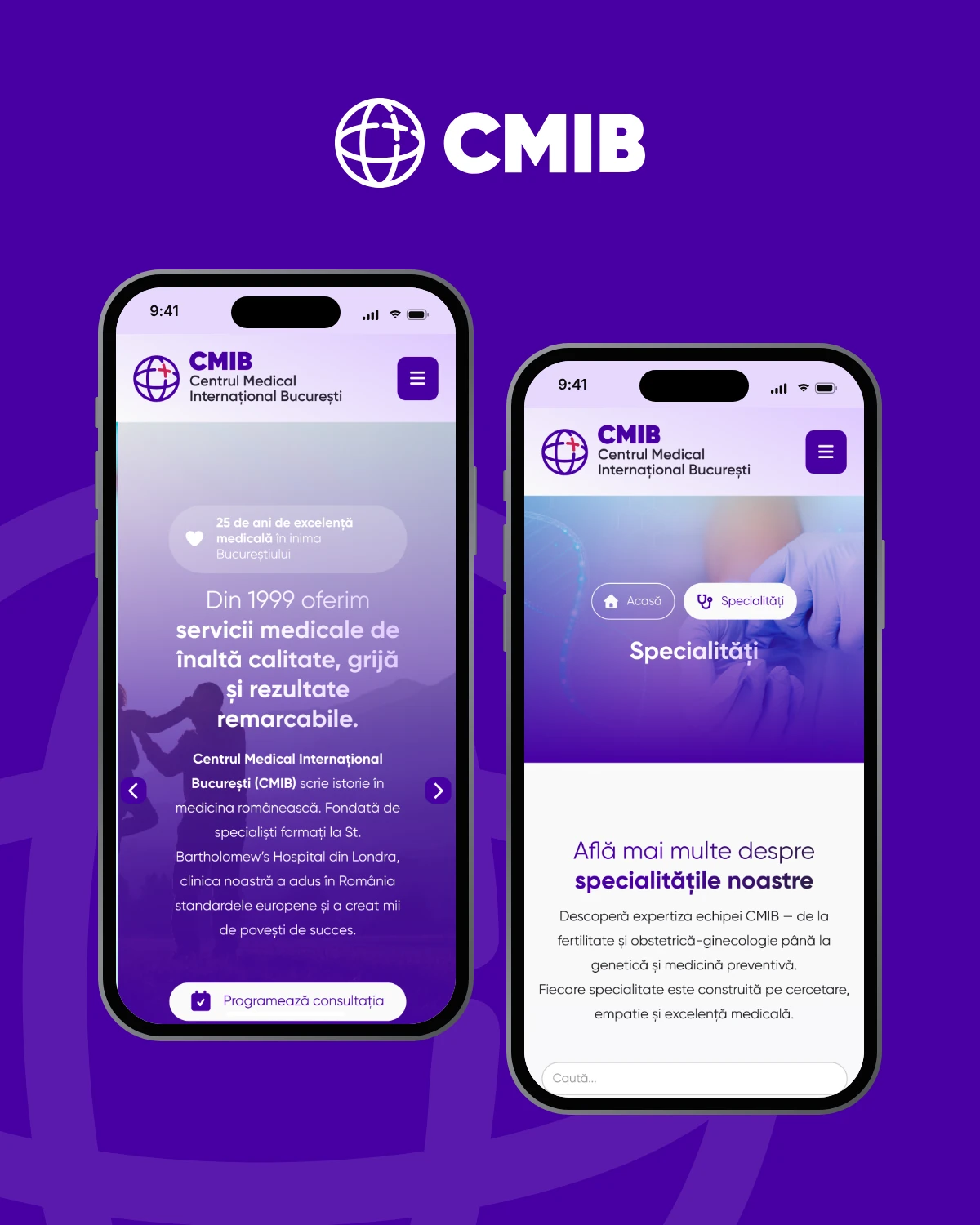
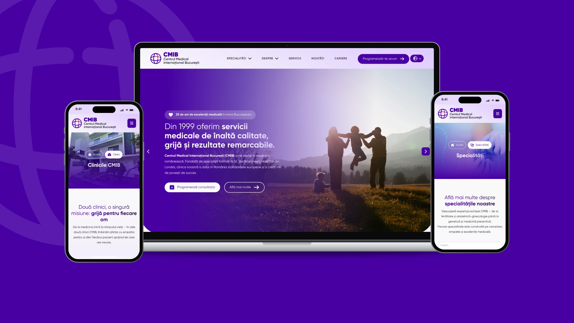
Rebrand and Webflow website for Centrul Medical Internațional București: one master mark, two clinics, and every specialty a click away.
The challenge
CMIB has practised medicine in Bucharest since 1999, from fertility and IVF to cardiology, gynaecology and occupational medicine, across two clinics in Primăverii and Dacia. Its identity was recognised, but the clinic wanted it warmer and newer without losing the trust it had earned. The website had a bigger job than presenting: bring in qualified enquiries, show the clinic's partnerships and give careers a proper home.
The insight
In medicine, warmth is clarity: one mark people recognise, and a site where every patient finds their doctor without calling.
The approach
Our strategy team began with working sessions to map the clinic's history, specialties and goals, then our designers explored a master brand that could carry each specialty in its own colour and symbol. In parallel, our content team turned a section-by-section questionnaire into a clear structure and rewritten copy. The identity settled into a deep purple with a red-pink cross, delivered as a complete kit, and our web team built the site around a specialties CMS, clinic pages and a search that works.
The project
Rebrand and Webflow website for Centrul Medical Internațional București: one master mark, two clinics, and every specialty a click away.
What we delivered
- Brand overview and logo system
- Final logo kit for digital and print
- Partnership lock-ups, typography, palette and usage rules
- Content questionnaire and rewritten site copy
- Webflow website with specialties CMS
- Specialty search and clinic pages for Primăverii and Dacia
- On-page SEO and responsive build
Discover — Kickoff meetings
Working sessions to map the clinic's history since 1999, website goals, specialties and the two locations, plus what we needed from the team.
Specialties, clinics and goals mapped
Define — Brand direction
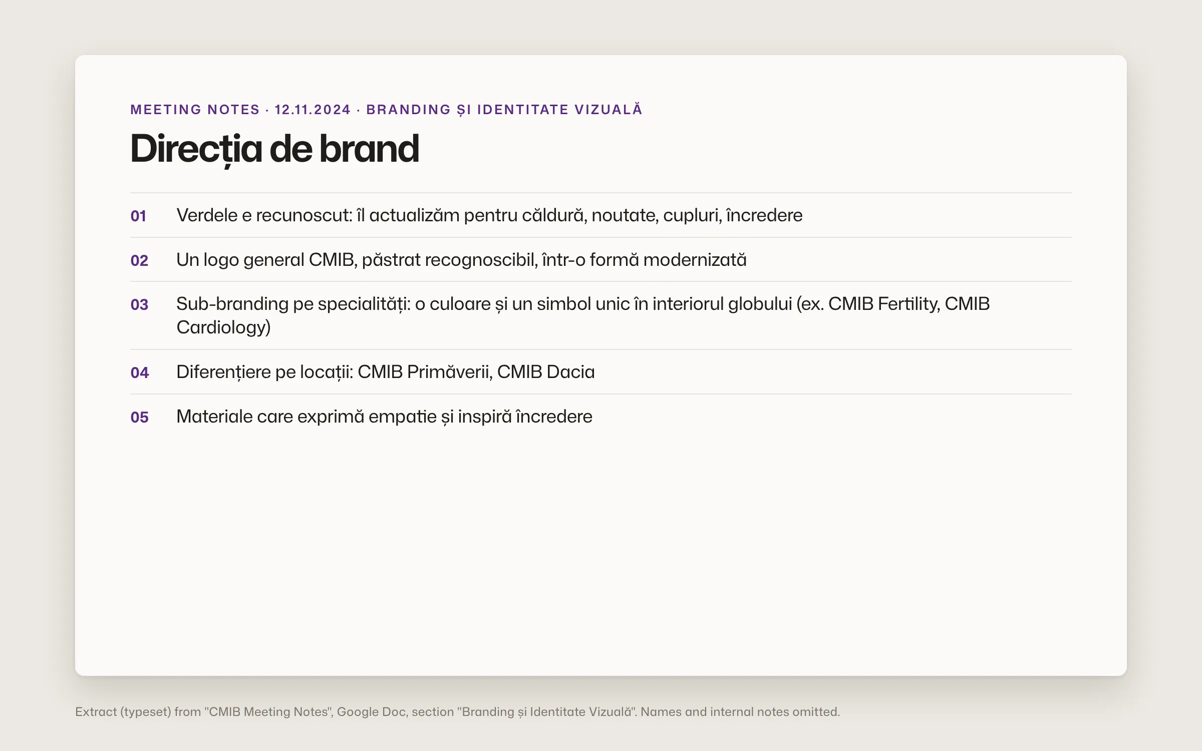
Keep what people recognise, add warmth and trust. The brief set a master CMIB mark with room for specialty sub-brands and location variants.
Brief: master mark, specialty sub-brands, location variants
Design — Specialty system exploration
A globe icon that carries a glyph for each specialty, tested across gynaecology, cardiology, occupational medicine and the master brand.
Exploration board, January 2025: specialty variants in the earlier teal palette

Design — Final identity kit
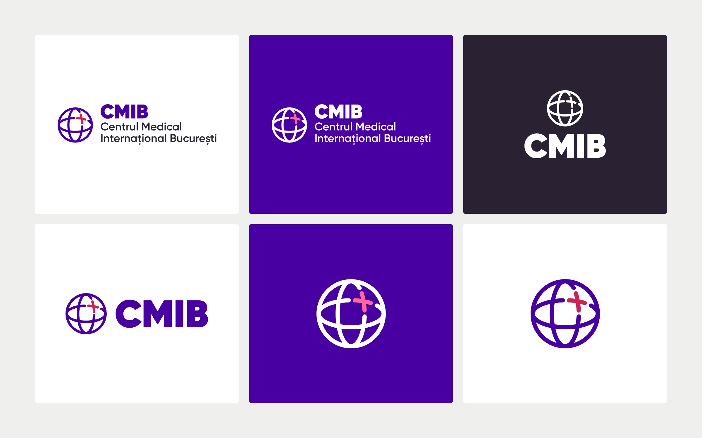
After successive palette studies, the system settled on a deep purple with a red-pink cross, delivered as full, horizontal, vertical, icon and text-only versions.
Final kit in dark, white and purple
Define — Content questionnaire
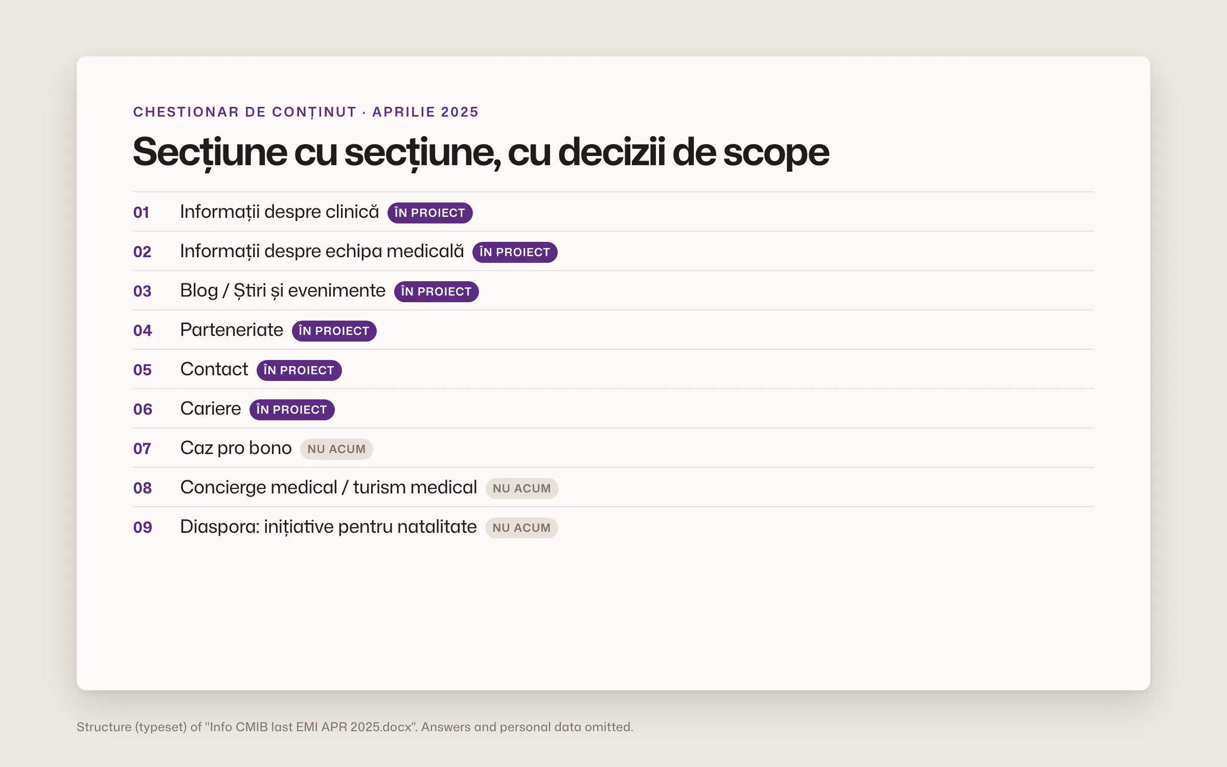
Section by section, from clinic history and doctor profiles to partnerships, careers and medical tourism, with clear calls on what ships now and what waits.
Questionnaire with scope decisions per section
Deliver — Build and QA
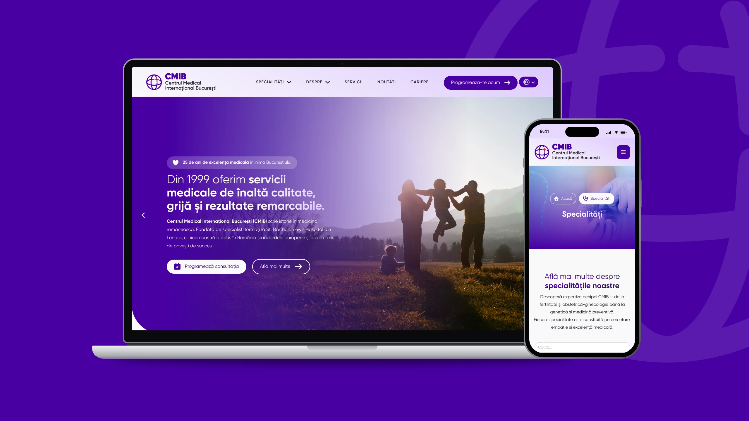
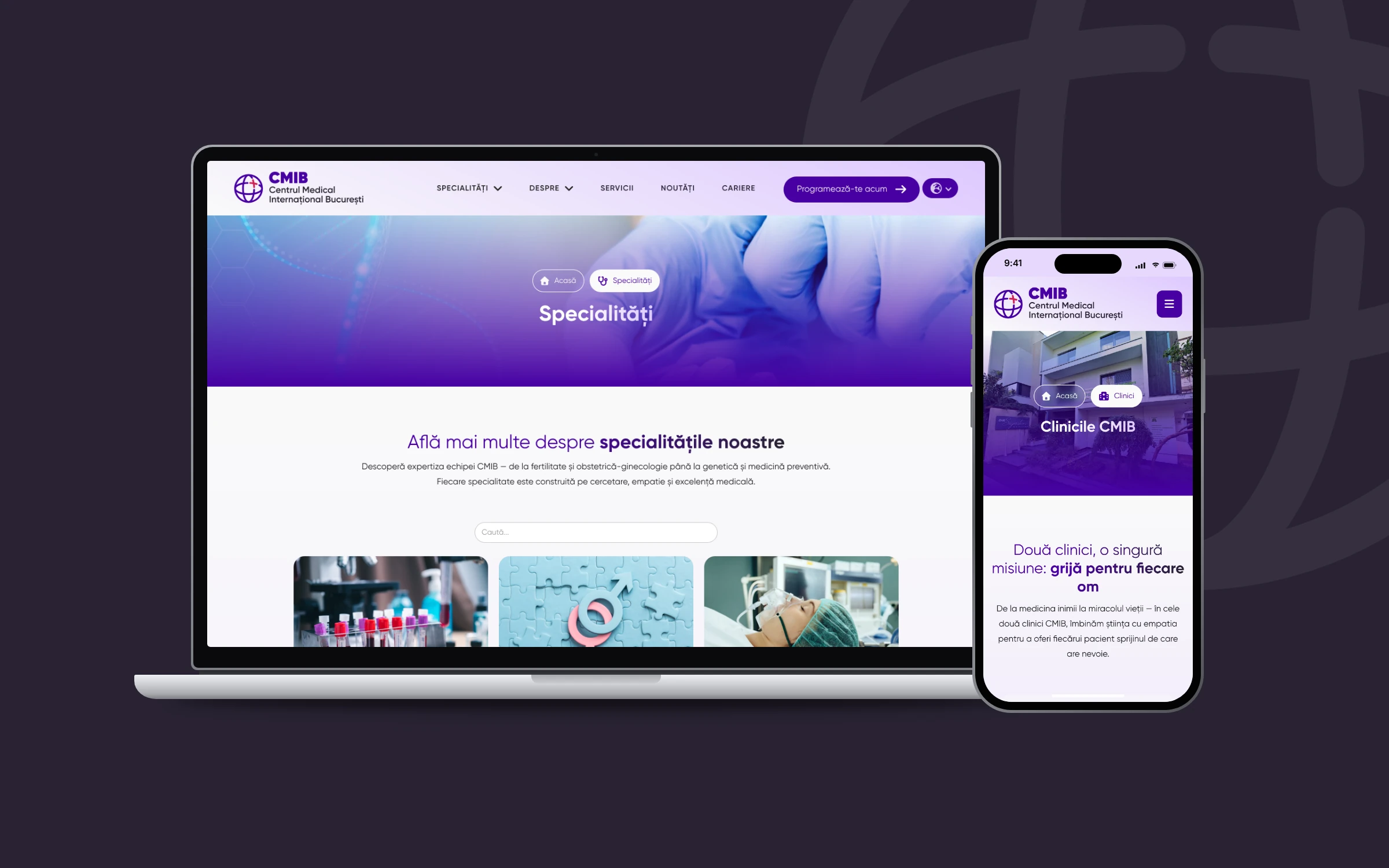
Specialties CMS, a fast specialty search, team views that switch without reloading, animated homepage figures and a mobile menu refined in QA before launch.
Live cmib.ro, signed 'Realizat de FA Studios.'

Results
What it added up to.
The new cmib.ro is live and signed "Realizat de FA Studios." Specialties, both clinics, IVF programmes, partners, news and careers now sit in one navigable structure, with a booking call to action on every page and one identity kit ready for every touchpoint, digital and print.
1999
the year CMIB began practising medicine in Bucharest
2
clinics, Primăverii and Dacia, under one mark and one site
The outcome
What the work changed.
The new cmib.ro is live and signed "Realizat de FA Studios." Specialties, both clinics, IVF programmes, partners, news and careers now sit in one navigable structure, with a booking call to action on every page and one identity kit ready for every touchpoint, digital and print.
A note from Alex
CMIB came to us with 25 years of medicine behind it and an identity ready for its next chapter. The ask was precise: keep the trust, add warmth, make it feel new. We explored a mark with a colour and symbol for every specialty before settling on one clean system the clinic can live with every day. On the site, what matters most is quiet: a specialty search that works, clinic pages that don't reload. That is what keeps a patient on the page.
Alex Codreanu
Founder and design lead
What the client said
Credits
FA Studios: rebranding, identity system, content structure and copy editing, Webflow design and development, SEO.
Related work.
More work in this field, then projects with the same services.

































































Want a project like this one?
Tell us what you’re building. You’ll hear back within one business day.
Prefer email? contact@fastudios.co