
This case study is for adults only.
It shows work for nicotine products and is intended for people aged 18 or over.
DentexLink → DentGo → CliniGo
Brand identity, Rebranding, Website, Presentations
One product, three names, and a brand system that kept up.
Identity and product UI for a Romanian dental-procurement startup in 2025, from DentexLink to DentGo to CliniGo, with a clickable clinic dashboard.
The challenge
The founders started with DentexLink, an online shop for dental supplies, then widened the idea into DentGo, a platform for clinics, and later into CliniGo, a procurement platform connecting clinics with distributors. Each step meant a new name on screen while the product was still being built. Marks, app icon, dashboard and pitch visuals had to stay coherent through every change, without the team starting from zero each time.
The insight
When a product is still finding its market, design the system before the logo: colour, type and interface logic that survive a rename.
The approach
We treated each name as a new layer on a stable base: the same navy and the same typeface carried from DentexLink to DentGo. Our product designers turned the clinic dashboard into a clickable prototype, so the founders could put a real product in front of people instead of a slide. Interface flows were benchmarked against established marketplace patterns before we designed them, and the CliniGo marks, mockups and pitch visual closed the cycle.
The project
Identity and product UI for a Romanian dental-procurement startup in 2025, from DentexLink to DentGo to CliniGo, with a clickable clinic dashboard.
What we delivered
- DentexLink logo (gradient, light and dark) and website materials
- E-commerce promo banners
- DentGo logo, mobile mark and app icon
- Clinic dashboard UI and clickable prototype (May 2025)
- UX benchmarking for supplier onboarding and notifications
- CliniGo logo and dashboard mockups (August 2025)
- CliniGo pitch-deck key visual and demo data templates
Discover — Reading the product
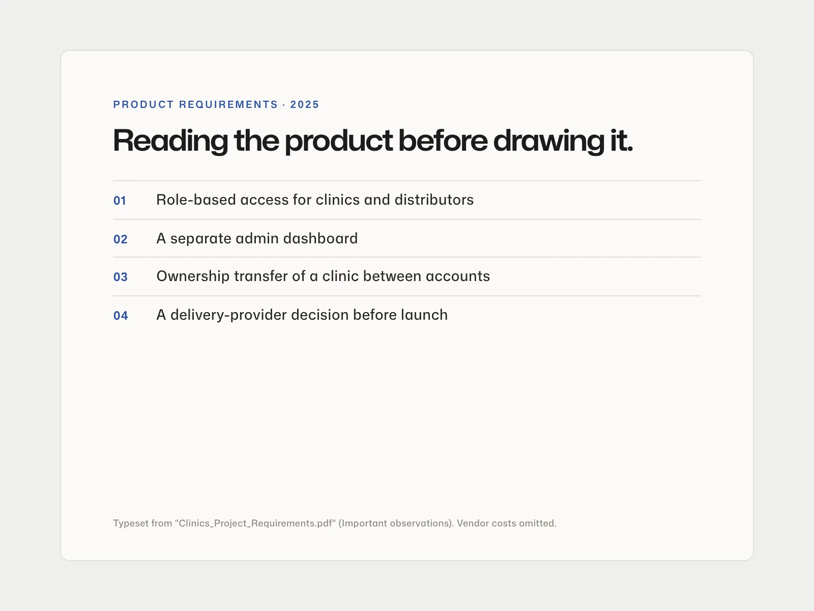
We started from the platform's technical requirements: user roles for clinic owners, staff, distributors and admins, integrations and a roadmap.
Product requirements, roles and roadmap
Design — DentexLink identity
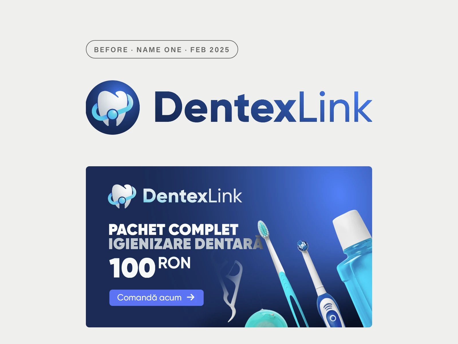
A blue gradient mark in light and dark versions, website materials and the first e-commerce promo banners.
DentexLink mark and promo banner
Design — DentGo and the app icon
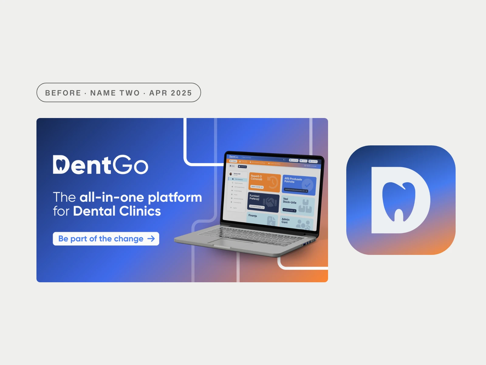
A new name for a wider platform. Same navy, new mark, plus a mobile mark and an app icon that hides a tooth inside the letter D.
DentGo logo, mobile mark, app icon
Deliver — Clinic dashboard
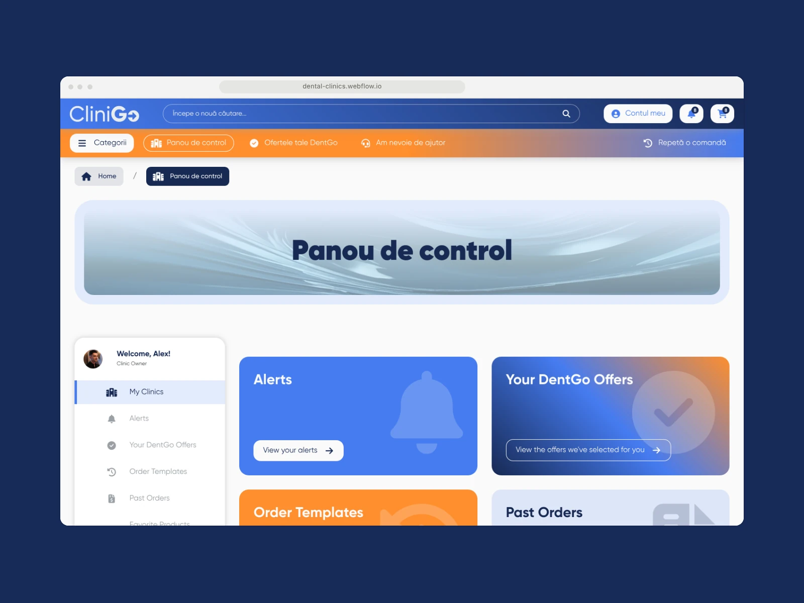
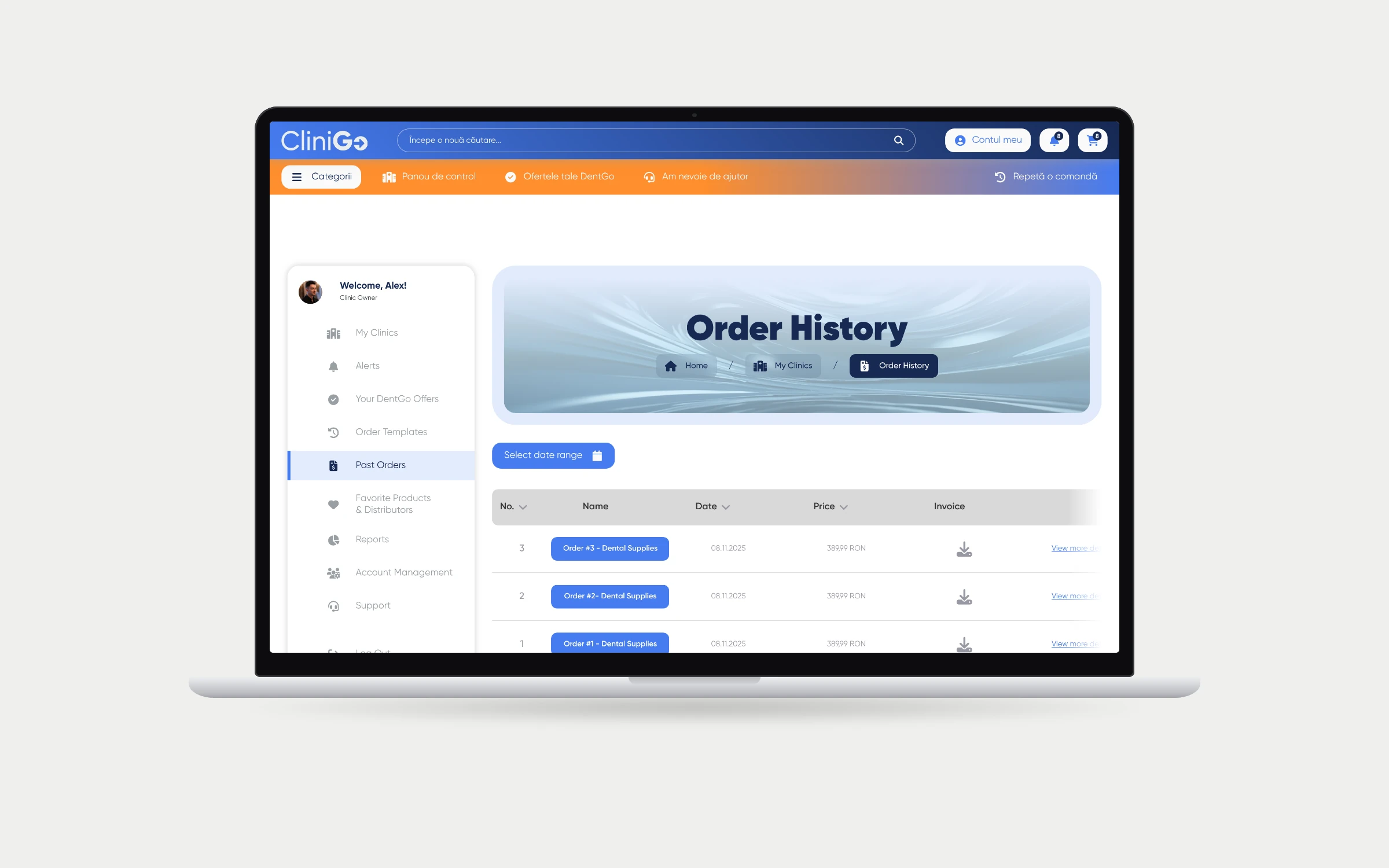
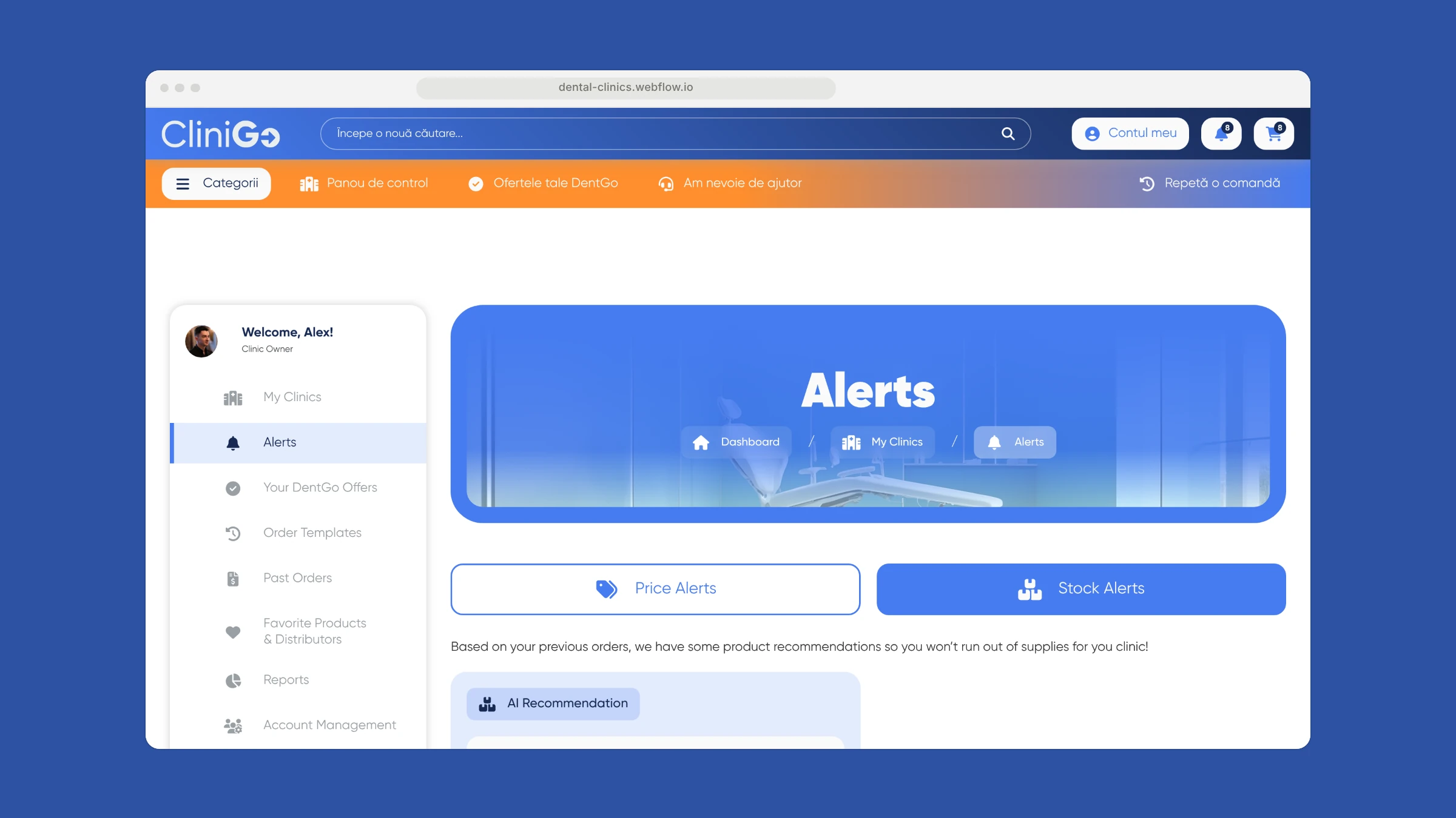
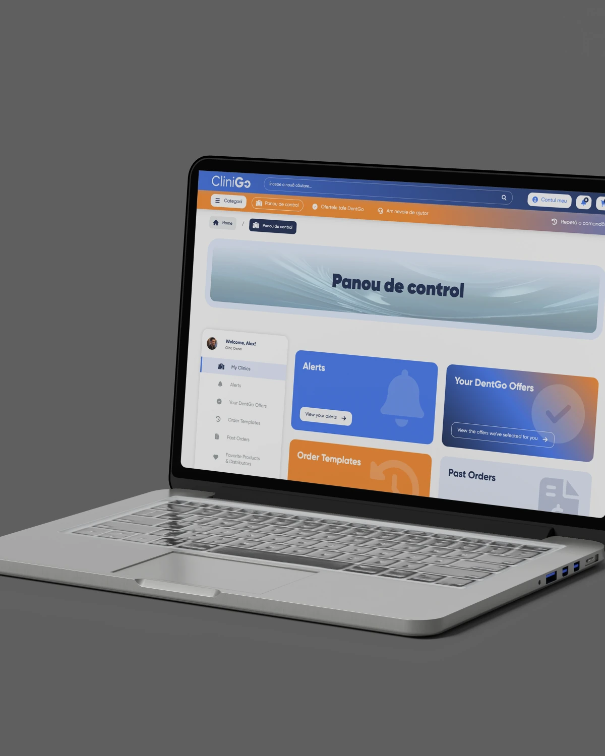
A Romanian-language dashboard for clinics, designed and built as a clickable prototype: reorder, product finder, preferred suppliers, stock, finance and account settings.
Clickable dashboard prototype, May 2025
Discover — UX benchmarking
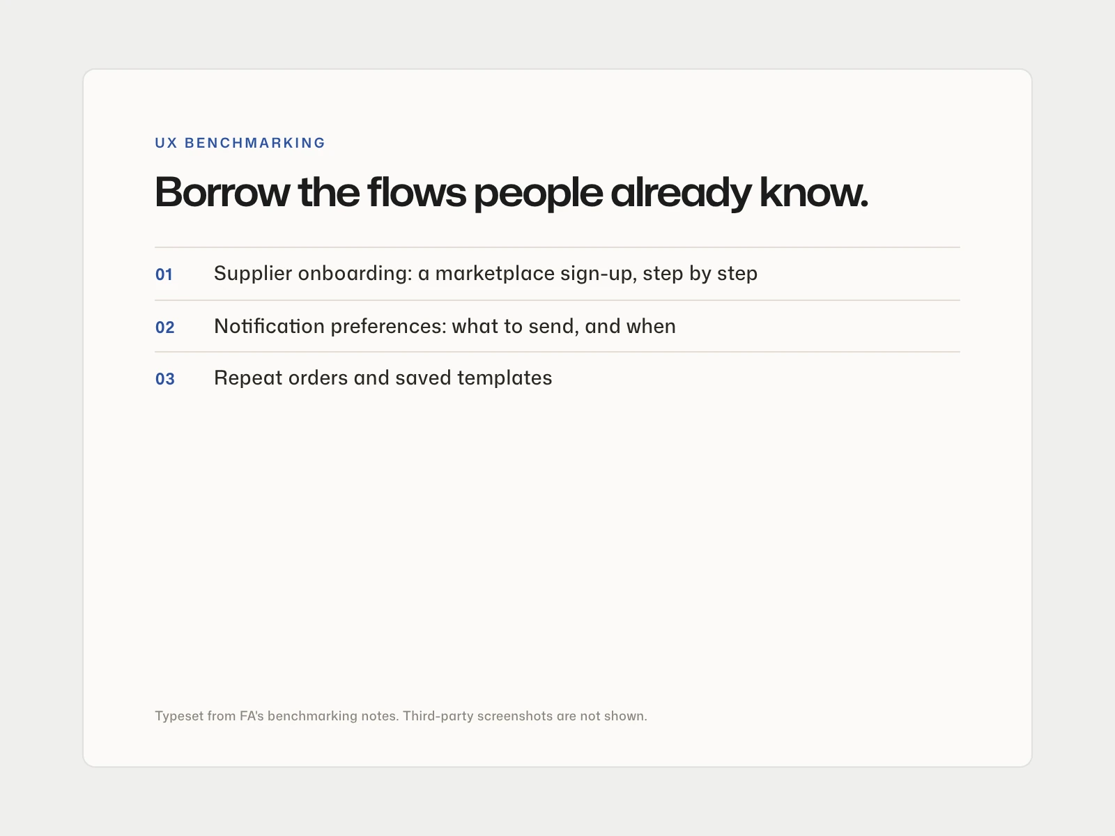
Before designing supplier onboarding and notification settings, we studied how an established marketplace handles the same flows.
Reference flows: supplier onboarding, notifications
Design — CliniGo
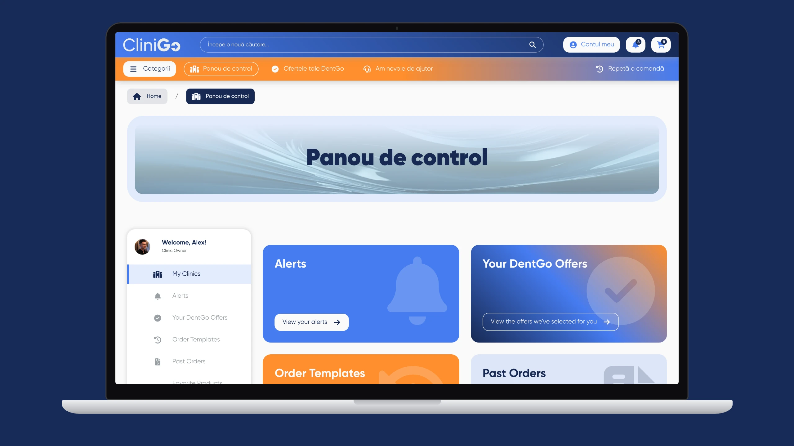
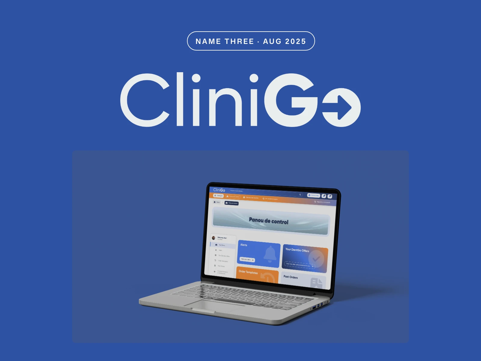
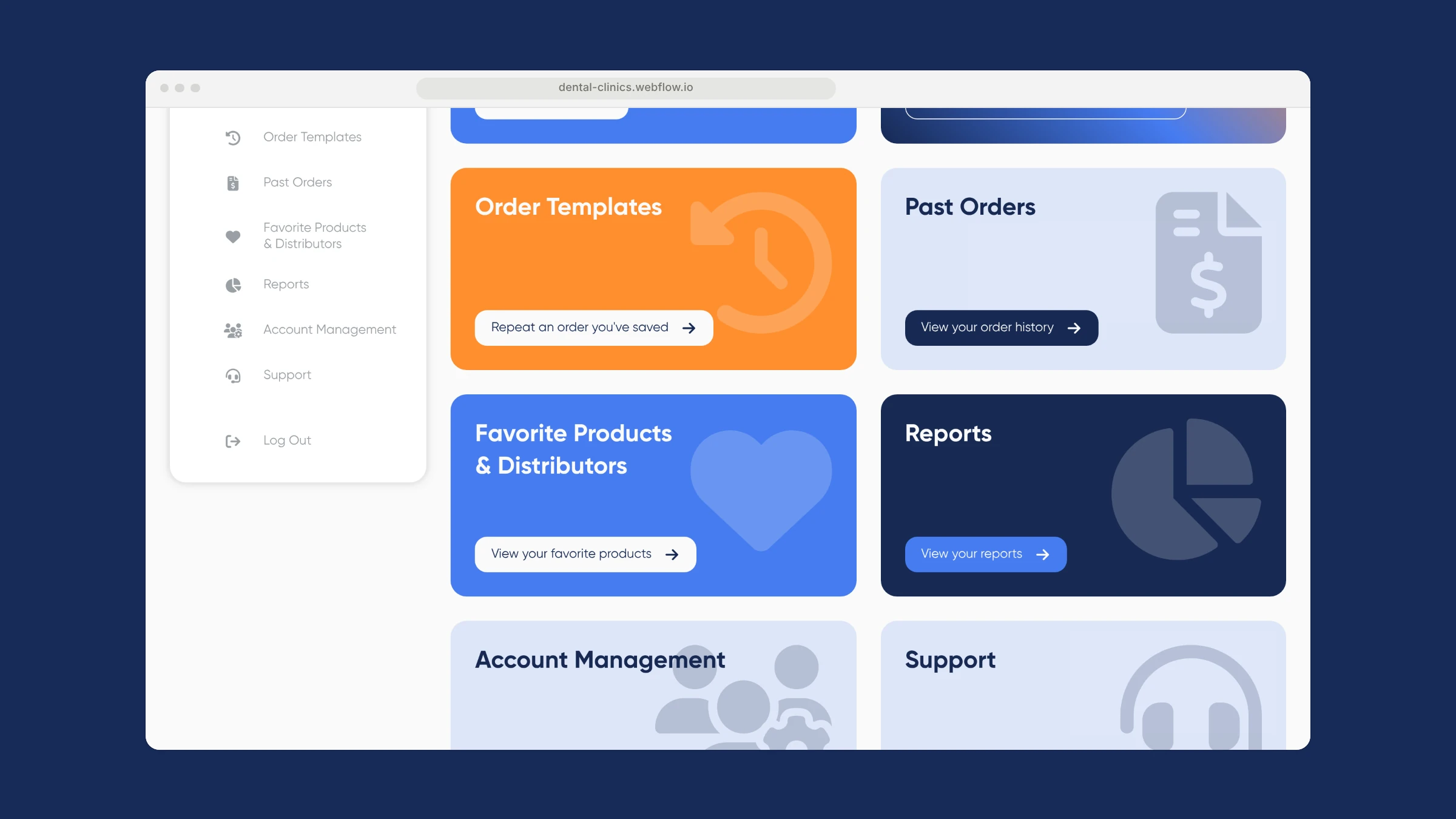
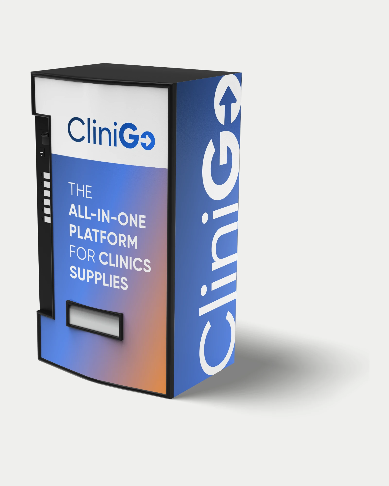
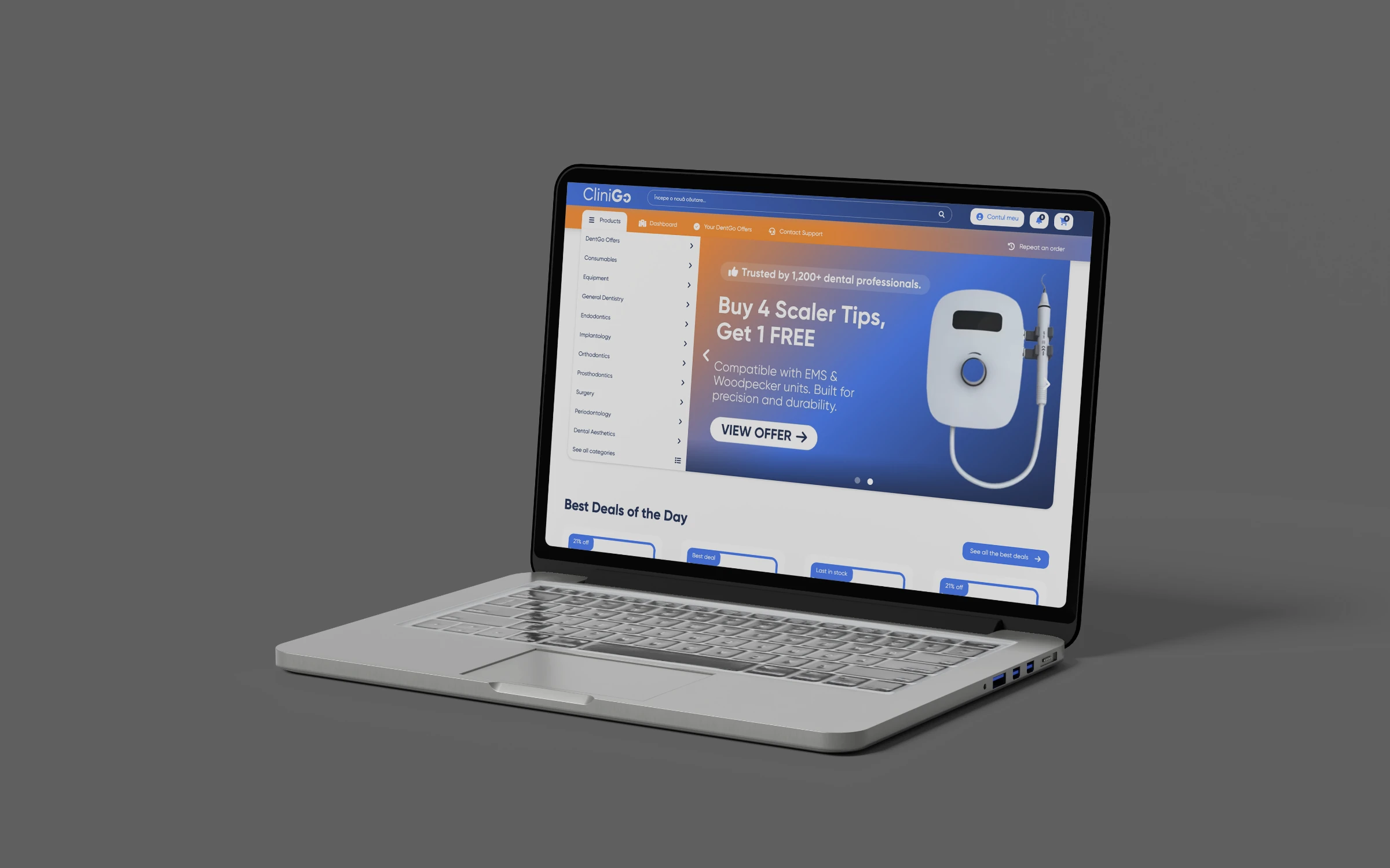
The third name, in 2025. A new logo, the 'Panou de control' dashboard on laptop mockups, a pitch-deck key visual and demo data for product walkthroughs.
CliniGo logo, dashboard mockups, pitch visual
Results
What it added up to.
Through 2025 the product changed its name twice, and its brand never had to be thrown away. The clinic dashboard ran as a clickable prototype from May, and the CliniGo identity, dashboard mockups and pitch key visual followed in August, ready for the pitch.
The outcome
What the work changed.
Through 2025 the product changed its name twice, and its brand never had to be thrown away. The clinic dashboard ran as a clickable prototype from May, and the CliniGo identity, dashboard mockups and pitch key visual followed in August, ready for the pitch.
A note from Alex
DentexLink taught me to design for change. Over 2025 the product moved from a shop to a platform to a procurement tool for clinics and distributors, and the name moved with it. If we had treated each logo as the finish line, the founders would have started over three times. Instead we kept the navy, the type and the dashboard logic constant, and let the name and the mark do the moving. A clickable dashboard did the rest: something people could use, not only look at.
Alex Codreanu
Founder and design lead
What the client said
Credits
FA Studios (2025): brand identity across three names, app icon, dashboard UI design and Webflow prototype, mockups and pitch key visual. The clinigo.ro site live today is a different brand and not FA Studios work.
Related work.
More work in this field, then projects with the same services.













































Want a project like this one?
Tell us what you’re building. You’ll hear back within one business day.
Prefer email? contact@fastudios.co