
This case study is for adults only.
It shows work for nicotine products and is intended for people aged 18 or over.
Digital Fine Art
Brand identity, Website, Presentations, Social & content
A digital museum for fine art, designed screen by screen.
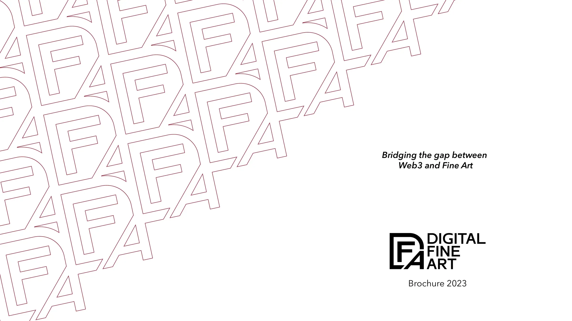
Two years of brand, website, print and social for a platform bridging fine art and Web3: UI from V1 to V2, brand guidelines and brochures in two languages.
The challenge
Digital Fine Art set out to bridge Web3 and fine art: artist collections, a members' club called L'Atelier and a staking museum. The audience mixed art collectors who expect gallery-grade restraint with a crypto audience used to loud launches. Every touchpoint, from the website to a Georges Braque catalogue, had to feel like it belonged in a museum.
The insight
Borrow the codes of the museum, not of crypto: parchment, burgundy and editorial type make a new medium feel collectable.
The approach
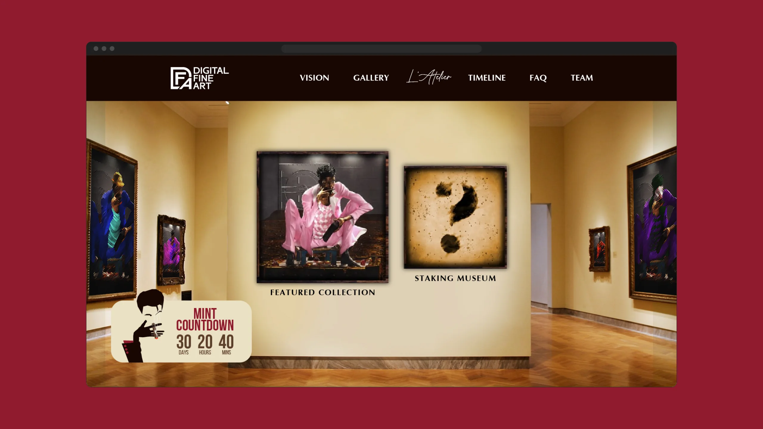
Our designers built the website first, from UI V1 to V2 and final screens, a virtual museum hall with an illustrated Vision page and the L'Atelier club, then codified what worked into brand guidelines. Brochures in English and French, a catalogue, flyers, a social series and collection assets all followed the same system through two years of releases.
The project
Two years of brand, website, print and social for a platform bridging fine art and Web3: UI from V1 to V2, brand guidelines and brochures in two languages.
What we delivered
- Website UI V1 → V2 and final screens; builds and a 2023 redesign
- Brand guidelines
- Brochures and presentations in English and French
- Georges Braque catalogue and flyers
- Social post series for launches, mints and events
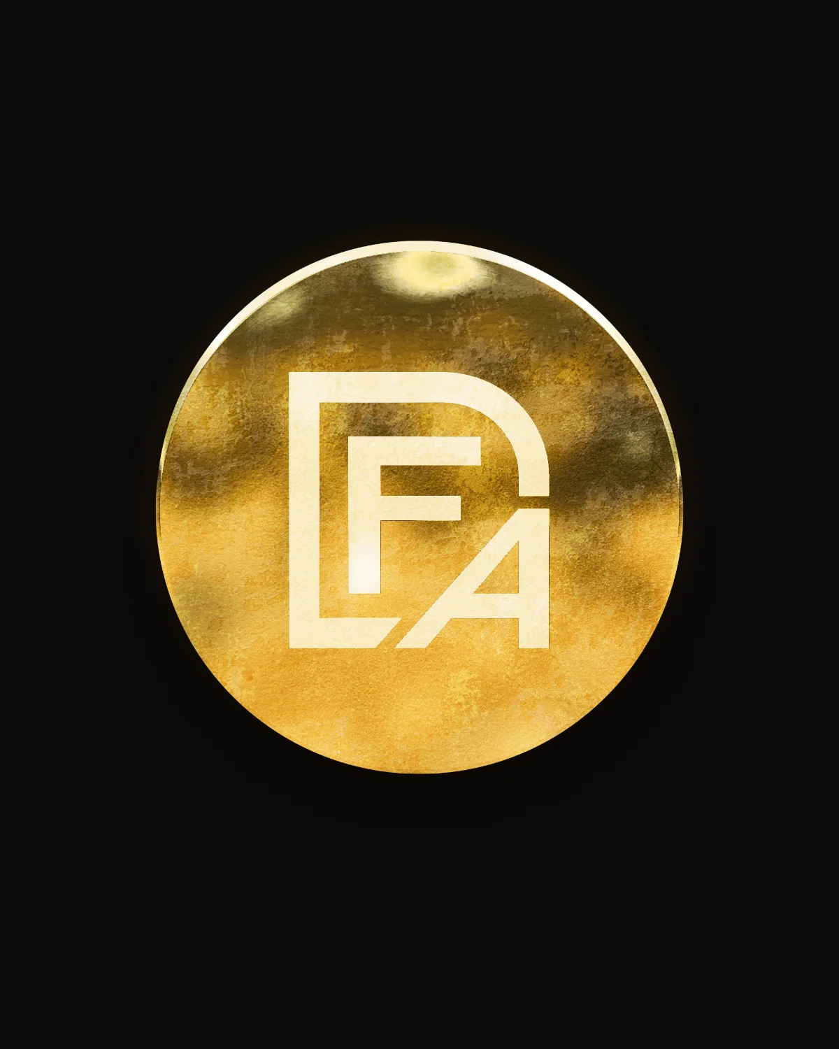
- Staking Museum logo, token and collection assets
Design — UI from V1 to V2
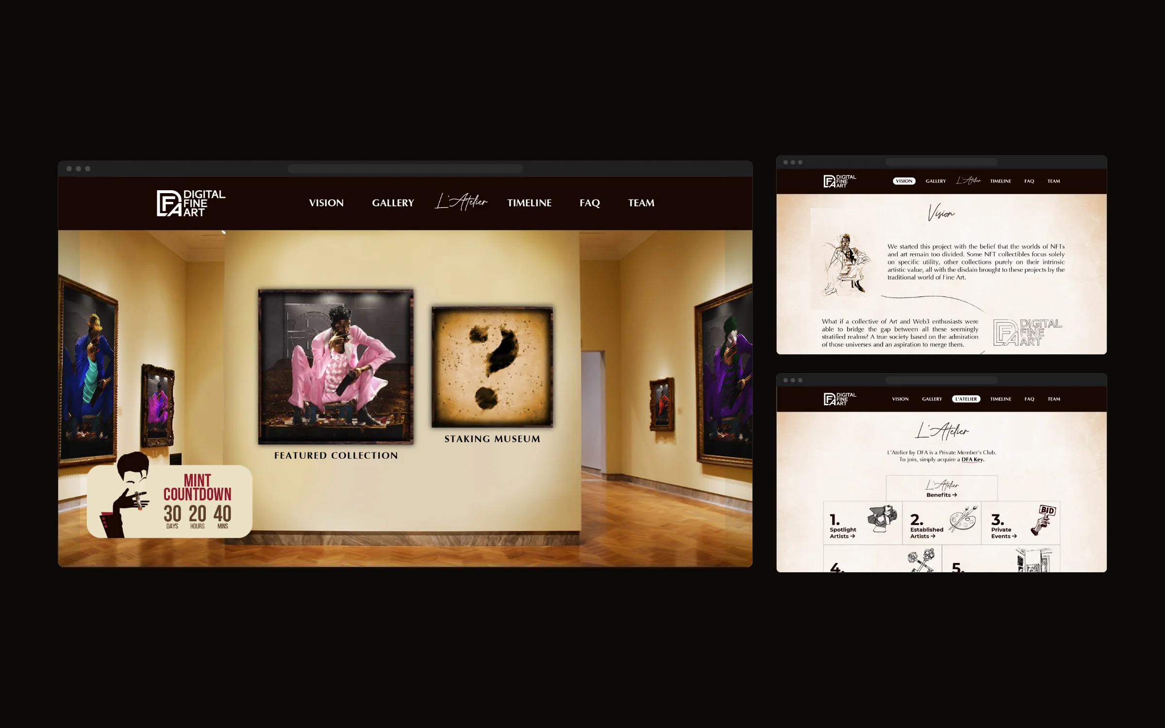
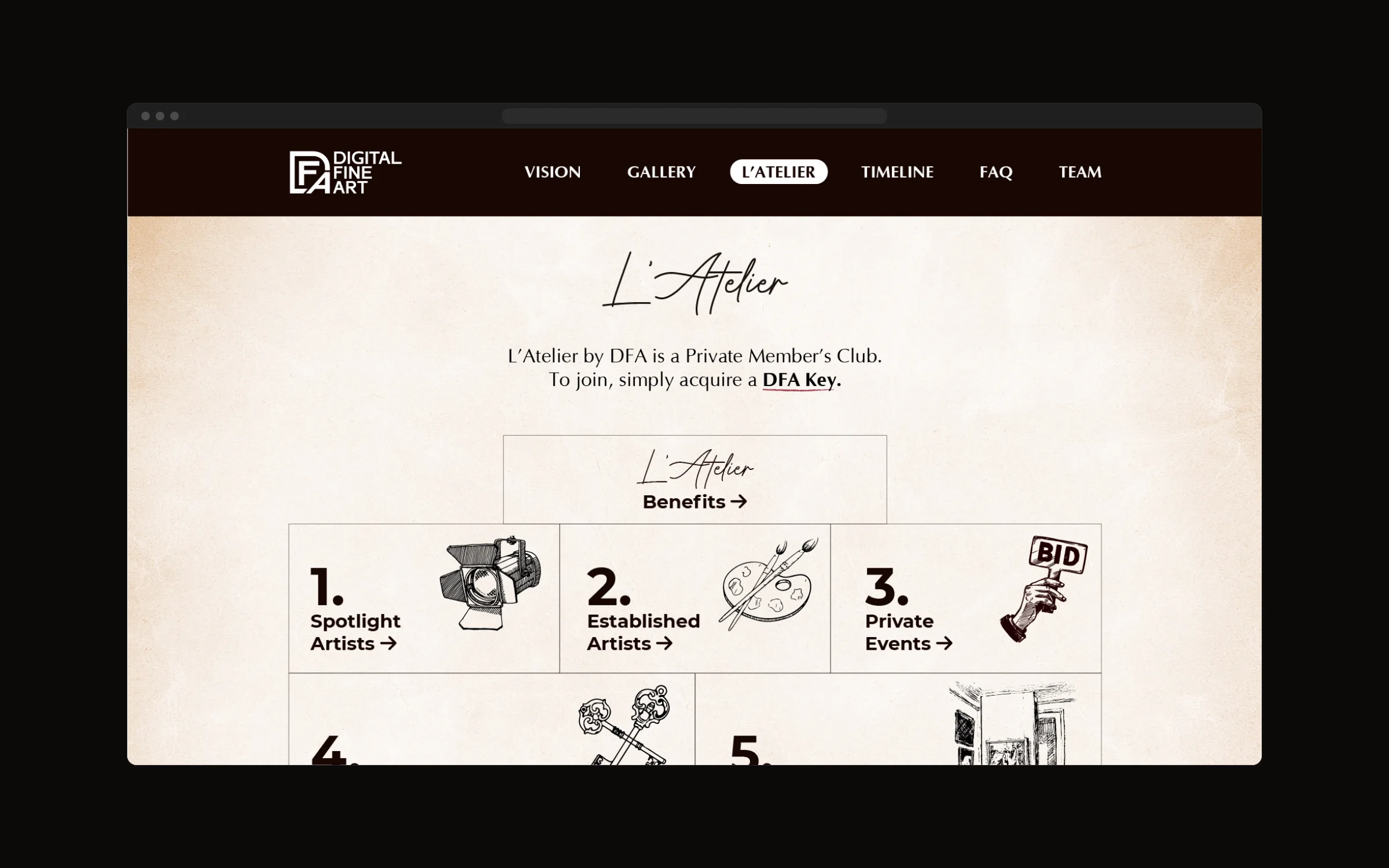
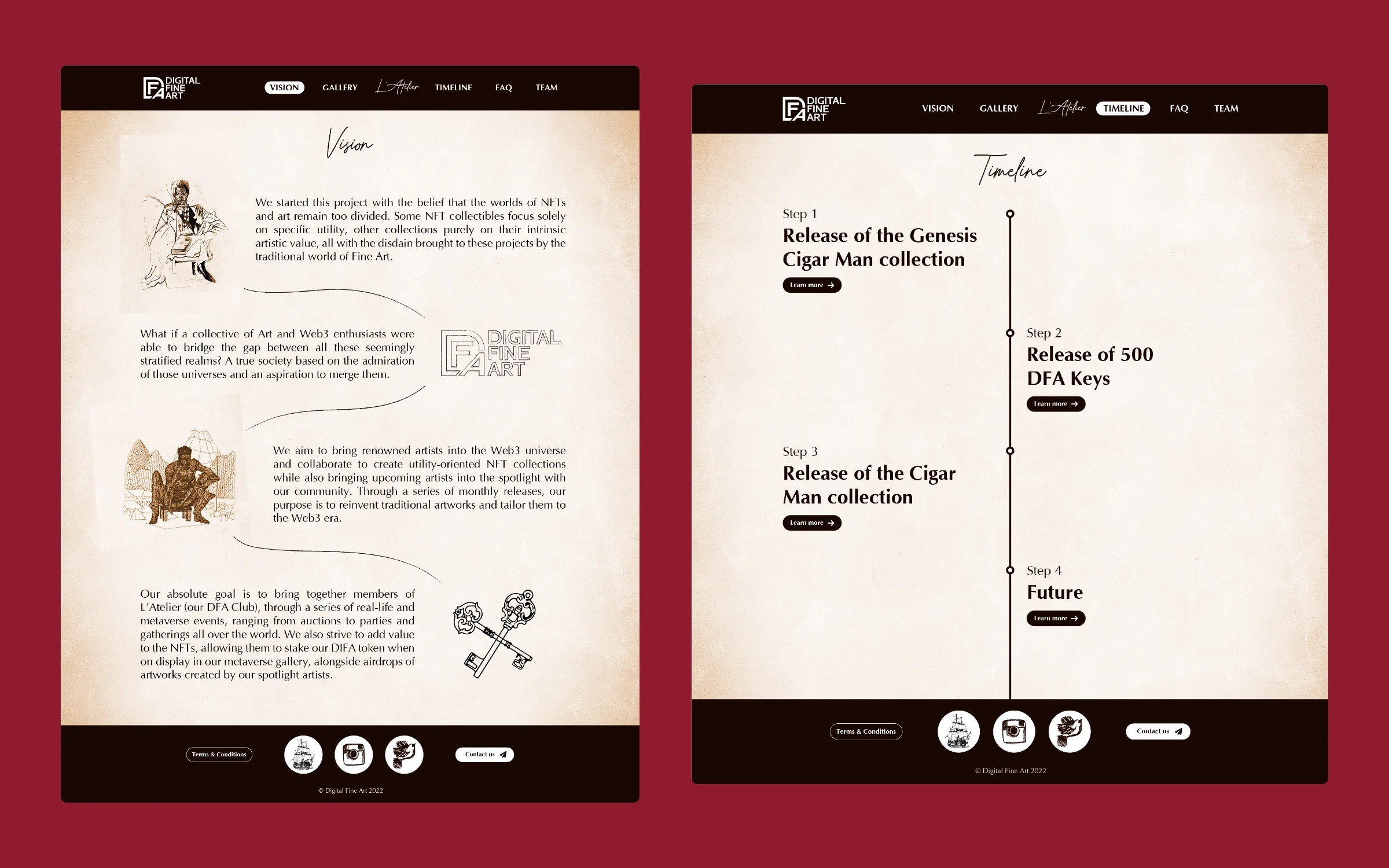
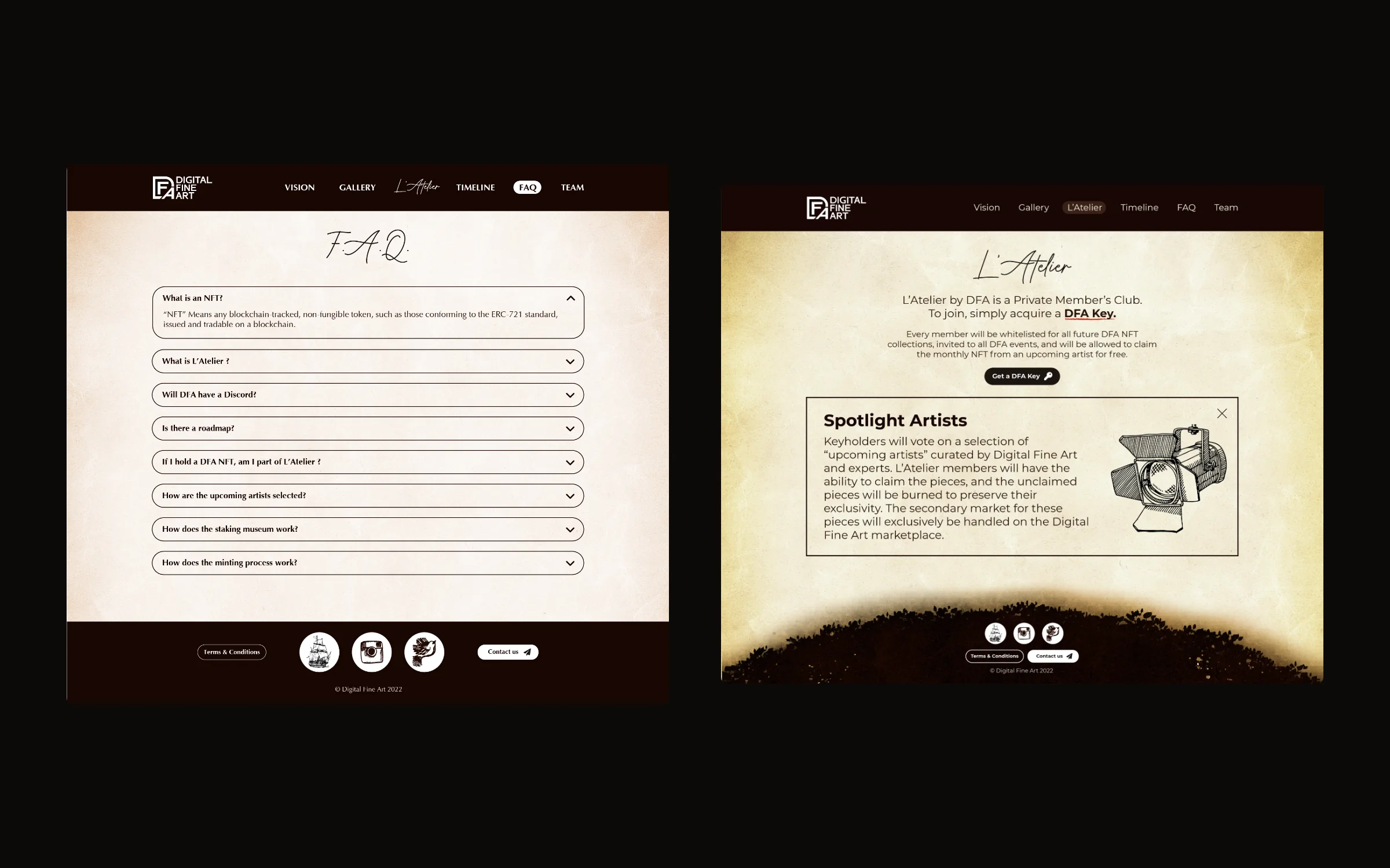
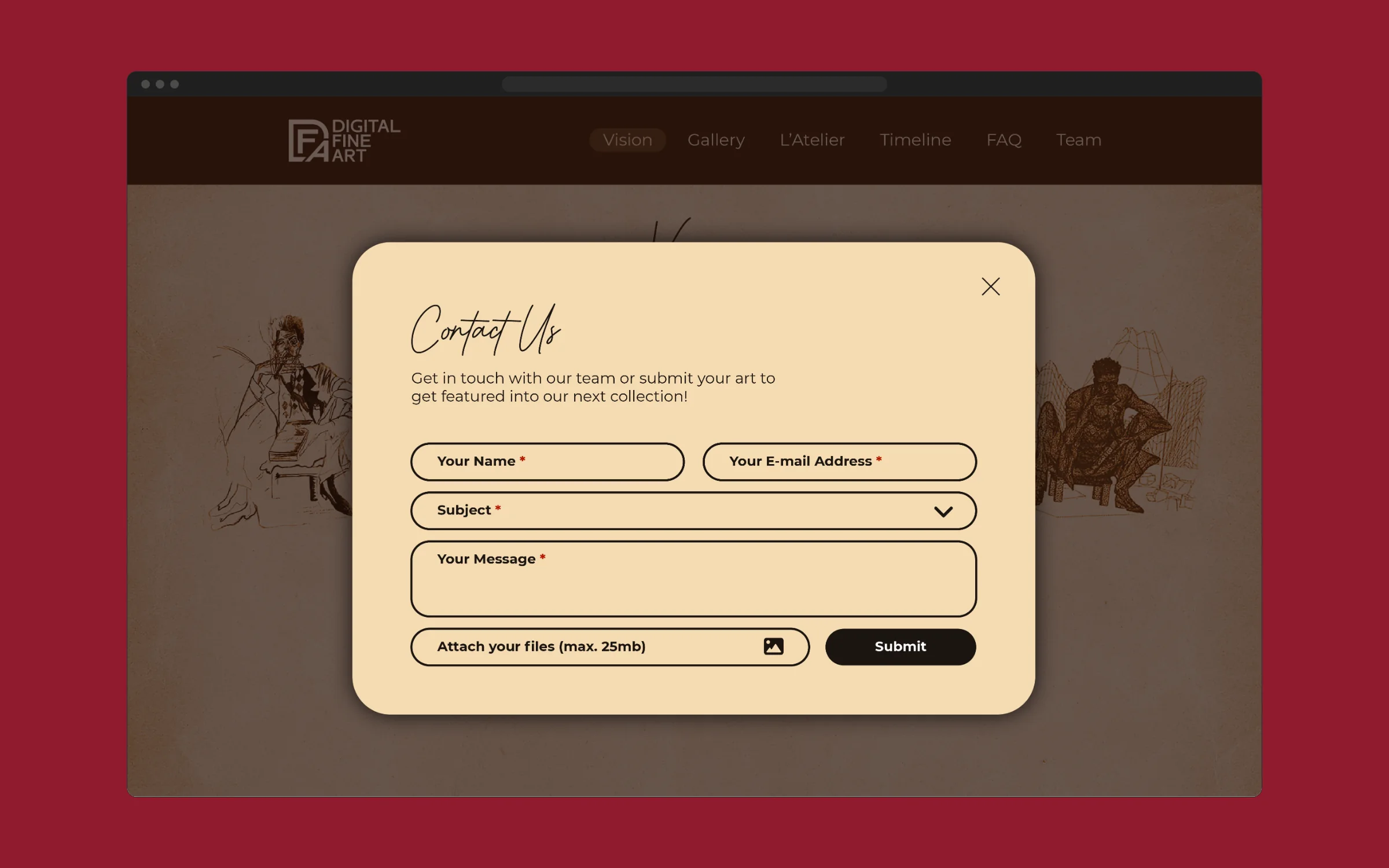
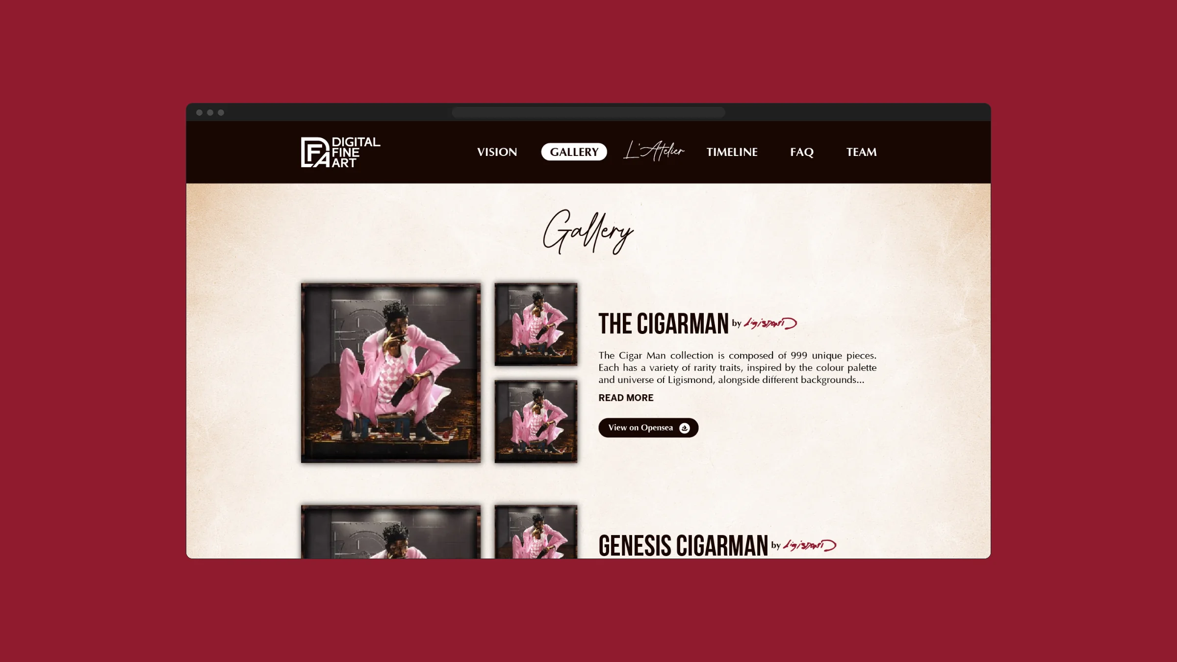
A virtual-museum homepage, an illustrated Vision page, L'Atelier, timeline, FAQ and team screens, refined through design rounds and a client QA pass.
Final screens: homepage, Vision, L'Atelier
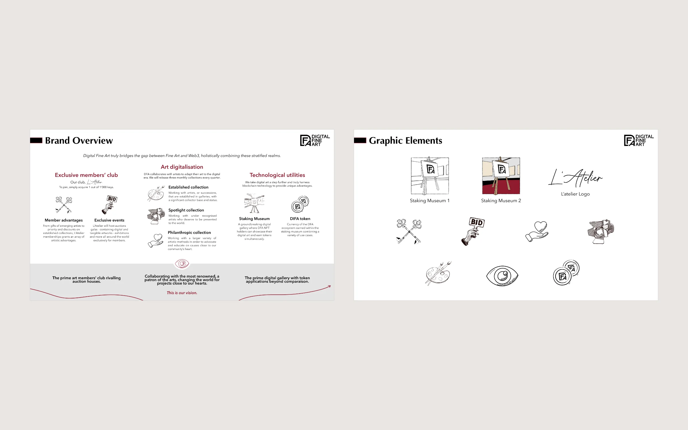
Design — Brand book and Staking Museum
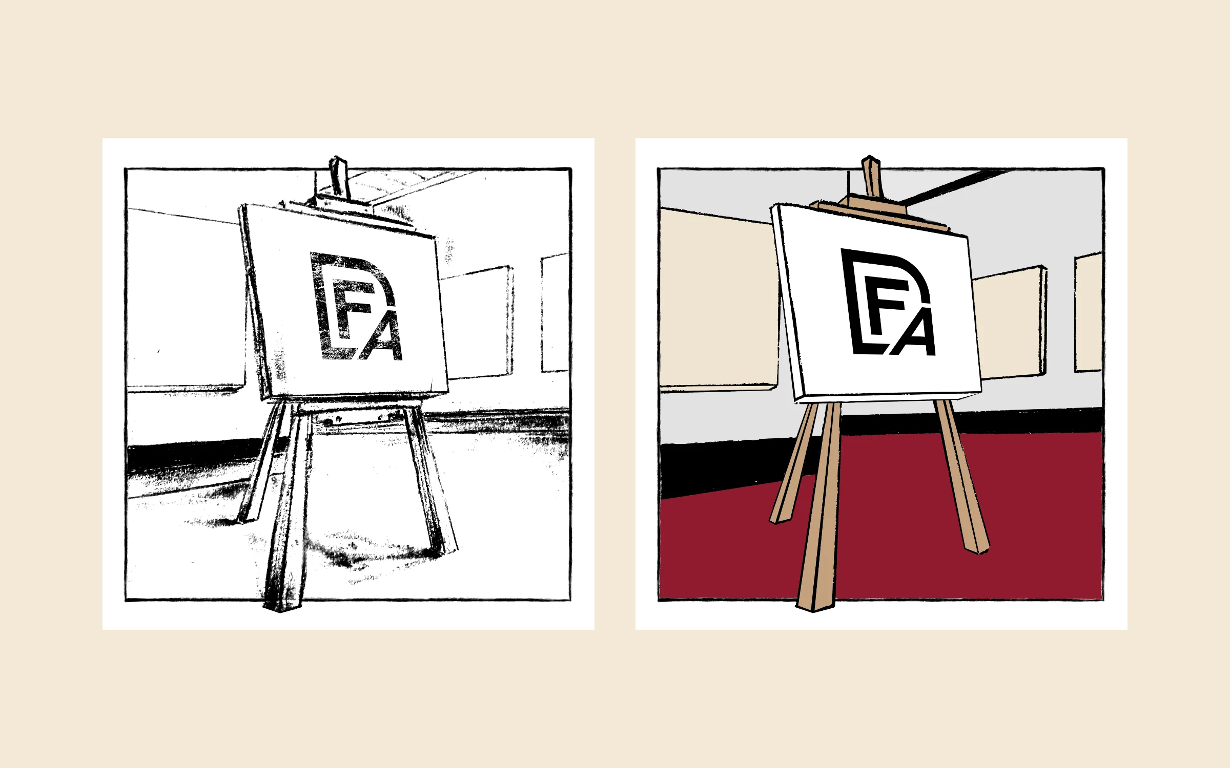
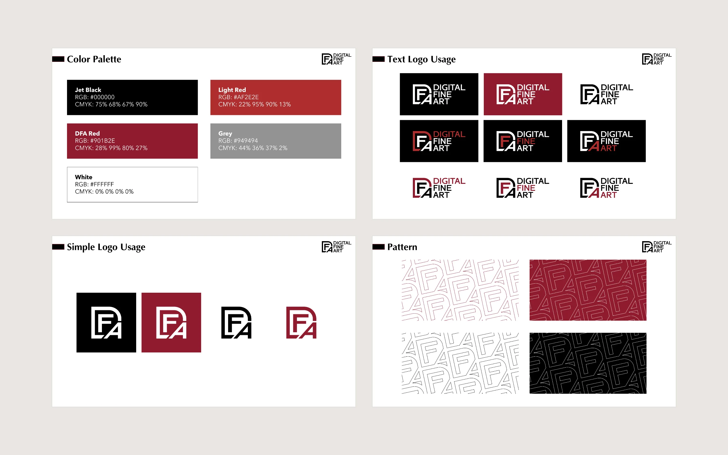
Values, voice, type and a burgundy palette written into guidelines; the Staking Museum mark drawn from ink sketch to colour.
Staking Museum, from sketch to final
Results
What it added up to.
The site went live with a newsletter sign-up and was redesigned in 2023, and the brand book, bilingual brochures and print kept every release consistent across two years. A new medium was presented with the restraint of a gallery, in two languages.
The outcome
What the work changed.
The site went live with a newsletter sign-up and was redesigned in 2023, and the brand book, bilingual brochures and print kept every release consistent across two years. A new medium was presented with the restraint of a gallery, in two languages.
A note from Alex
DFA was one of the longest relationships of my early years. The hardest part wasn't the volume, it was restraint: making something new feel like it had always hung in a museum, in two languages and across every release. When the client wrote back about the L'Atelier page, we knew the tone was right.
Alex Codreanu
Founder and design lead
What the client said
Credits
FA Studios: UI/UX, website, brand guidelines, editorial and print design, social and motion assets.
Related work.
More work in this field, then projects with the same services.



































Want a project like this one?
Tell us what you’re building. You’ll hear back within one business day.
Prefer email? contact@fastudios.co