
This case study is for adults only.
It shows work for nicotine products and is intended for people aged 18 or over.
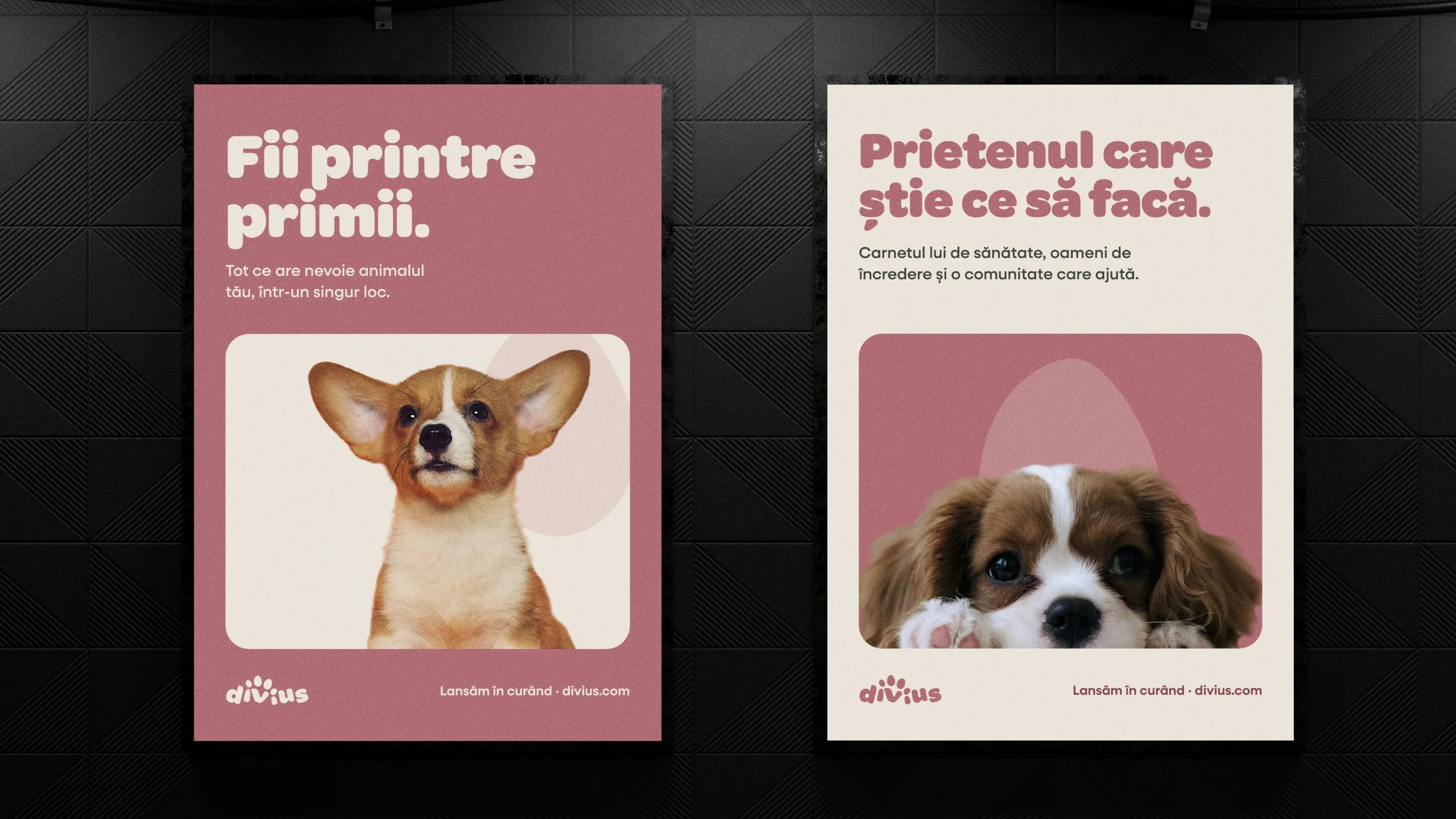
Divius
Rebranding, Brand strategy, Brand identity, Website
A pet app, rebranded around the bond, not the software.
Rebrand for Divius, a Romanian pet-care app: research, tone of voice, a paw built into the wordmark, a brand book and a complete launch kit.
The challenge
Divius puts a pet's health record, care services and a community for adoptions and lost pets into one Romanian app. Before launch, its identity read like a tech product: safe, clean and easy to forget. It needed a brand people would trust with their animal, ready as files the app, the web and print could use from the first day.
The insight
Divius had to look like a brand built around people and their animals, not like a software company.
The approach
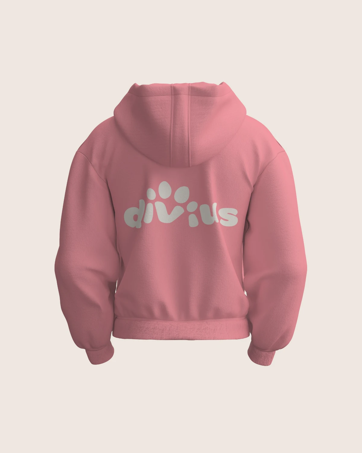
Our strategists started with research: local apps, international references such as Rover, Tractive and TrustedHousesitters, and a tone of voice summed up as "the friend who knows what to do". Our designers then put a paw inside the word itself, the v as the pad and the dots on the i's as toes, and built a brand architecture that gives each area of the app, medical, services and community, a toe and a colour of its own. Every file the launch needs followed, from app icons and a custom paw home button to posters, flyers and a website prototype.
The project
Rebrand for Divius, a Romanian pet-care app: research, tone of voice, a paw built into the wordmark, a brand book and a complete launch kit.
What we delivered
- Brand research and benchmarks
- Tone of voice: "The friend who knows what to do"
- Wordmark with an integrated paw, symbol and map pin
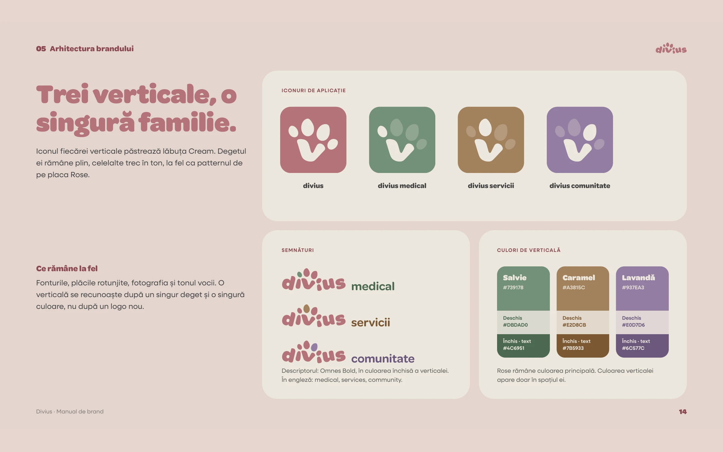
- Brand architecture for the app's three areas
- Brand book v1.0
- App icon set for iOS, Android and web
- Custom paw "Home" tab button
- Social profile and cover set
- Launch posters, flyers and social posts
- Website prototype
Discover — Research and diagnosis
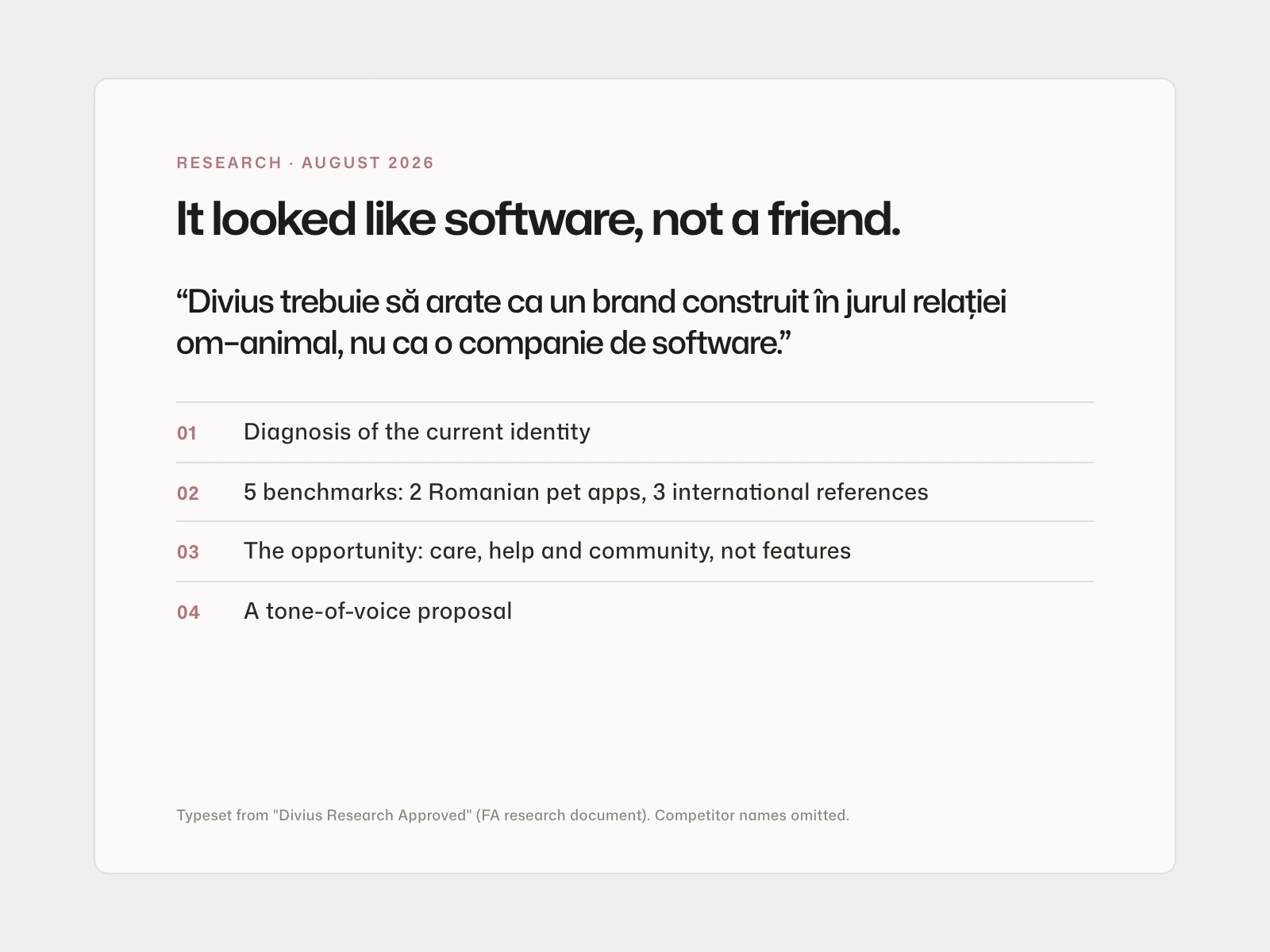
Local competitors such as PetFolder and TotoPet, international references such as Rover, Tractive and TrustedHousesitters, and a plain diagnosis: the identity read like a tech product.
Brand research, August 2026
Define — Tone of voice
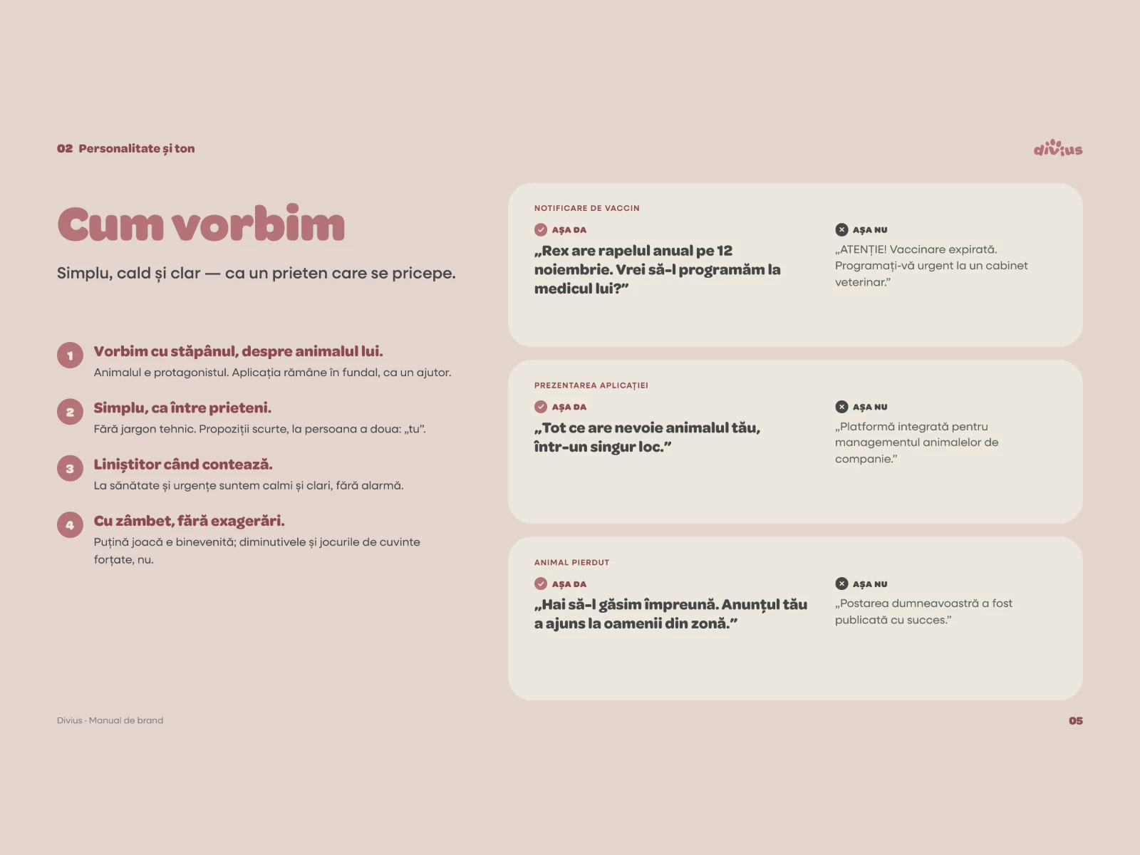
Helpful, warm, reassuring, playful, purpose-driven: "the friend who knows what to do". The brand book turns it into do and don't examples for real messages, from a vaccine reminder to a lost-pet post.
We are / We are not
Design — A paw inside the word
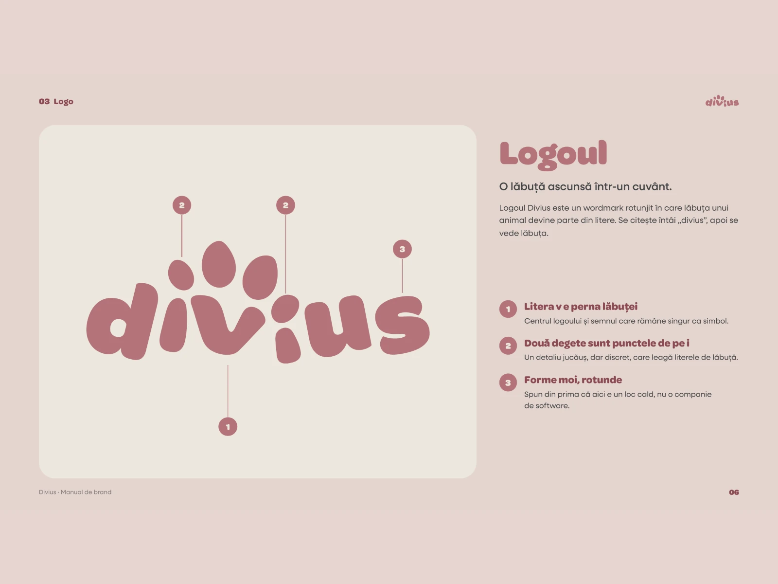
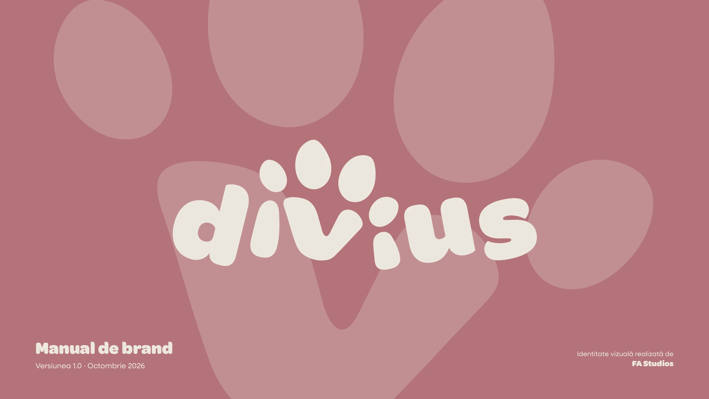
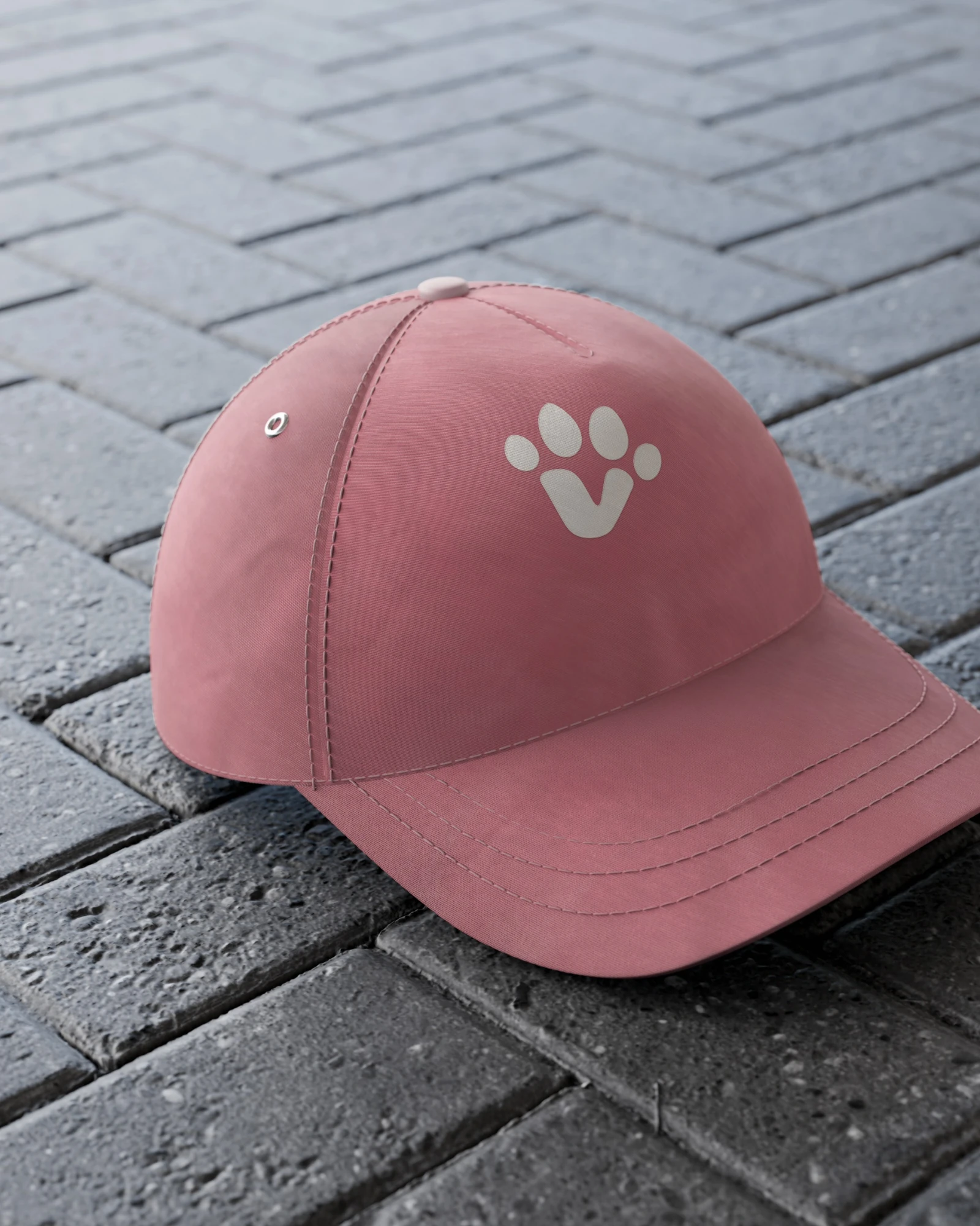
A rounded lowercase wordmark in which the v is the paw pad and two toes are the dots on the i's, with a paw symbol, an app tile and a map pin built from the same parts.
Logo construction
Design — Four toes, one paw
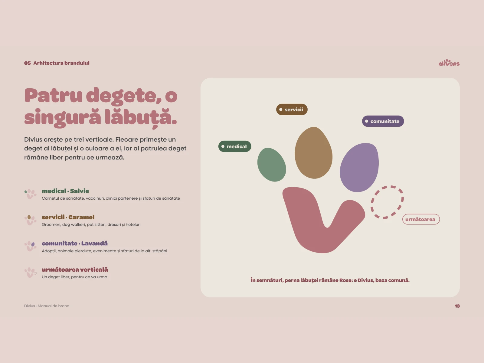
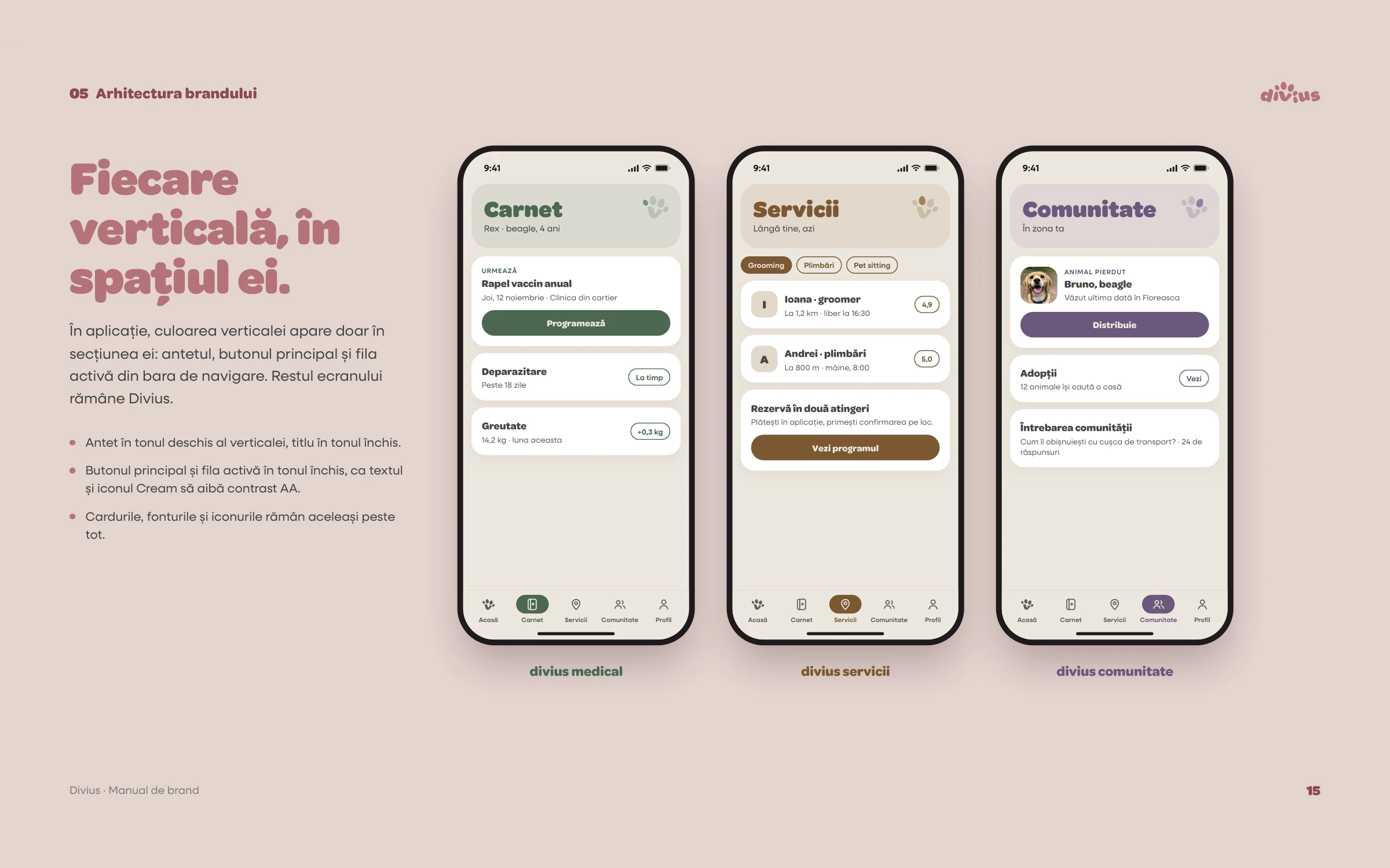
The app's three areas, medical, services and community, each own a toe of the paw and an accent colour: sage, caramel and lavender. One system that can grow with the product.
Brand architecture
Design — Brand book v1.0
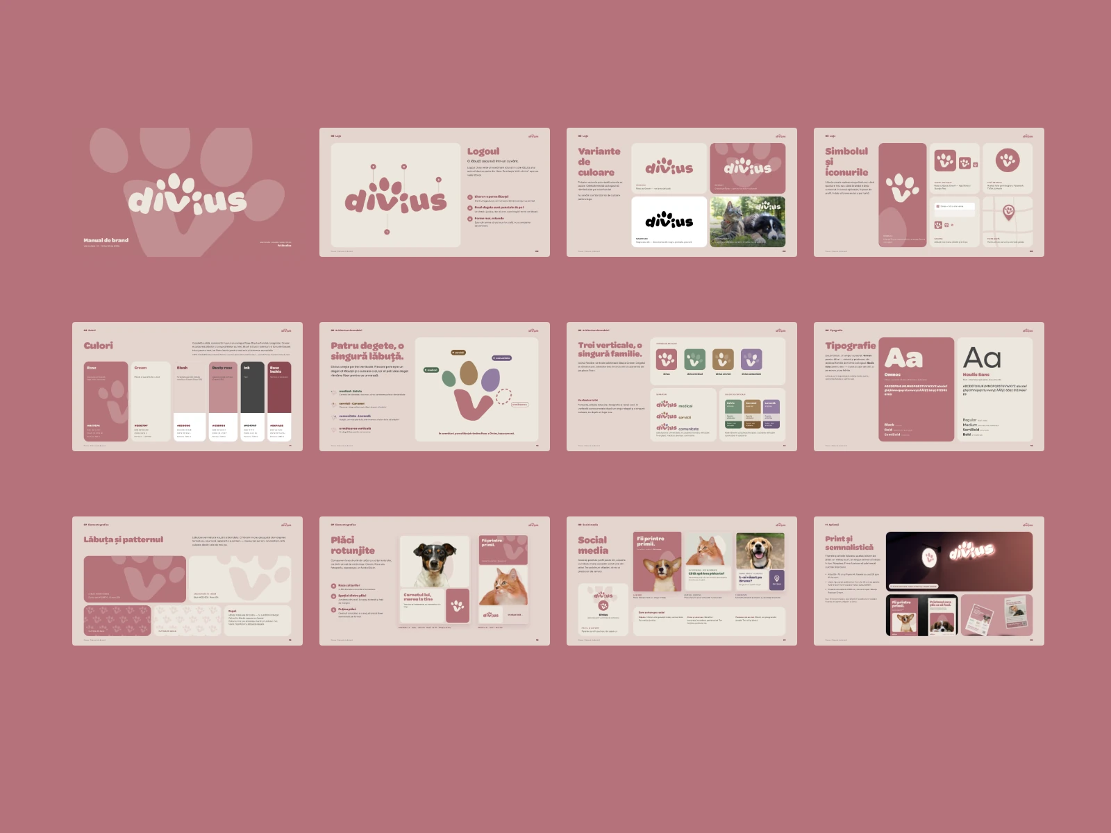
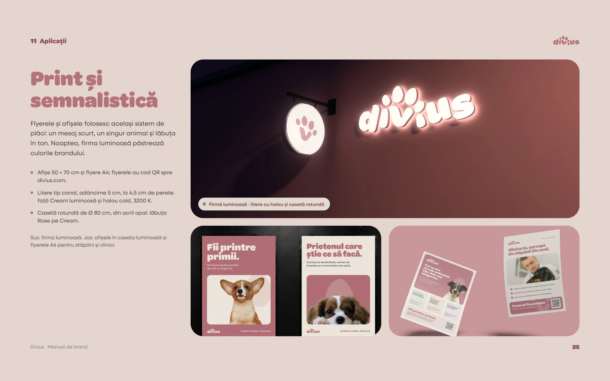
Personality, logo rules, colours with accessible contrast pairs, typography, graphic elements, photography, social, website and applications from merch to signage.
Brand book v1.0, October 2026
Deliver — Developer handoff
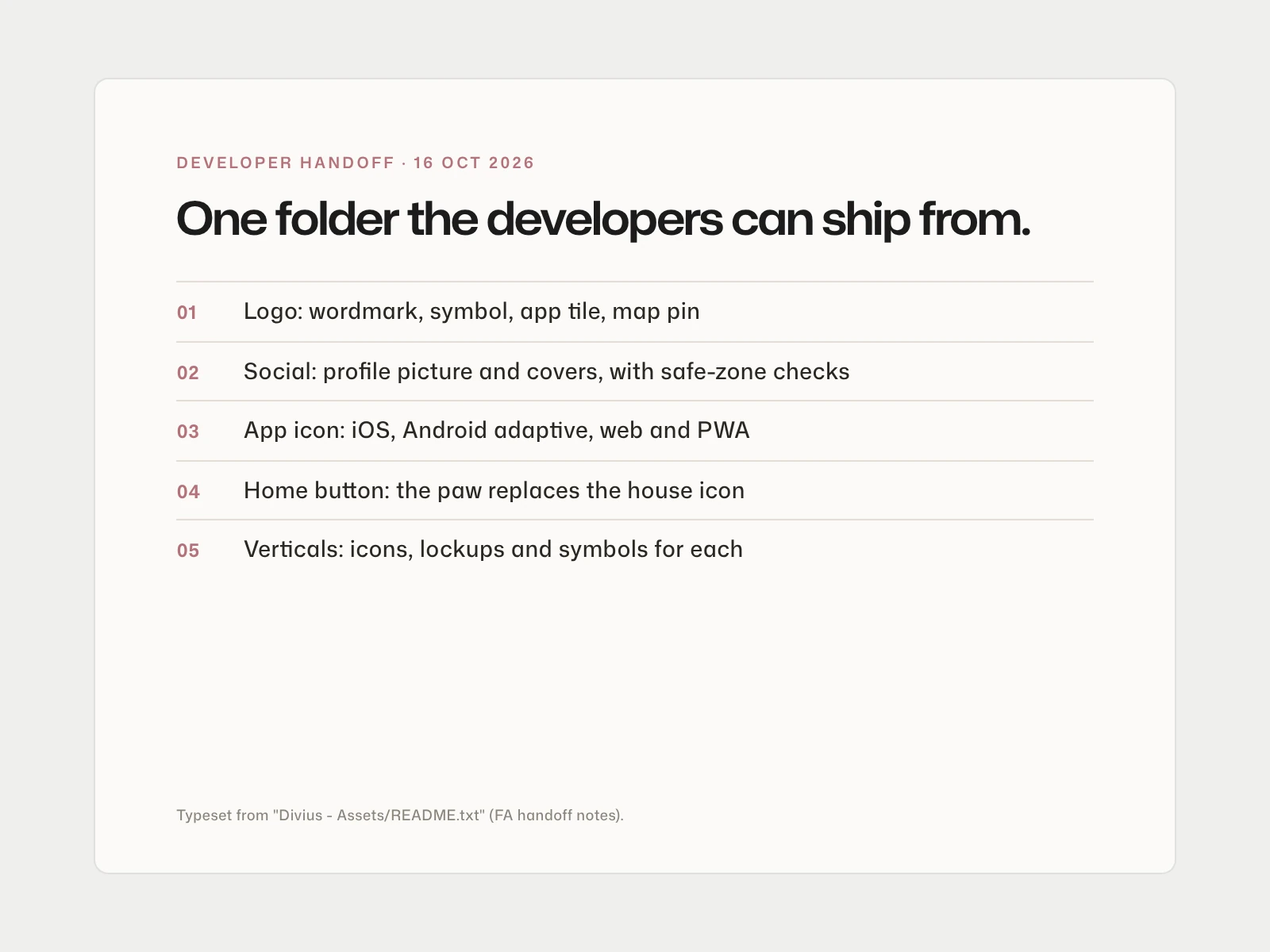
App icons for iOS, Android and the web, a custom "Home" tab where the paw replaces the house, and social covers checked against mobile safe zones, all as clean vectors from the master file.
The developer handoff
Deliver — Launch kit and website prototype
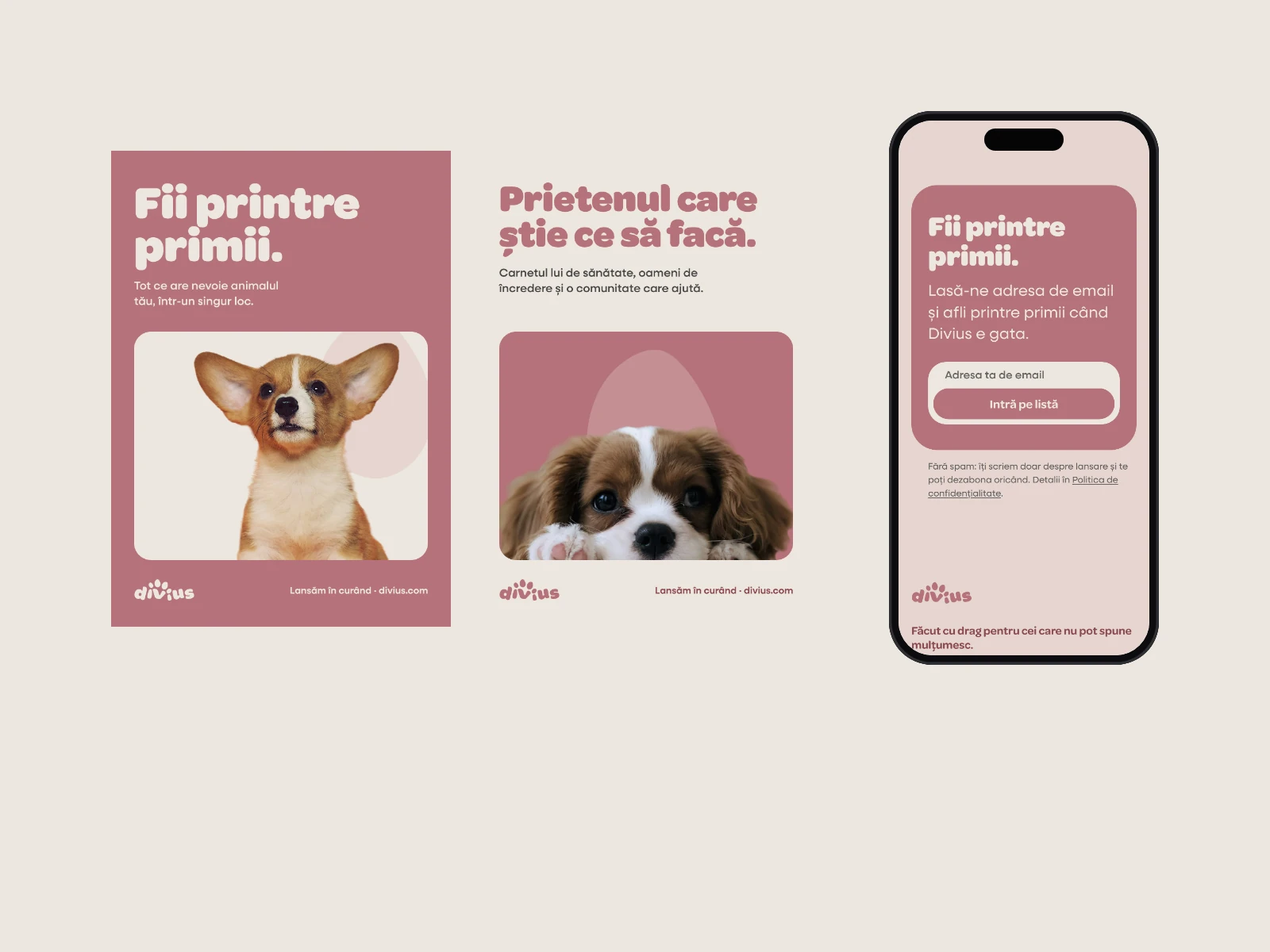
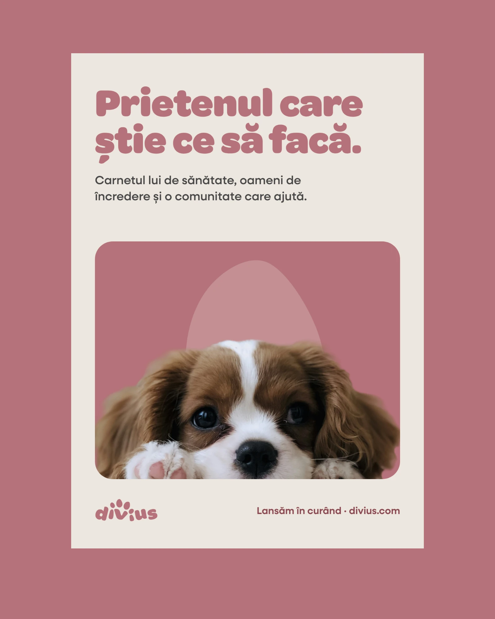
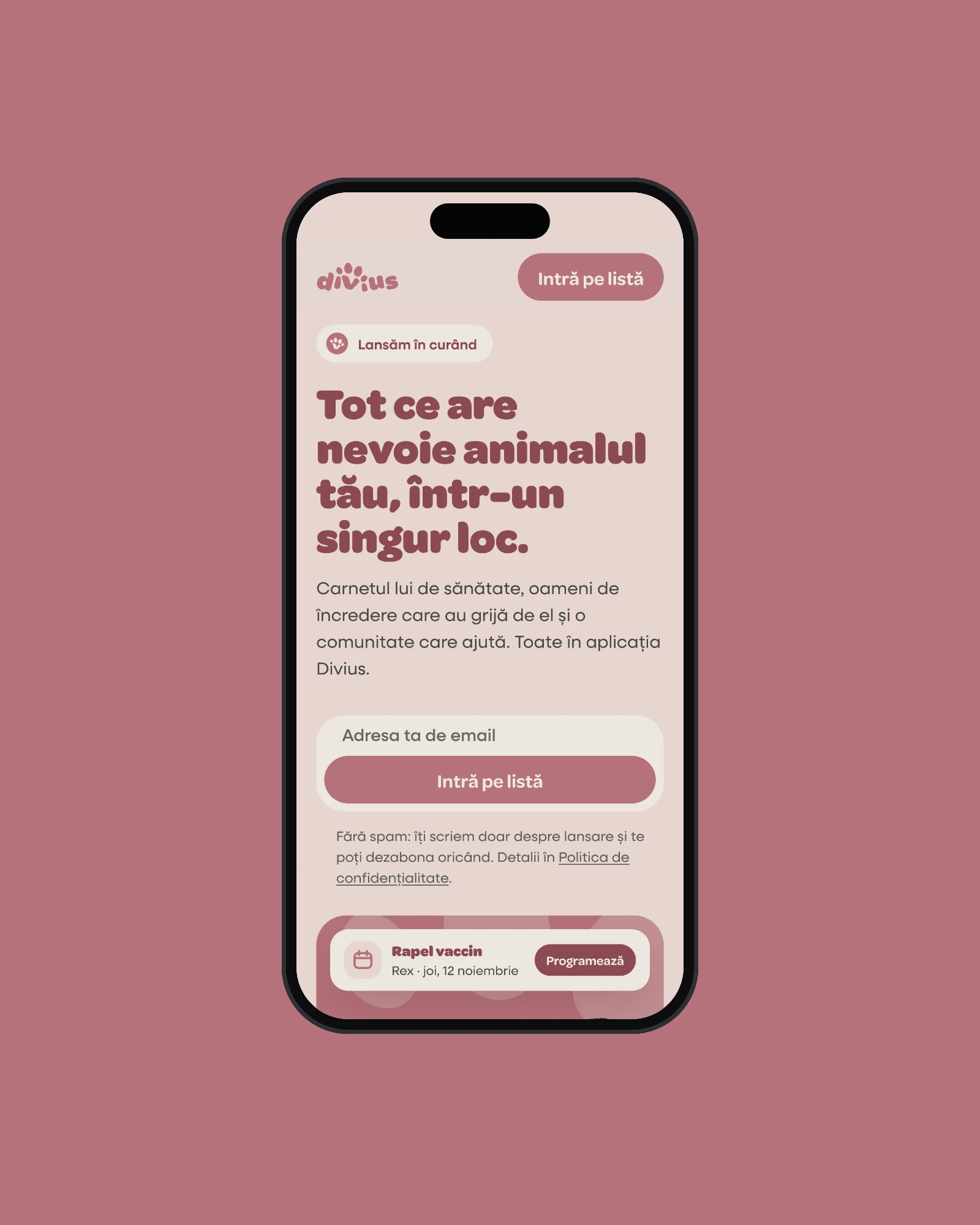
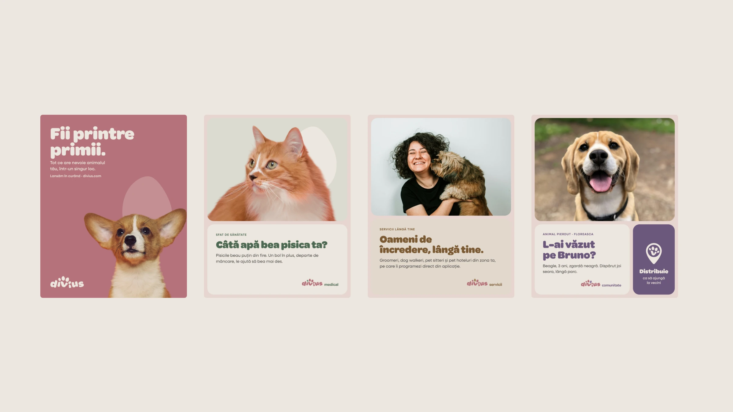
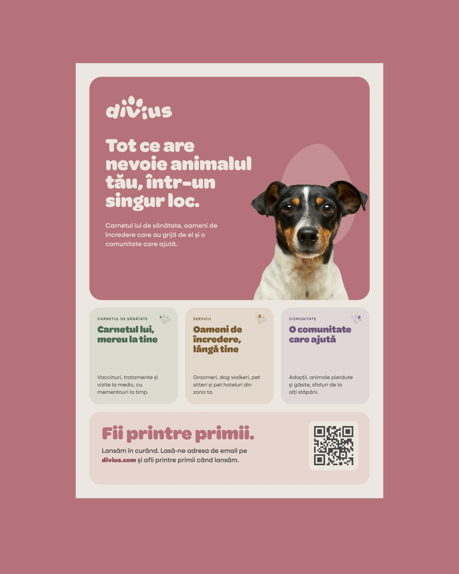
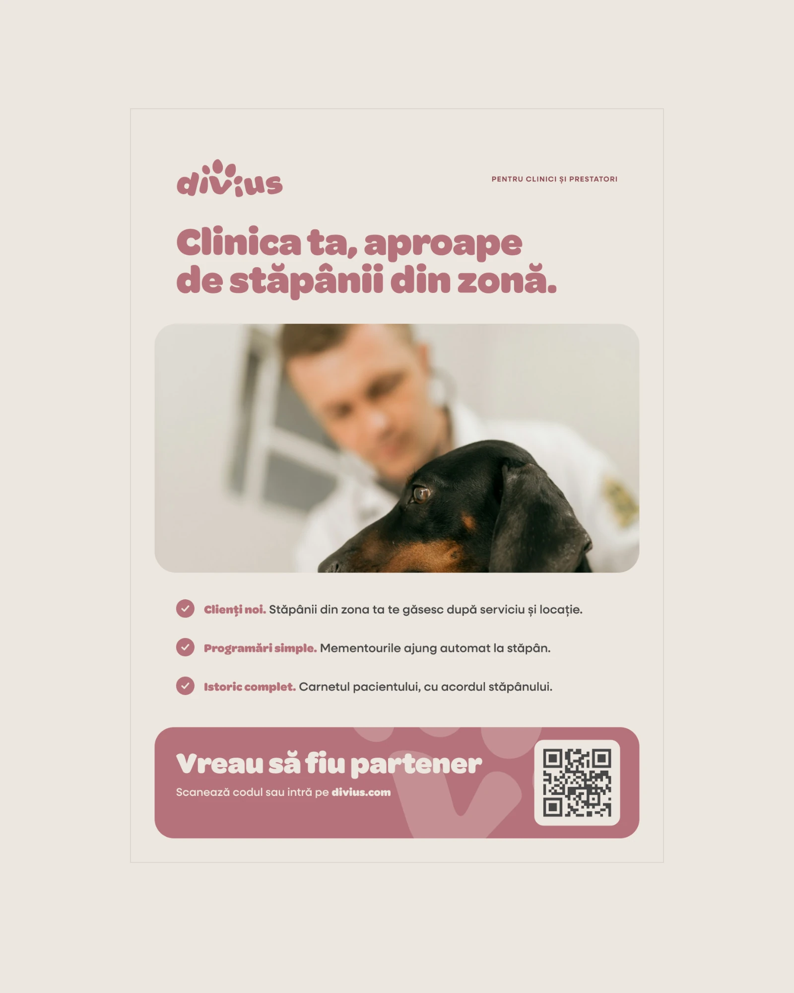
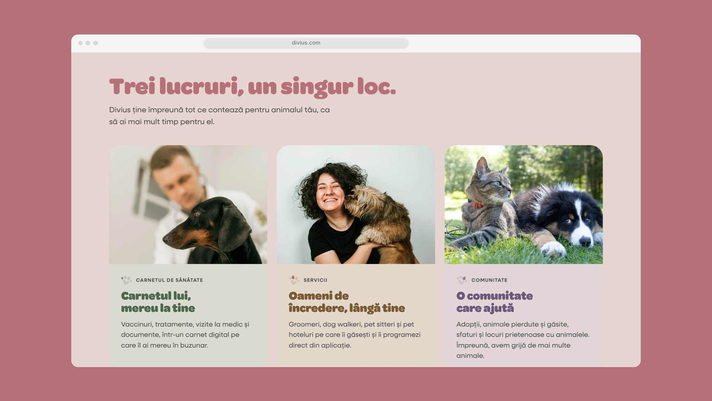
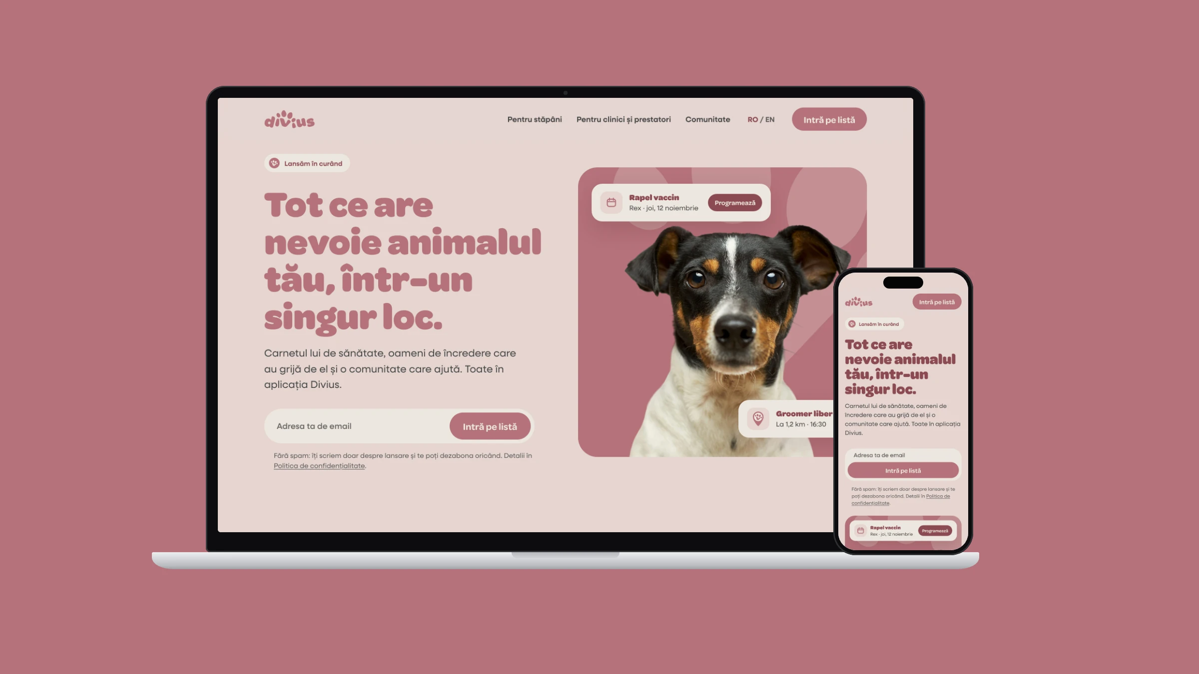
Launch posters, flyers for owners and for clinics, social posts and a website prototype led by the line "Everything your pet needs, in one place."
Posters, flyers, social, web
Results
What it added up to.
The identity is approved and the complete asset package is in the developers' hands: logo system, app icons, the custom home button and social covers, alongside launch posters, flyers and social posts. Divius is preparing for launch, with the new website as the next step.
The outcome
What the work changed.
The identity is approved and the complete asset package is in the developers' hands: logo system, app icons, the custom home button and social covers, alongside launch posters, flyers and social posts. Divius is preparing for launch, with the new website as the next step.
A note from Alex
The old Divius looked like a lot of apps: clean, safe, forgettable. The research gave us one sentence to design against: Divius should look like a brand built around people and their animals, not a software company. So the paw isn't a sticker next to the logo. It lives inside the word: the v is the pad, and two toes are the dots on the i's. A brand only helps a launch if the files are ready when the app is, so the developers' assets came first.
Alex Codreanu
Founder and design lead
What the client said
Credits
FA Studios: research, tone of voice, identity, brand book, launch materials, website prototype. The app itself is built by the client's development partner.
Related work.
More work in this field, then projects with the same services.









































Want a project like this one?
Tell us what you’re building. You’ll hear back within one business day.
Prefer email? contact@fastudios.co