
This case study is for adults only.
It shows work for nicotine products and is intended for people aged 18 or over.
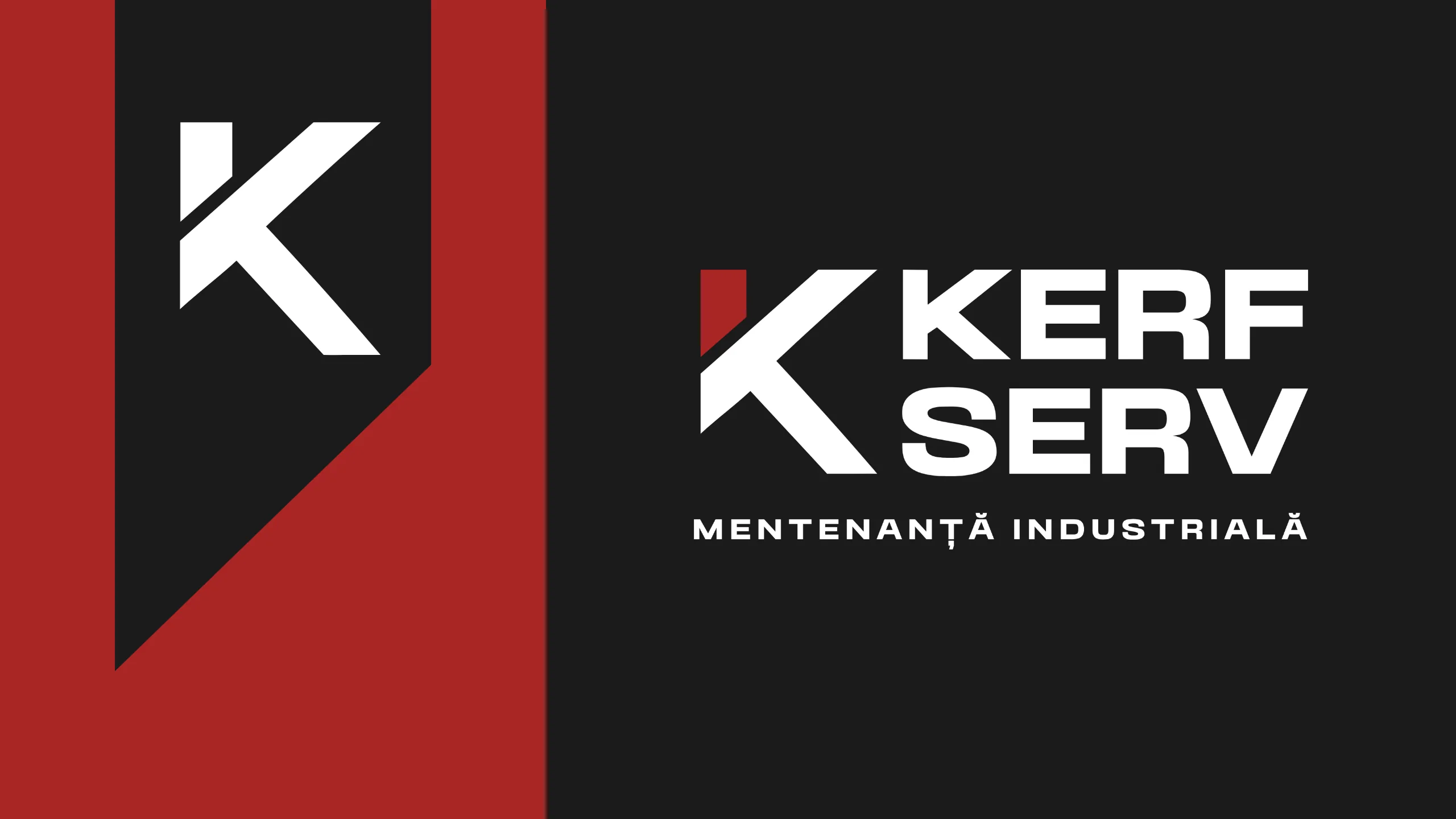
Kerf Serv
Brand identity, Website
An industrial brand that says only what it can prove.
Brand identity and website design for Kerf Serv, a Romanian industrial maintenance, retrofit and filtration specialist working with European manufacturers.
The challenge
Kerf Serv is a young Romanian company, founded in 2023, that maintains and modernises industrial equipment and supplies filtration and magnetic lifting systems from partners in Germany, Denmark and Italy. Its buyers are engineers and plant managers. They need to trust a new team quickly, and they notice any claim the manufacturer wouldn't make.
The insight
In industrial B2B, credibility is precision: a geometric mark with no soft curves, and copy that never promises more than the partners' own specs.
The approach
The brief already set the direction, so our proposal focused on execution: an identity system in black, red, grey and white, built around a hard-edged K monogram with a single red element, then a website designed around what Kerf Serv actually does. Our writers took the English copy through two passes, one expanded and one held strictly to the manufacturers' published ranges, and our designers prepared every page's imagery, from the factory floor to magnetic lifting beams.
The project
Brand identity and website design for Kerf Serv, a Romanian industrial maintenance, retrofit and filtration specialist working with European manufacturers.
What we delivered
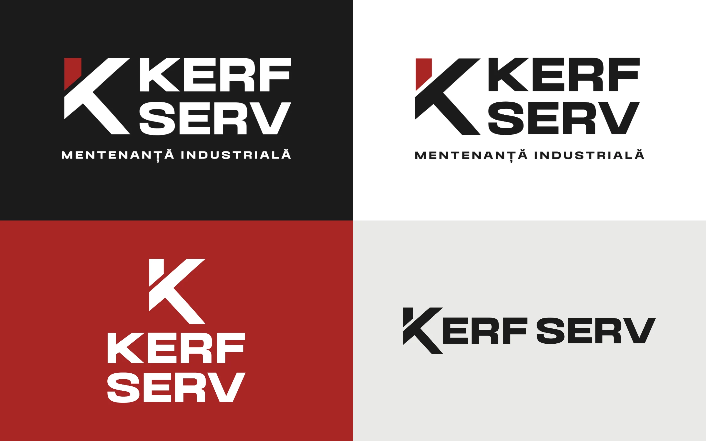
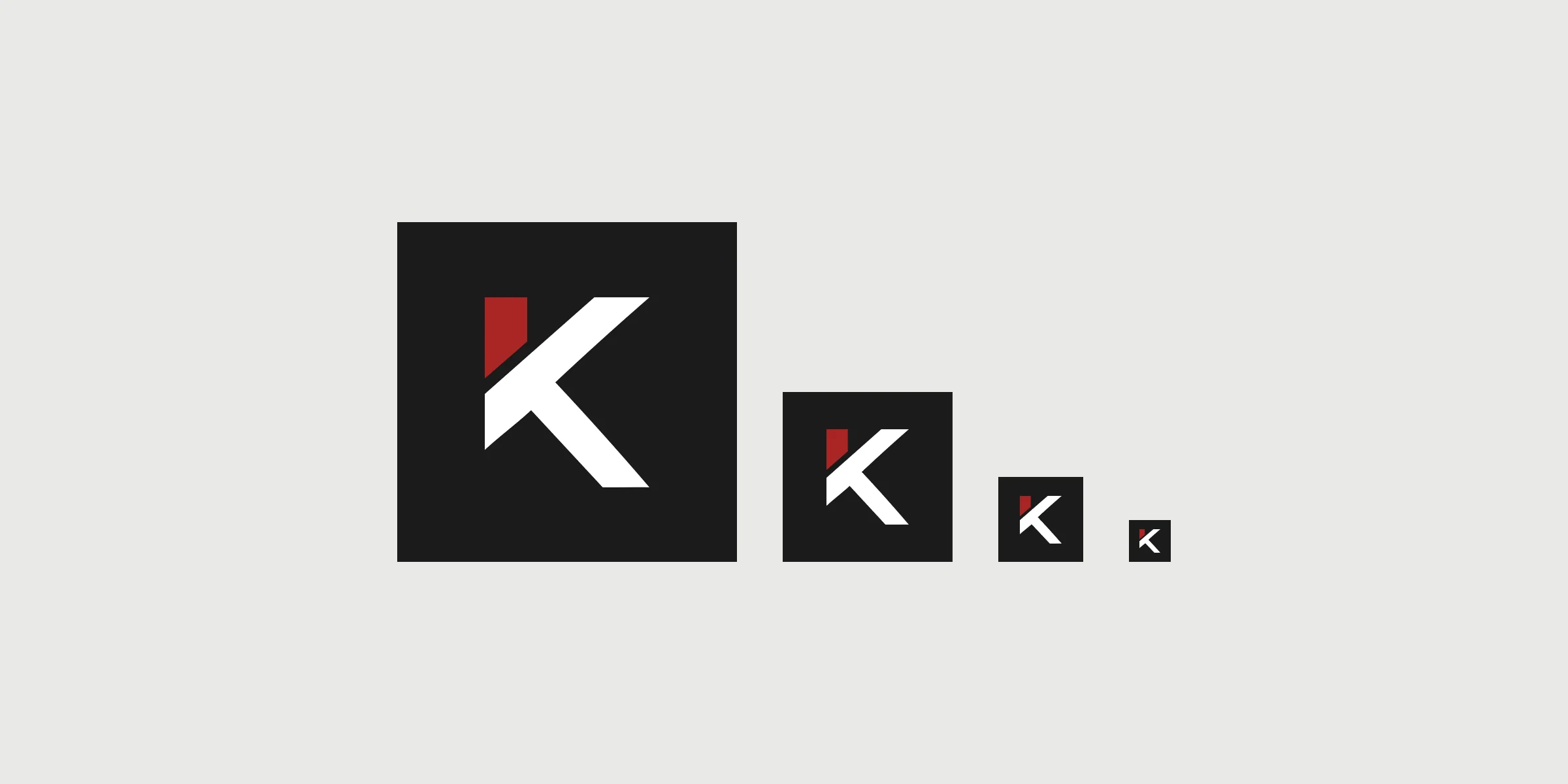
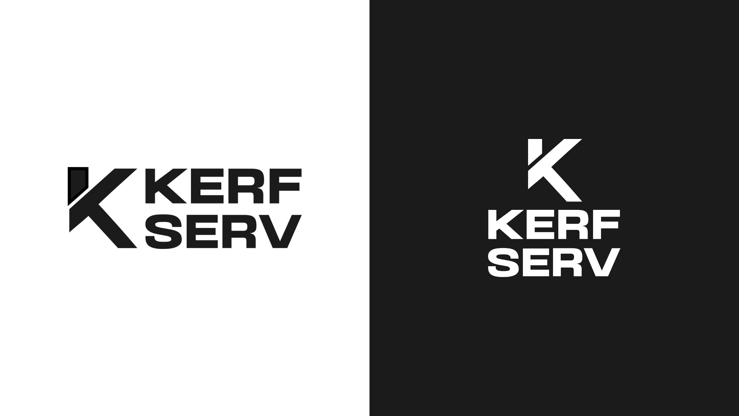
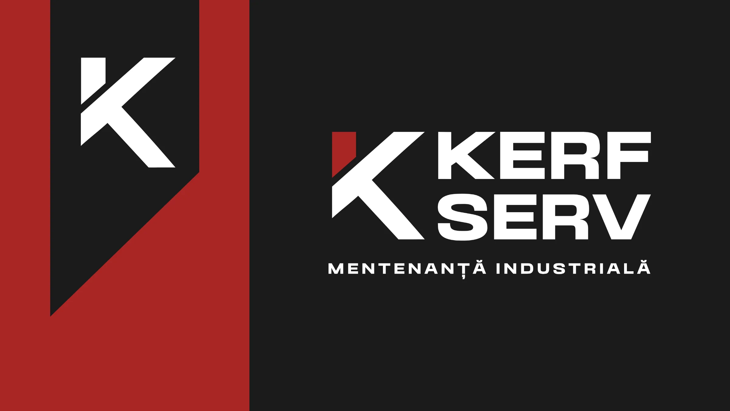
- K monogram with red accent and wordmark; favicons
- Identity palette: black, red, grey and white
- Website structure and design: About, Services and Retrofit, Filtration, Magnets, Contact
- Page-by-page imagery and web-optimised client photos
- English site copy in two passes
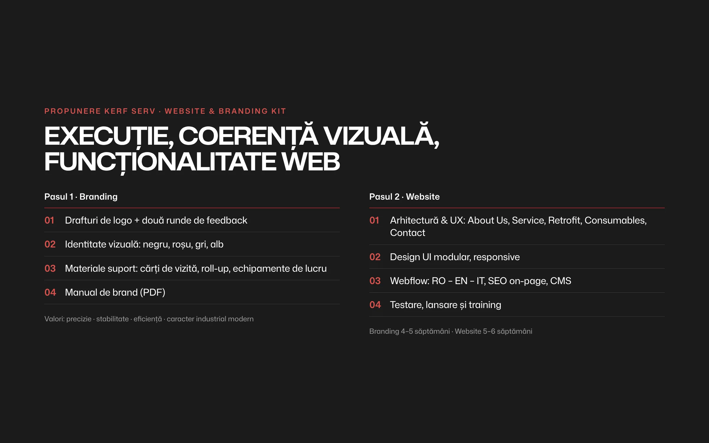
Define — Proposal: execution, not reinvention
With the direction set in the client's brief, we scoped two steps: a branding kit and a website, with values defined as precision, stability, efficiency and modern industrial character.
Branding and website proposal
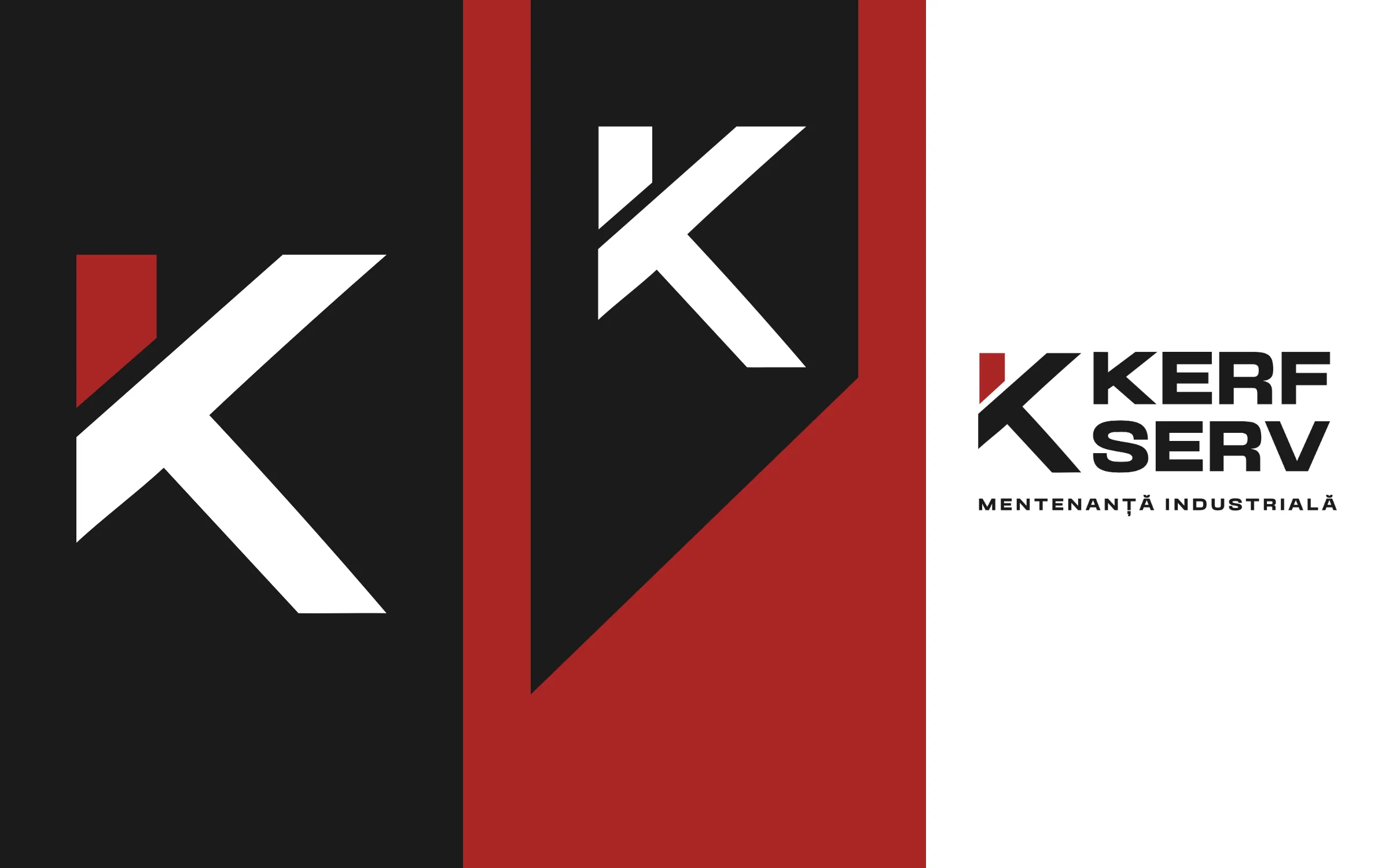
Design — A geometric K
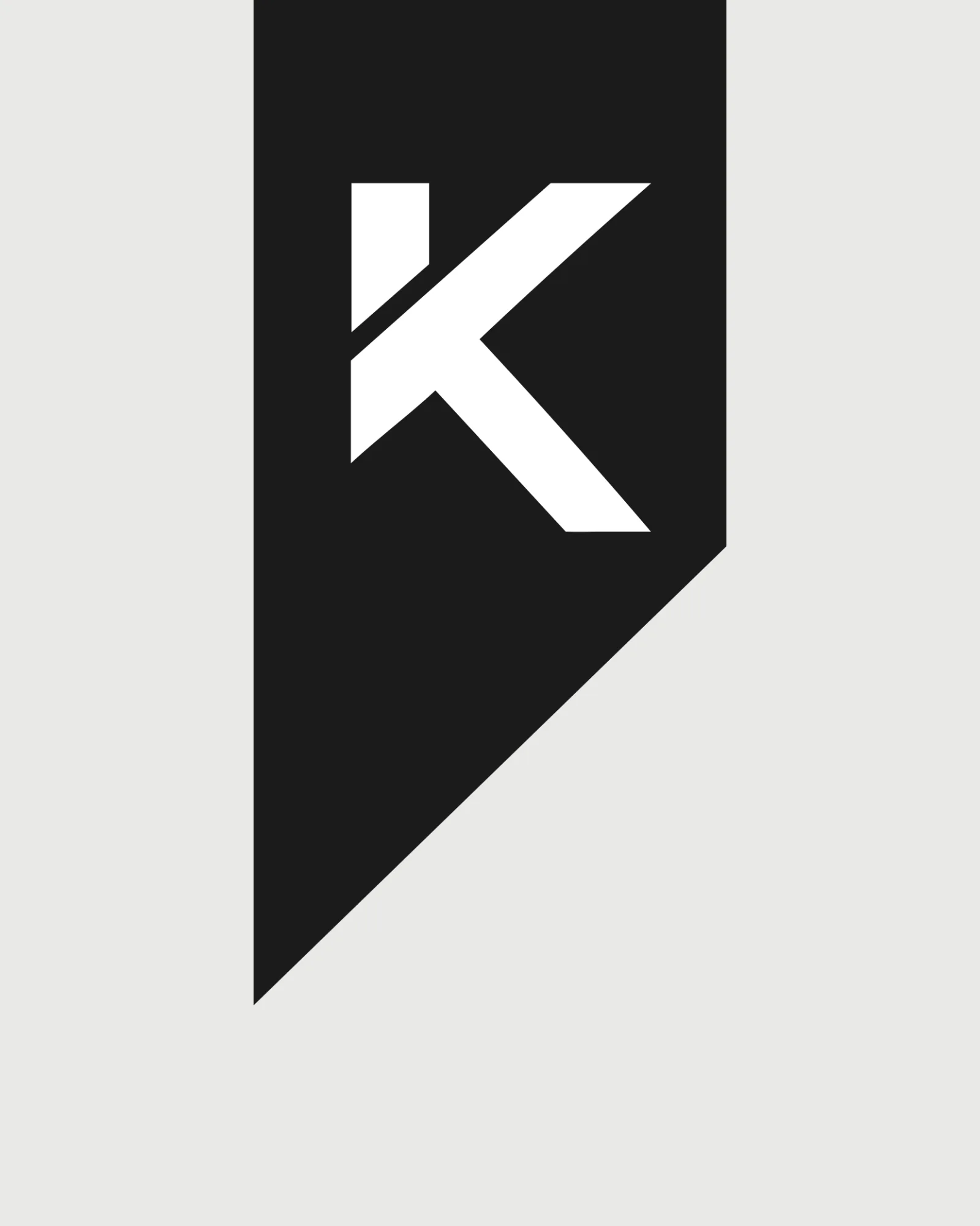
Firm lines, strong contrast, no decorative curves. A K monogram with a single red element, plus favicons and a full vector set.
K monogram and red accent
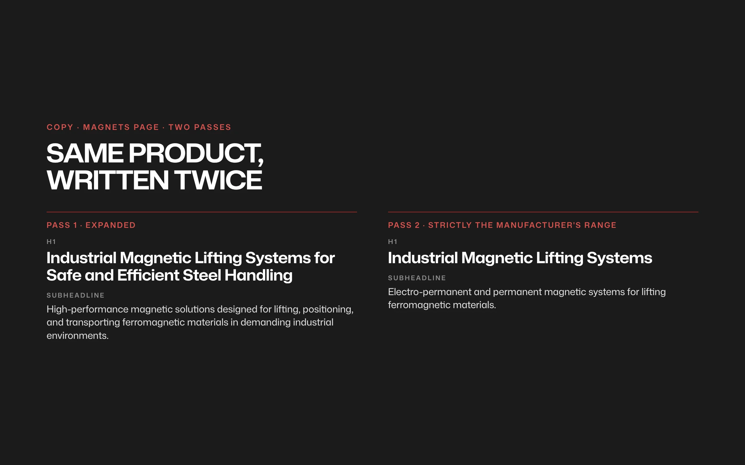
Define — Copy held to the spec sheet
Long-form copy for Services, Filtration and Magnets, then a second pass limited strictly to what the partner manufacturers publish.
Two copy passes: expanded and strict
Deliver — Website design
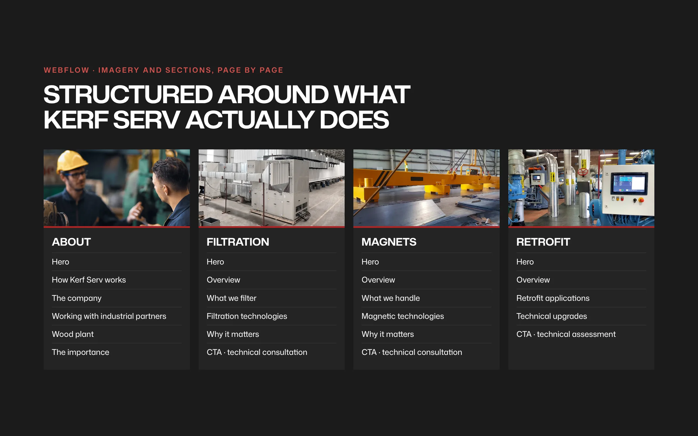
Page-by-page imagery for About, Filtration, Magnets and Retrofit, client site photos prepared for web, and a technical-assessment call to action on every page.
Section imagery: About, Filtration, Magnets, Retrofit

Results
What it added up to.
Kerf Serv now has one coherent industrial brand: a hard-edged K, a disciplined palette and a website design that sends engineers from a service or product range straight to a technical assessment request. Every line of copy holds to what the partner manufacturers publish.
The outcome
What the work changed.
Kerf Serv now has one coherent industrial brand: a hard-edged K, a disciplined palette and a website design that sends engineers from a service or product range straight to a technical assessment request. Every line of copy holds to what the partner manufacturers publish.
A note from Alex
Alex Codreanu
Founder and design lead
What the client said
Credits
FA Studios: brand identity, website design, copy.
Related work.
More work in this field, then projects with the same services.



































Want a project like this one?
Tell us what you’re building. You’ll hear back within one business day.
Prefer email? contact@fastudios.co