
This case study is for adults only.
It shows work for nicotine products and is intended for people aged 18 or over.
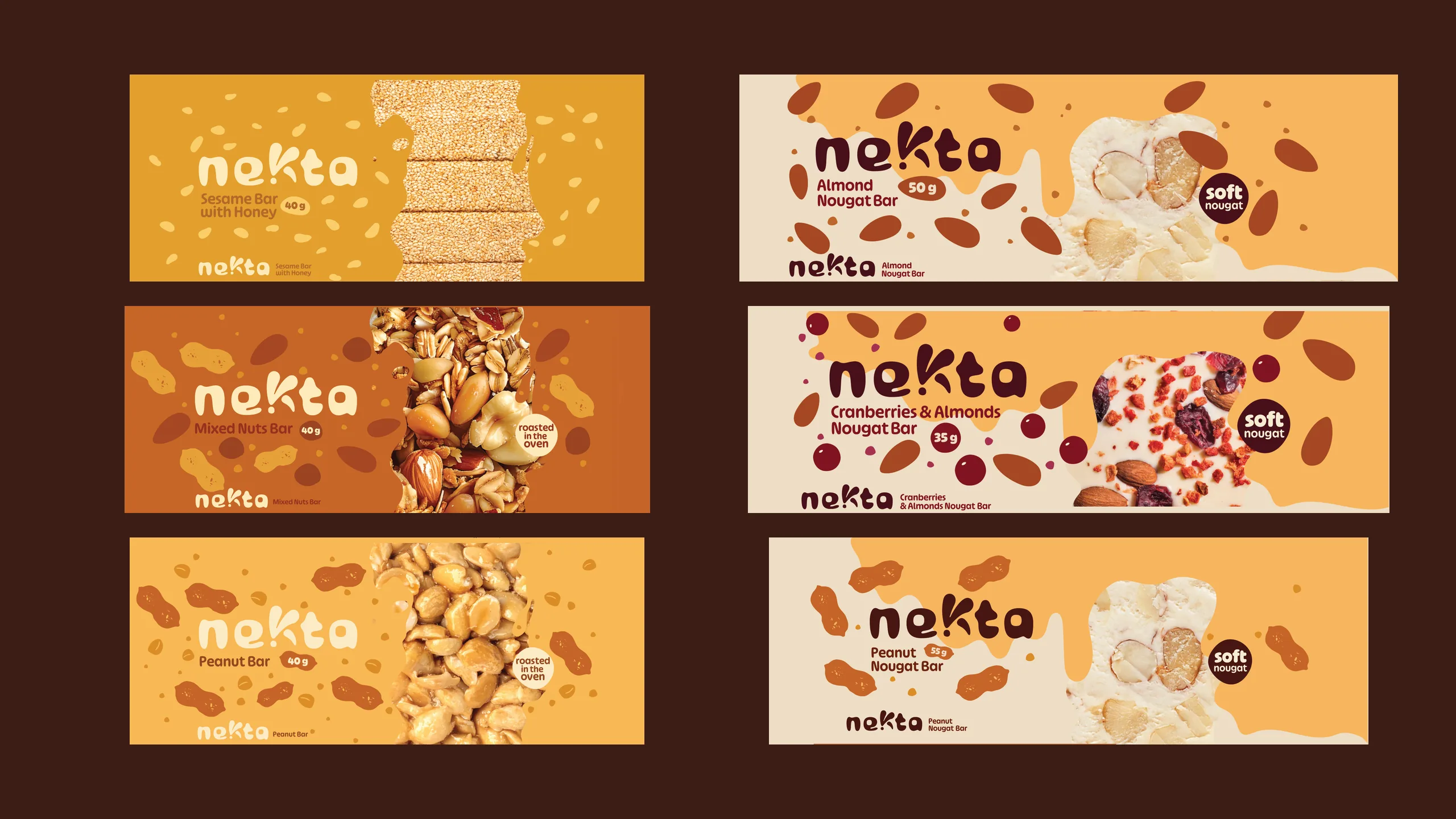
Nekta
Brand strategy, Naming, Brand identity, Packaging
From a range with no name to Nekta, a premium brand built to travel.
Research, naming, identity and packaging for Nekta, ISIS Grup's honey and nut bars: a name consumers chose and a pack system written for export.
The challenge
ISIS Grup wanted its own brand of honey, nut and nougat bars, with ambitions beyond Romania. The category had grown for a decade without a clear leader, caught between mainstream volume brands and premium niche players. The range had no name, no identity and no story, so the name and the pack would have to earn trust on their own.
The insight
In a category with no leader, the pack is the first filter of trust: say nectar instantly and show what's inside.
The approach
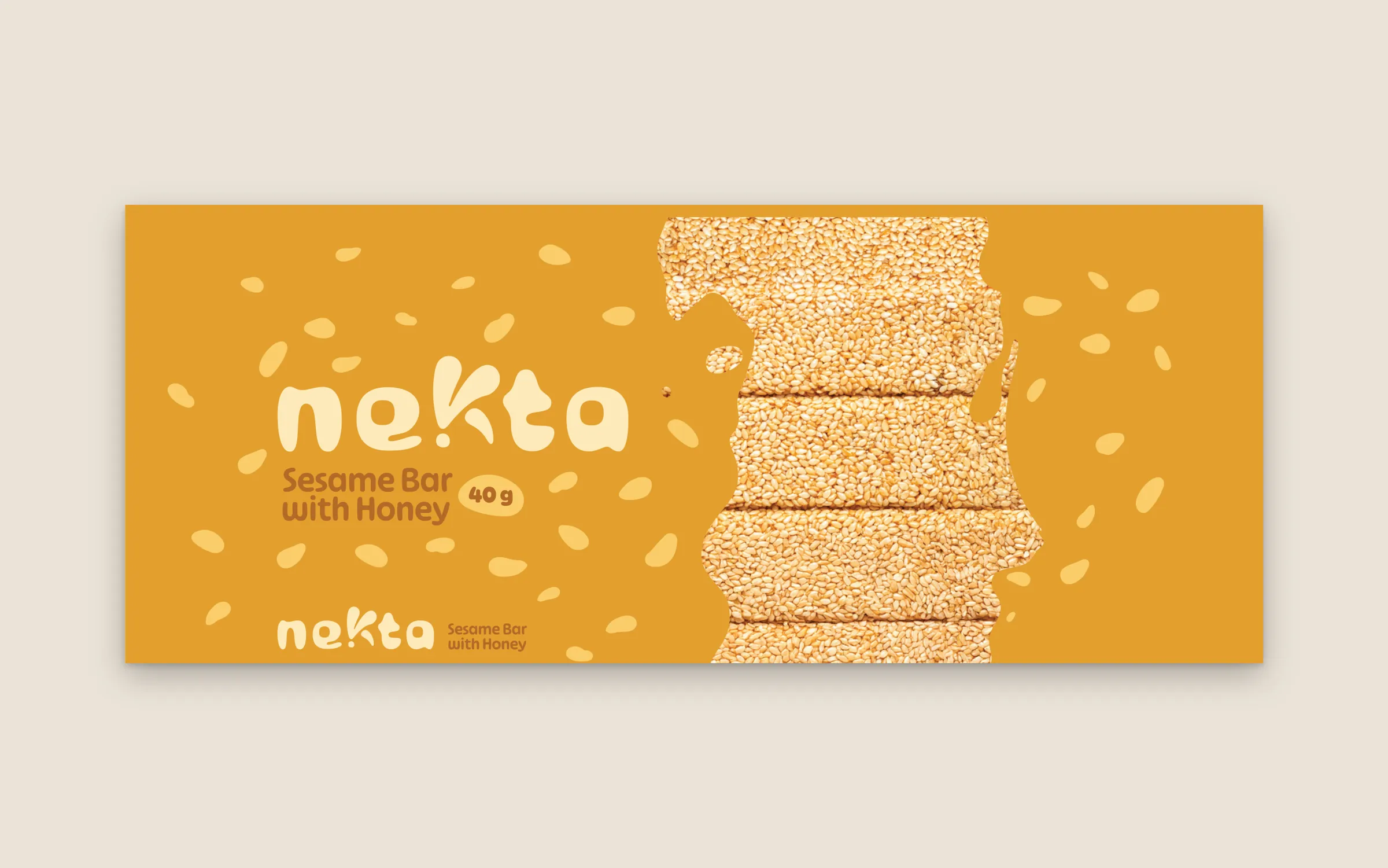
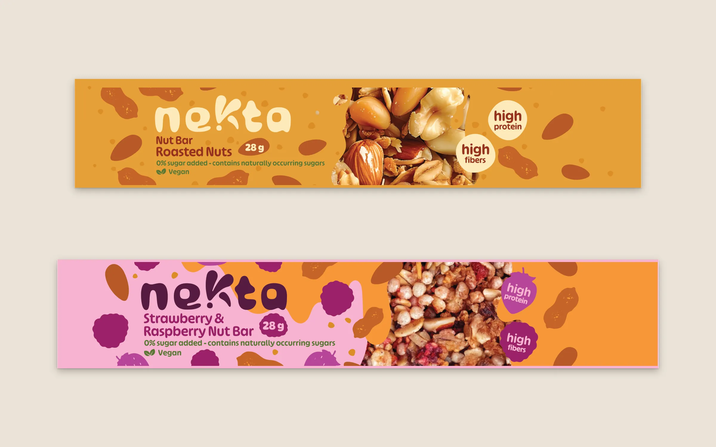
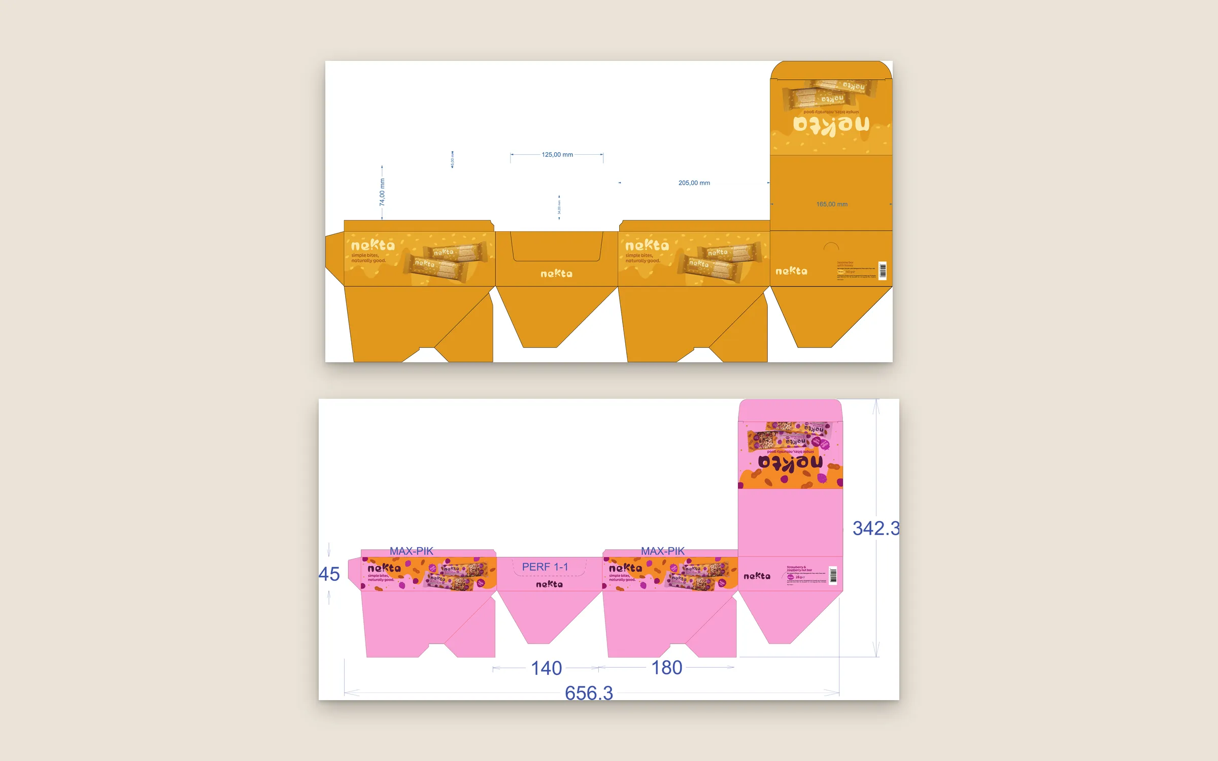
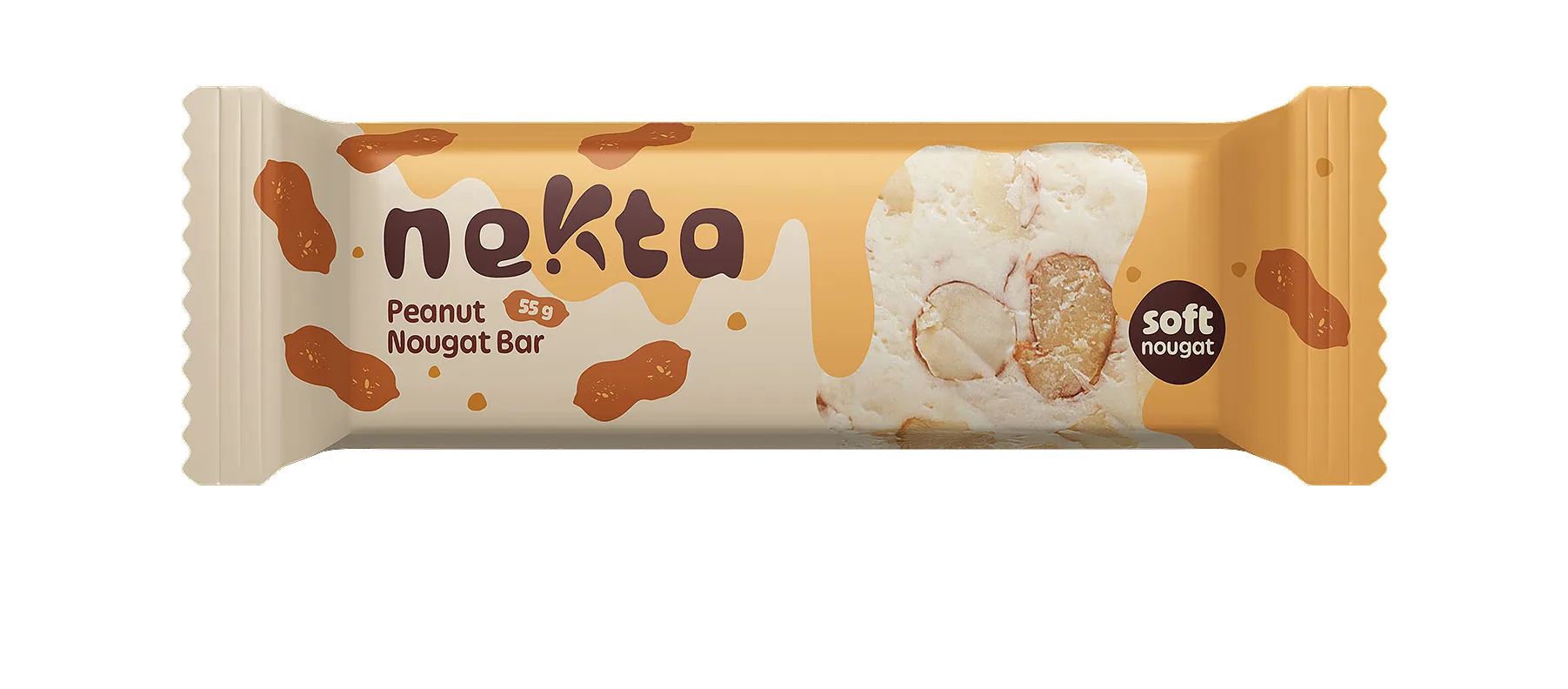
Our strategy team did the groundwork first: category research, a perceptual map of the shelf and two positioning routes, from which the client chose premium Mediterranean heritage. Our naming team built candidates across both routes, cleared each one against the trademark registers and tested the shortlist in consumer interviews, in Romania and on an international campus. Only then did our designers draw the wordmark, a K shaped like a drop of honey, and build one pack system for the whole range: one colour per flavour, the real ingredient up front, five languages on the back, and shelf-ready display boxes taken through prepress to print.
The project
Research, naming, identity and packaging for Nekta, ISIS Grup's honey and nut bars: a name consumers chose and a pack system written for export.
What we delivered
- Category research and competitor benchmark
- Perceptual map and positioning routes
- Naming strategy with trademark pre-checks
- Consumer naming validation
- Wordmark and honey-drip device
- Pack system for the full range
- Five-language back-of-pack system
- Shelf-ready display boxes and shipping cartons
- Logo kit for trademark registration
- EAN-13 barcodes and prepress
Discover — Consultancy and brief
A strategic branding and packaging proposal for an FMCG brand with international ambition, then a working session that set the practical frame: five label languages, die-cuts and the support materials the range would need.
Proposal and brief, July 2025
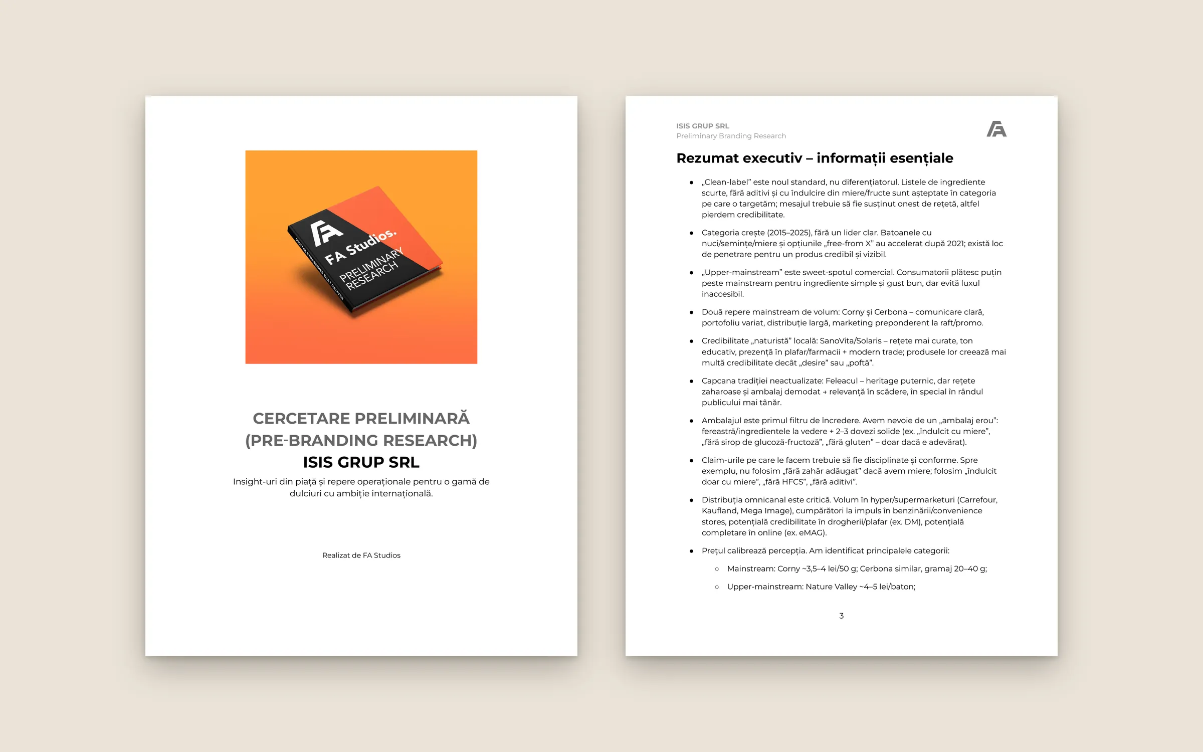
Discover — Preliminary research
Category dynamics from 2015 to 2025, competitor business cases from Feleacul to Nakd, the packaging rules that build trust and a claims checklist: never "no added sugar" when the recipe contains honey.
Category research, August 2025
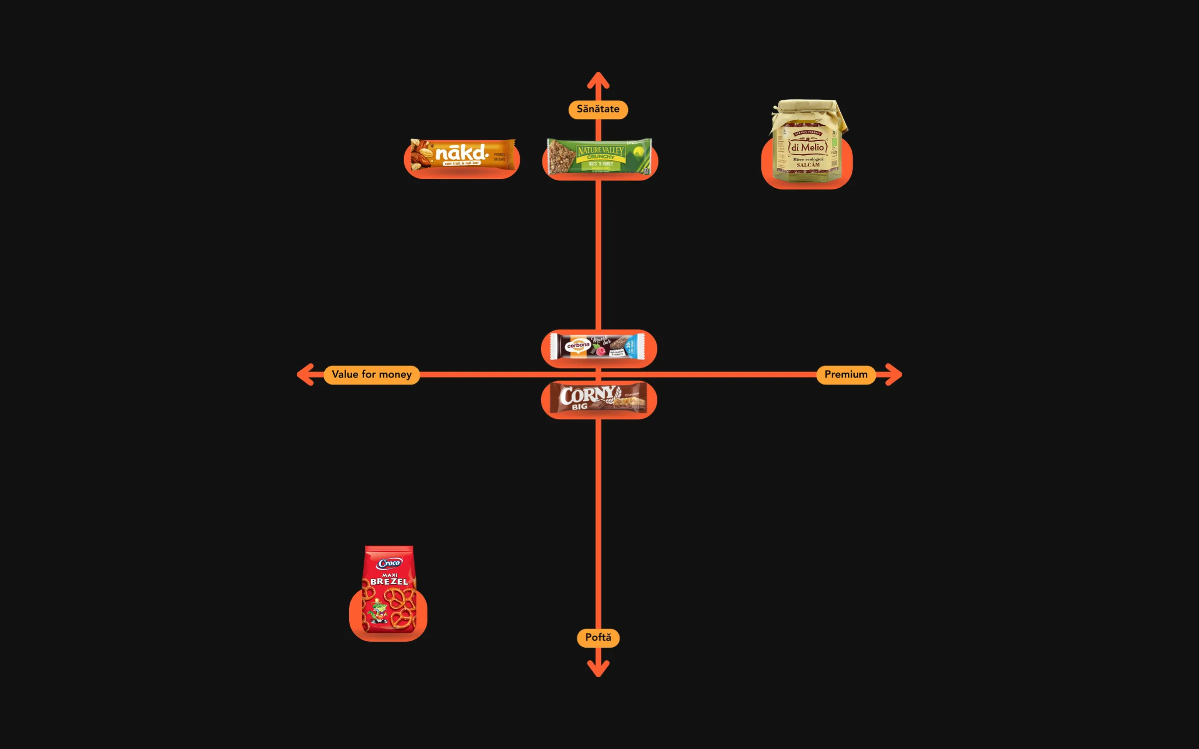
Define — Perceptual map and two routes
We mapped the shelf on two axes, craving to health and value to premium, and found the open space between them. It became two routes: upper-mainstream "natural & energising" and premium "Mediterranean heritage".
Five clusters, one open space
Define — Naming strategy
Candidates across both routes, from ALVEA and MELIGO to NEKTA and EVIA, each with a rationale and a collision check on Google and in the OSIM/EUIPO registers for Nice classes 29, 30 and 31.
Names cleared against OSIM and EUIPO
Define — Naming validation
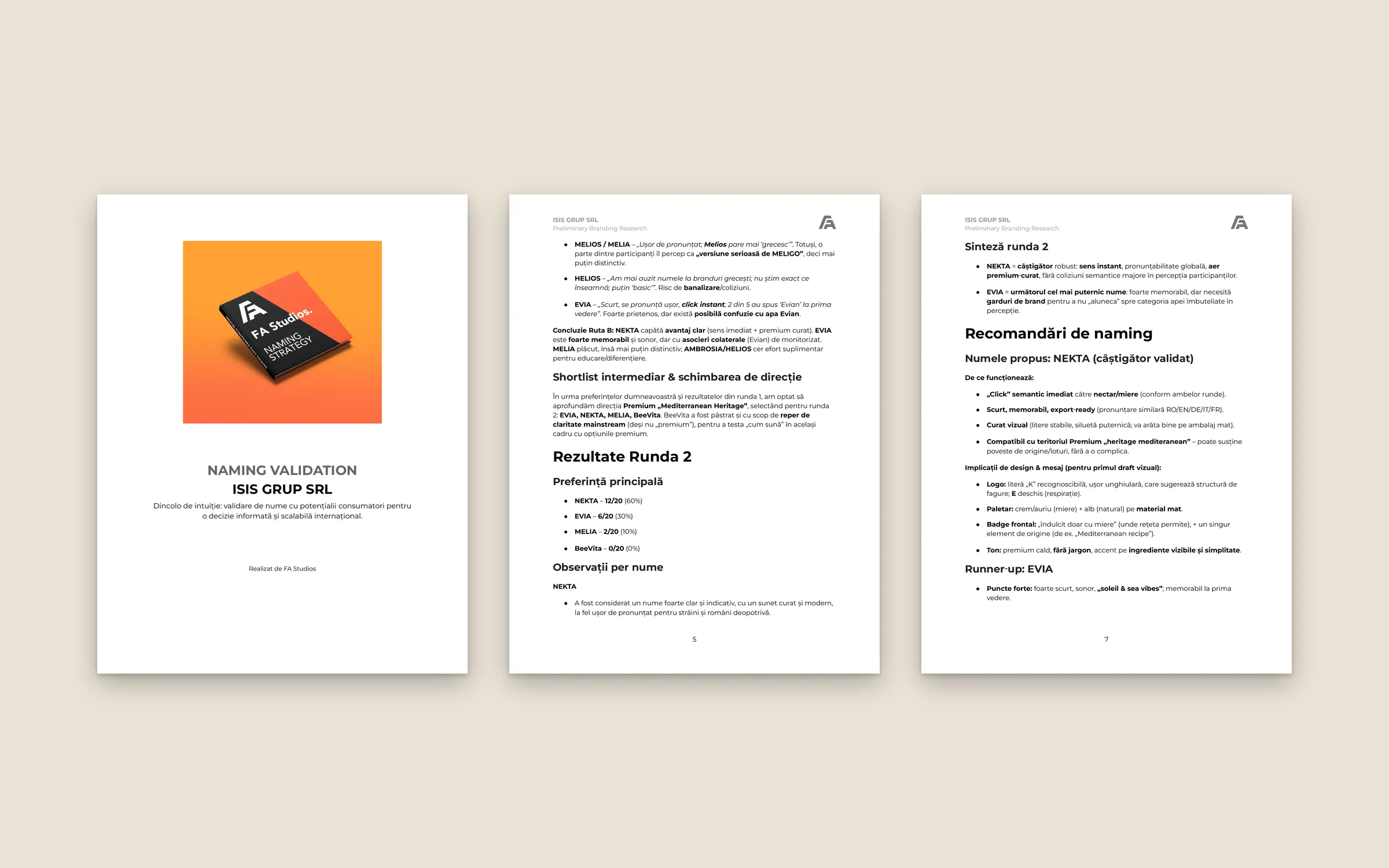
Qualitative interviews in two stages, in Romania and on an international campus in Amsterdam. The client confirmed the premium route between stages. NEKTA won the final stage with 60% of the vote; BeeVita was dropped for sounding too close to Belvita.
N=30 · NEKTA 60% in the final stage
Design — Wordmark and honey-drip device
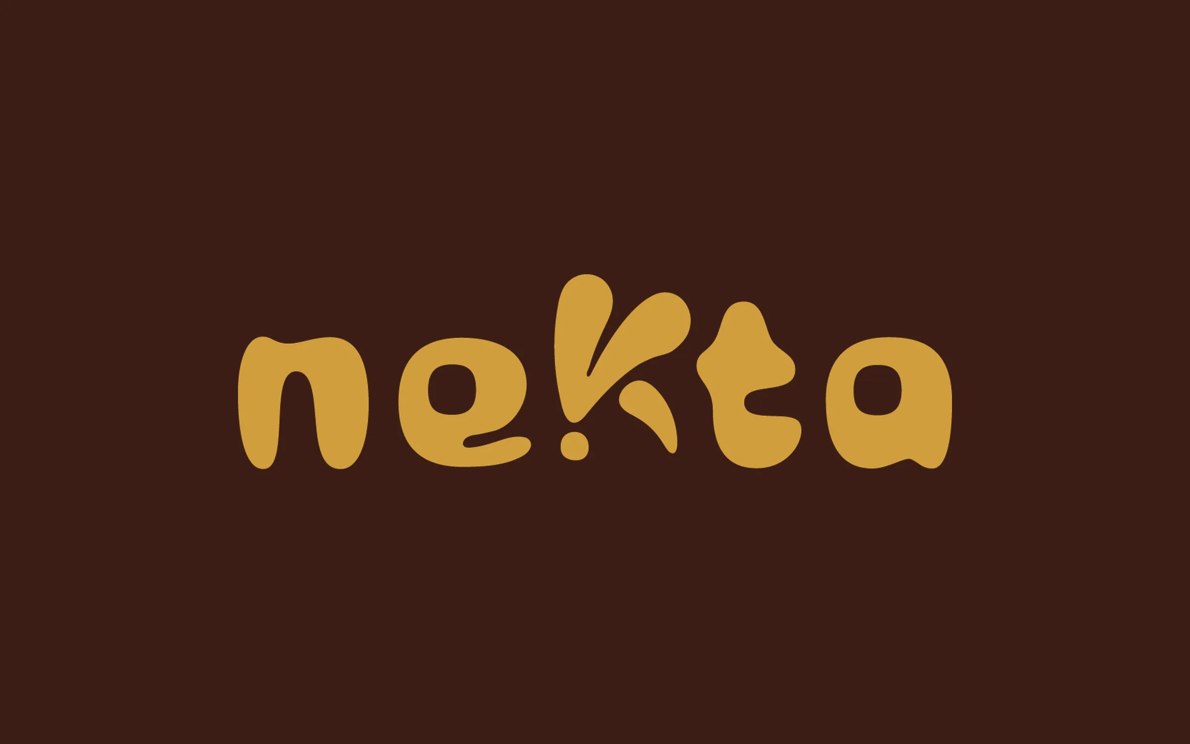
A soft, rounded wordmark in which the K is built from a drop of honey, plus a drip device that runs across the range. The logo also ships as a dedicated kit for trademark registration.
Wordmark, honey drip, registration kit
Design — Pack system, display boxes, cartons
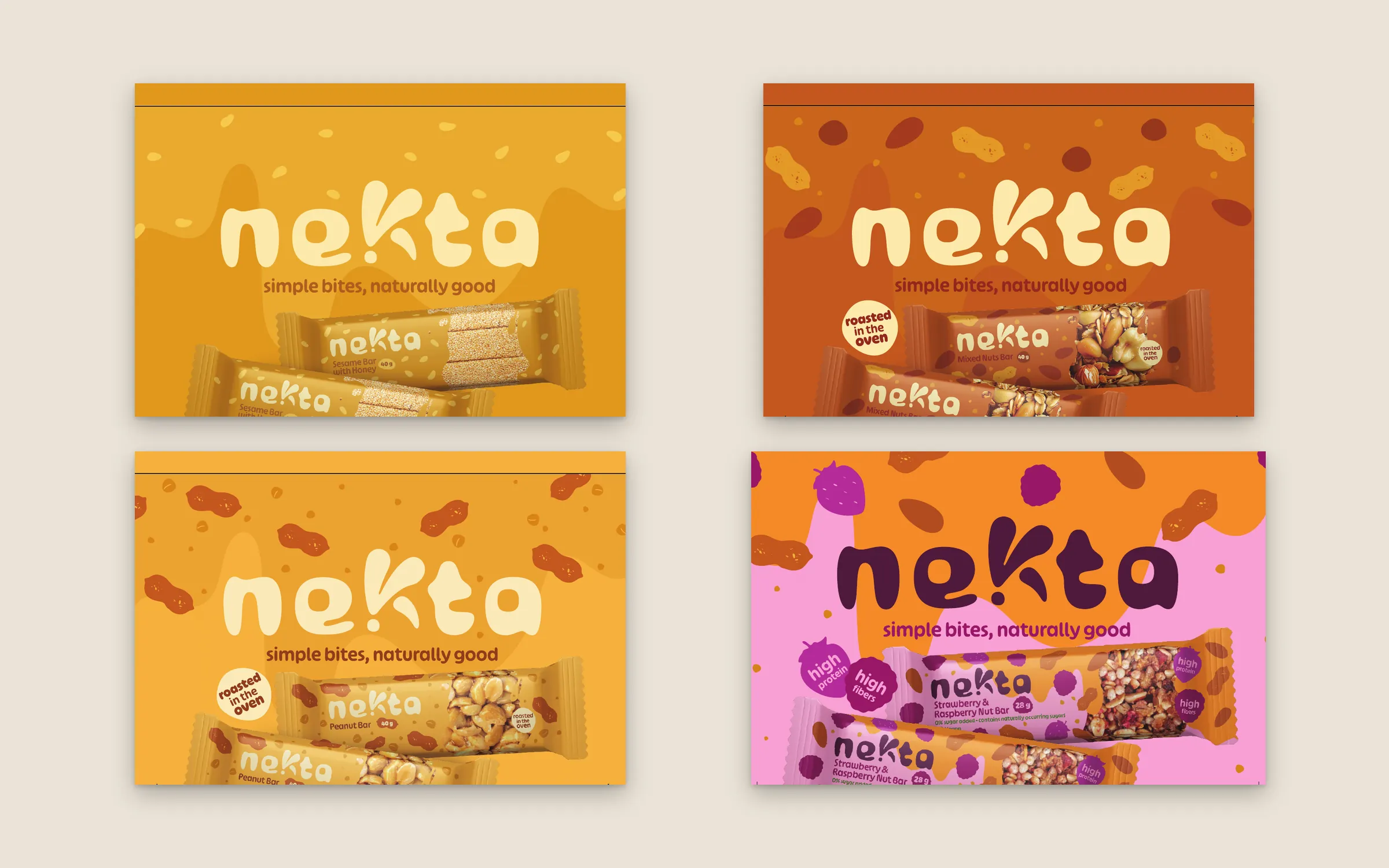
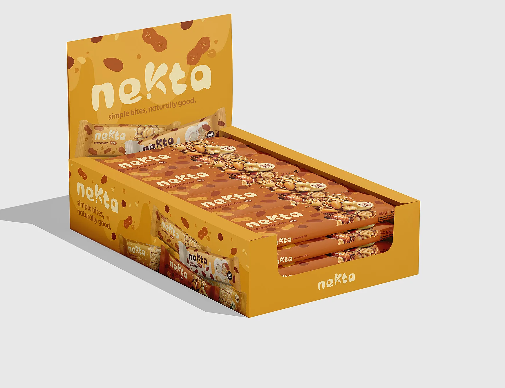
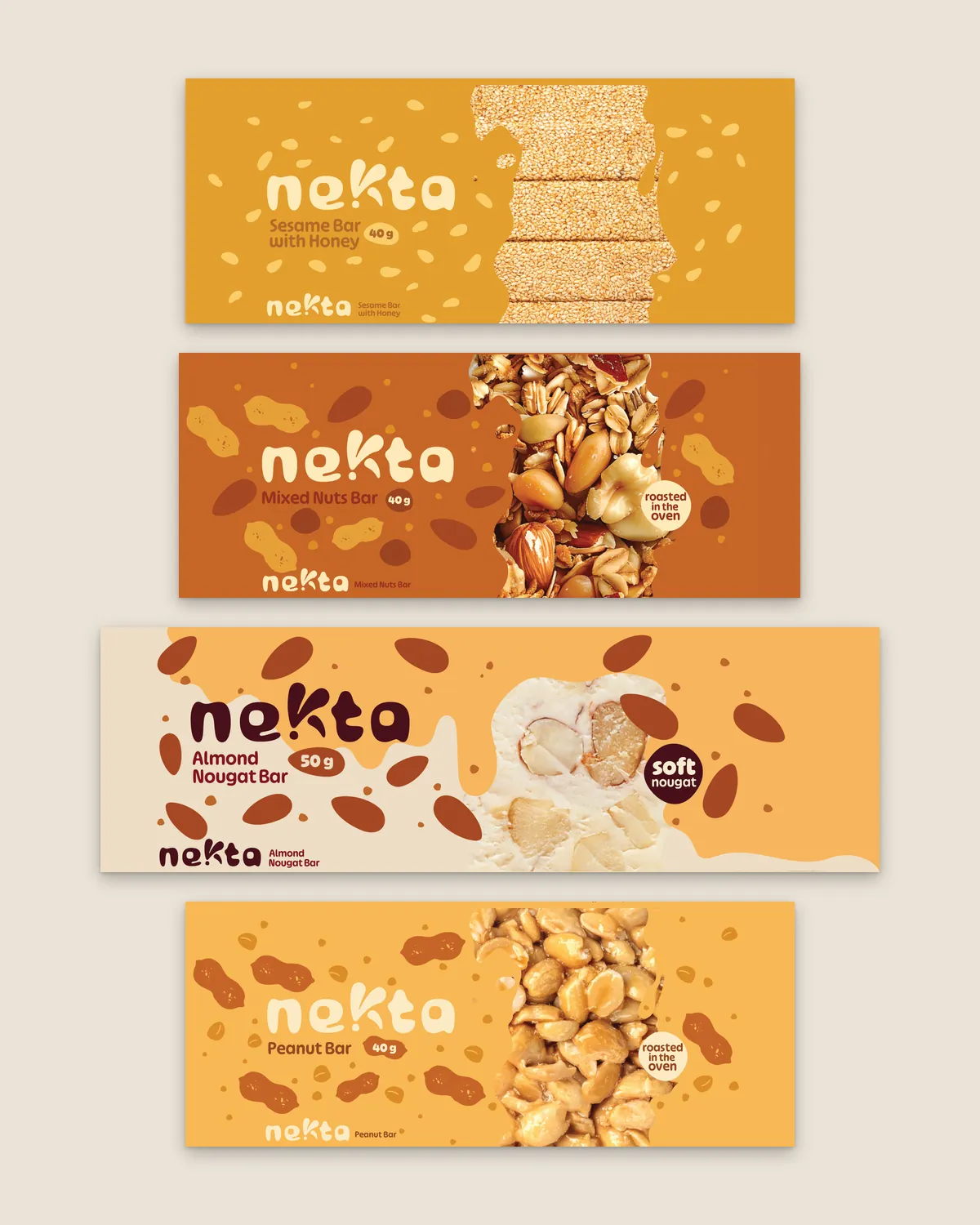
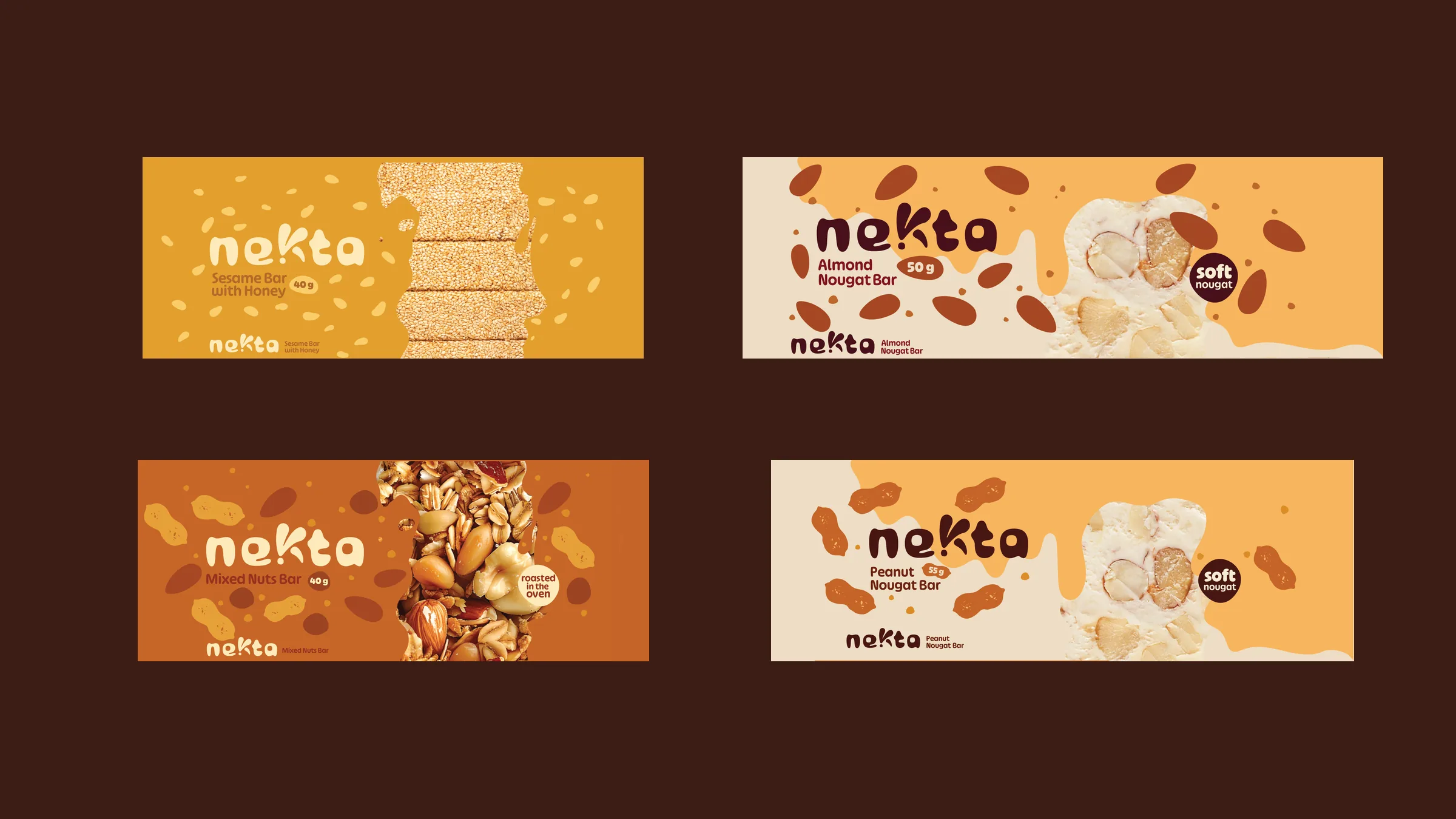
Two routes for every flavour, a window and a product photo; the photo route went to print. One colour per flavour, no more than three badges, back-of-pack copy in five languages, then shelf-ready display boxes and shipping cartons.
Pack system, display boxes and cartons
Deliver — Prepress and print
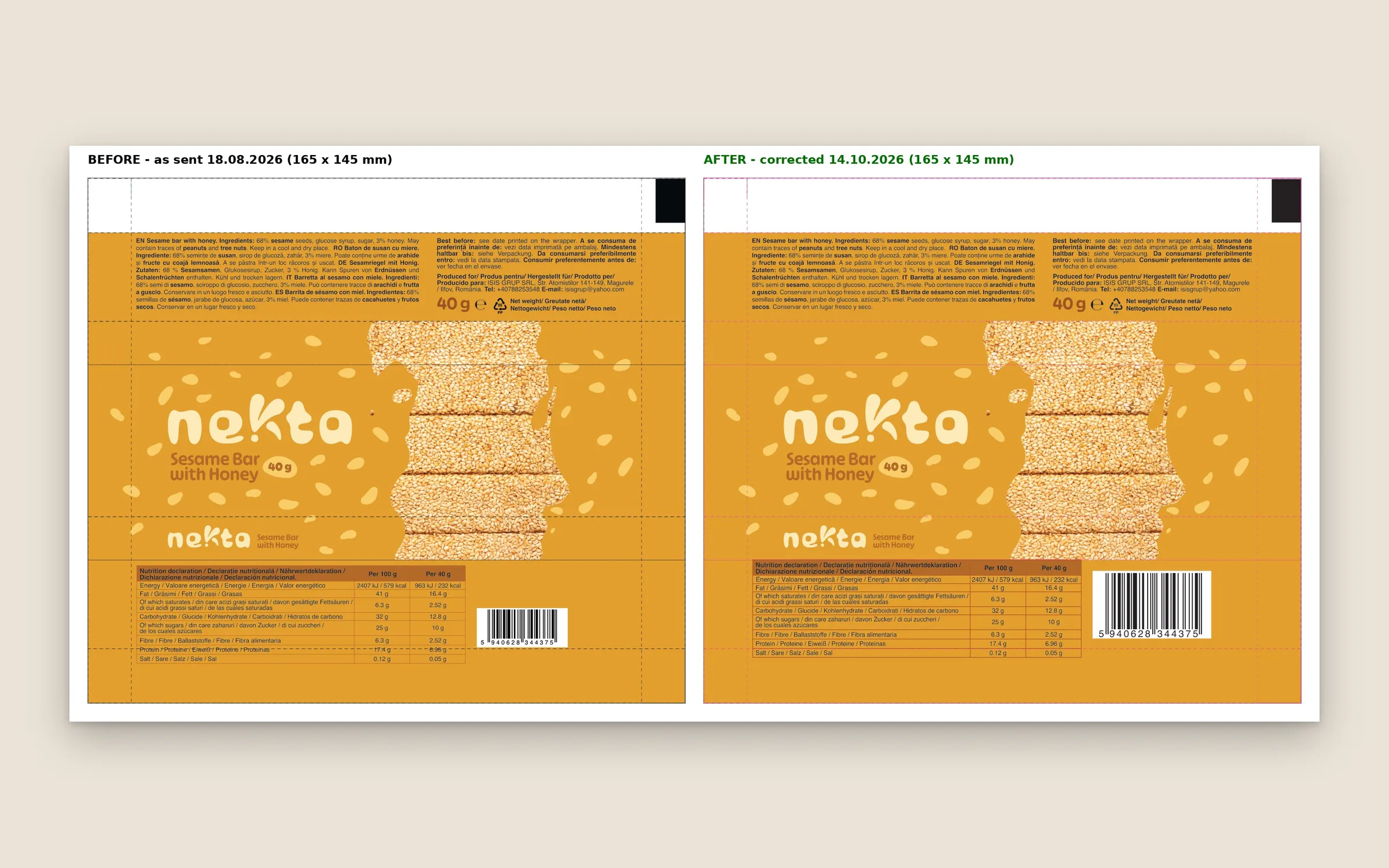
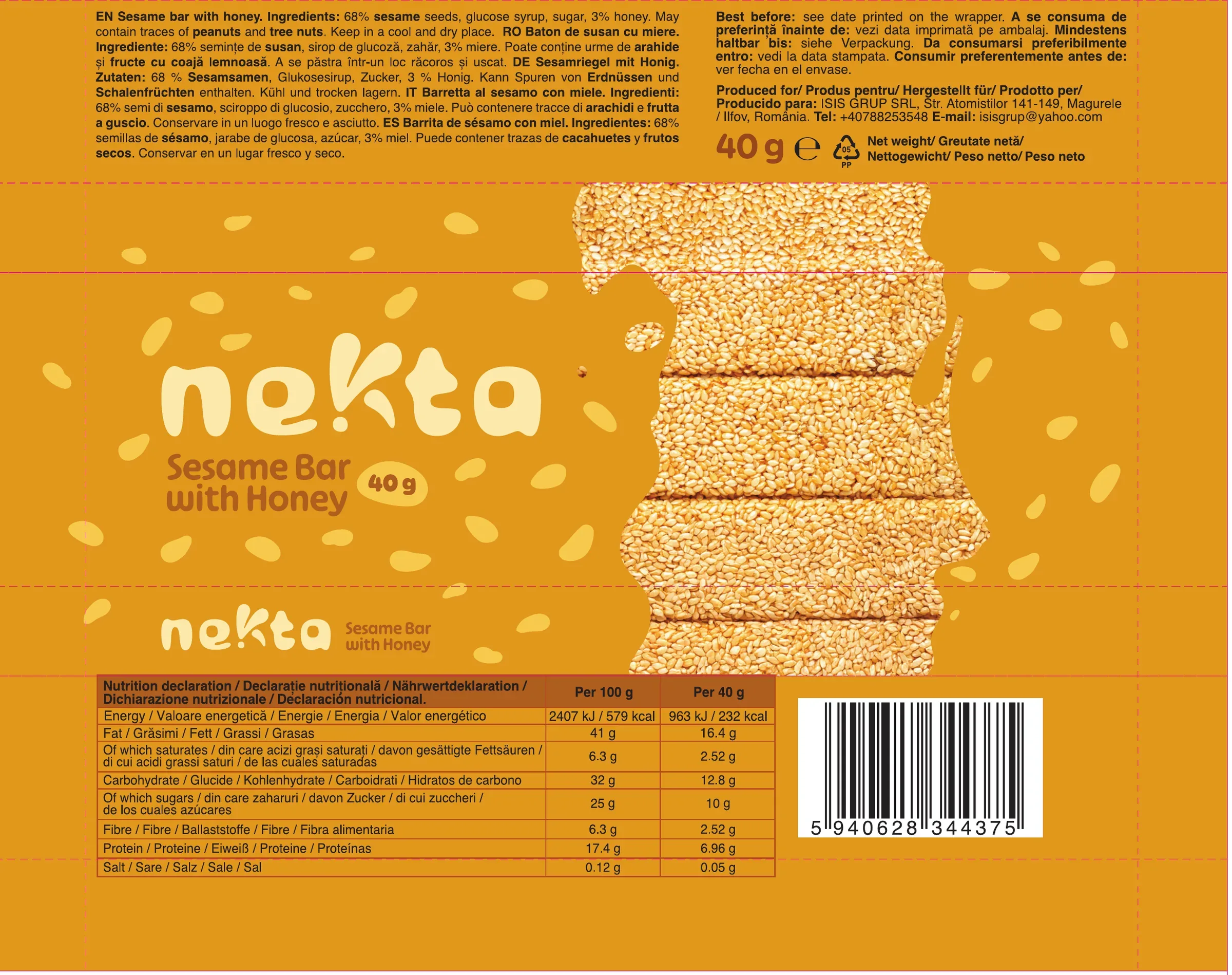
Every wrapper re-checked before print: dielines corrected and the EAN-13 codes enlarged and regenerated before the files went back to the printer.
Before/after prepress proof, October 2026


Results
What it added up to.
Nekta went from an unnamed range to a complete brand: a name consumers chose, a logo ready for trademark registration and a pack system now with the printer. Every wrapper speaks five languages and comes with shelf-ready display boxes, so the range is built for export from day one.
60%
of the final test panel chose NEKTA over three shortlisted rivals
The outcome
What the work changed.
Nekta went from an unnamed range to a complete brand: a name consumers chose, a logo ready for trademark registration and a pack system now with the printer. Every wrapper speaks five languages and comes with shelf-ready display boxes, so the range is built for export from day one.
A note from Alex
We could have opened with logos. Instead we started with the shelf: who leads, who doesn't, and where a new brand could stand. Then we let people decide. NEKTA didn't win because I liked it; it won because people heard "nectar" without any explanation, in Romanian and in English alike. Our proposal said the product has to speak for itself. The research told us what it should say. The pack says it.
Alex Codreanu
Founder and design lead
What the client said
Credits
FA Studios: research, strategy, naming, naming validation, identity, packaging, prepress.
Related work.
More work in this field, then projects with the same services.






































Want a project like this one?
Tell us what you’re building. You’ll hear back within one business day.
Prefer email? contact@fastudios.co