
This case study is for adults only.
It shows work for nicotine products and is intended for people aged 18 or over.
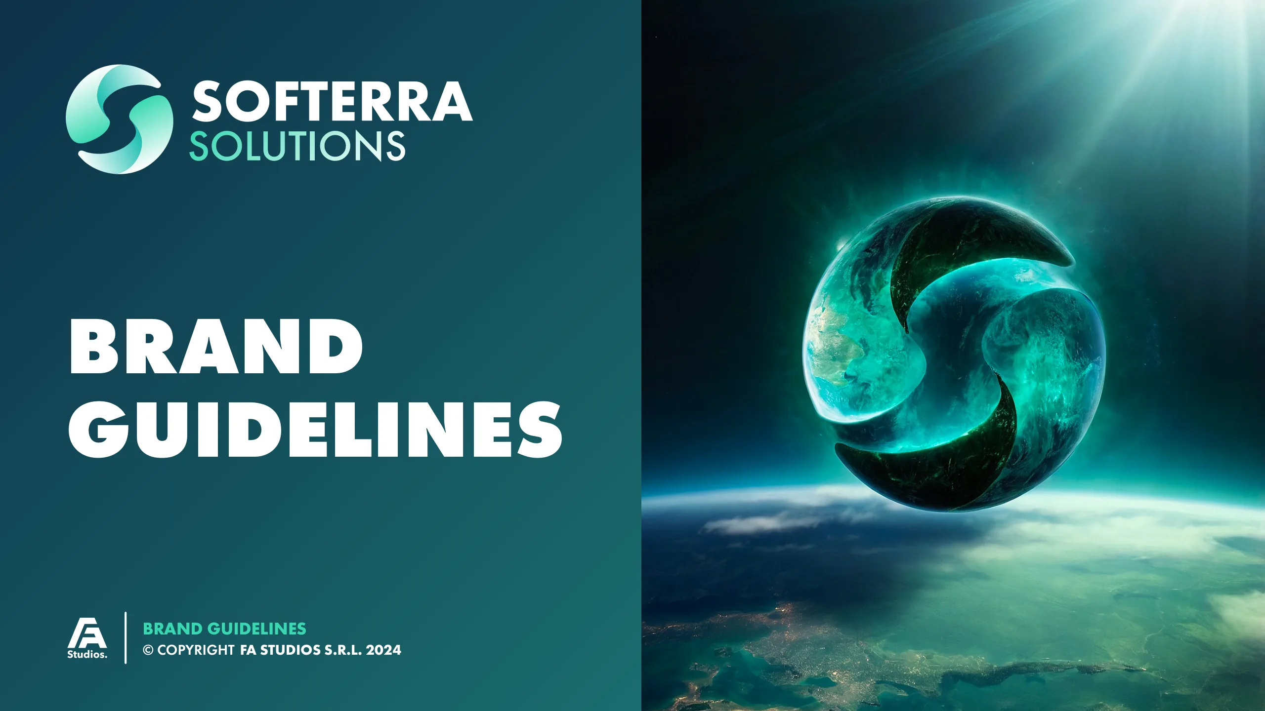
Softerra Solutions
Brand identity, Website
Software, era, terra: one ambigram for a young dev studio.
A concept-led identity for a software company: an ambigram S built from its own name, brand guidelines, print and a full website asset kit.
The challenge
Softerra is a young software team building websites, web apps and mobile apps on a wide stack. It needed an identity that looked credible next to established development houses, and enough assets to launch a site that explains web, mobile and software services clearly.
The insight
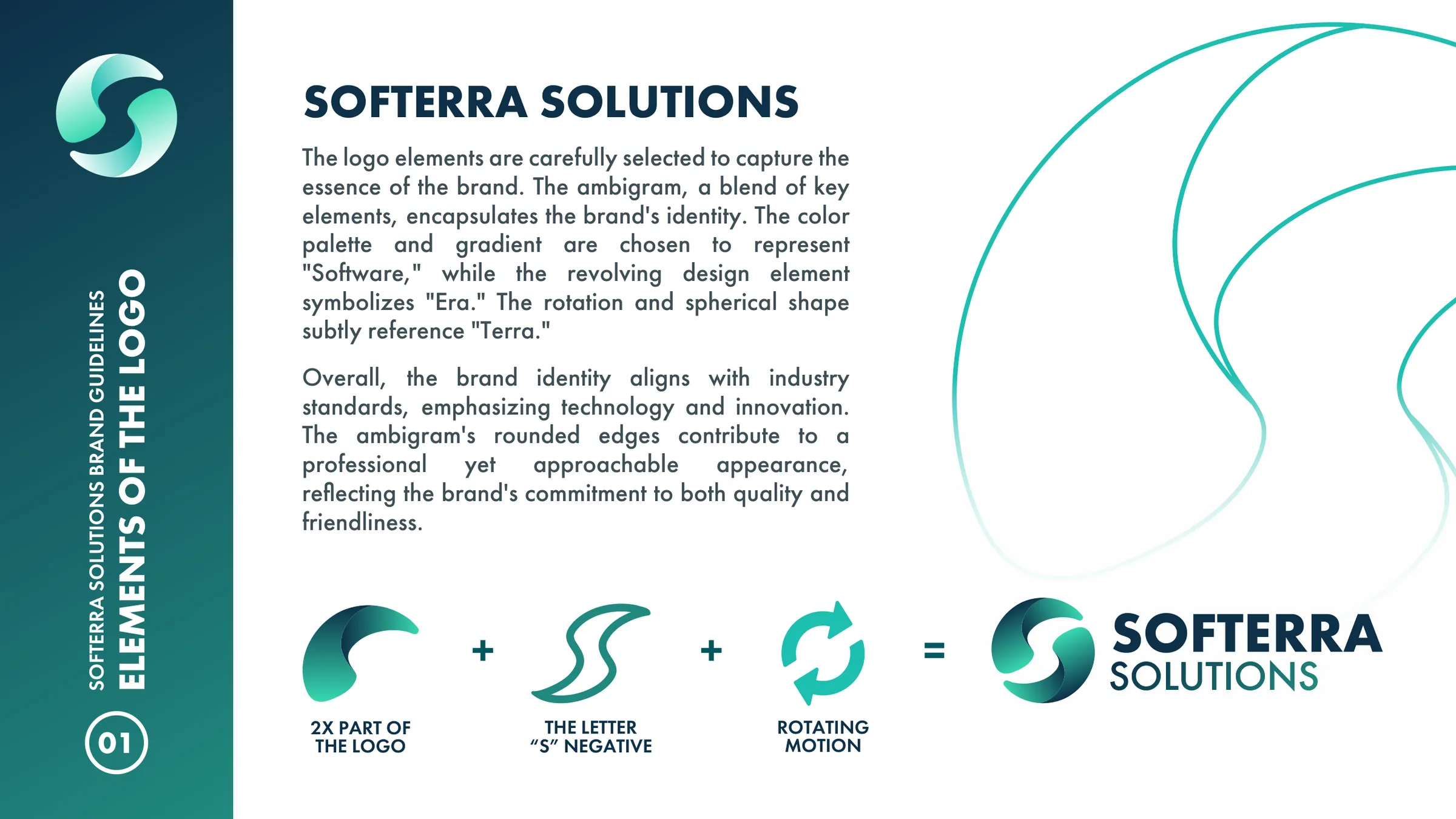
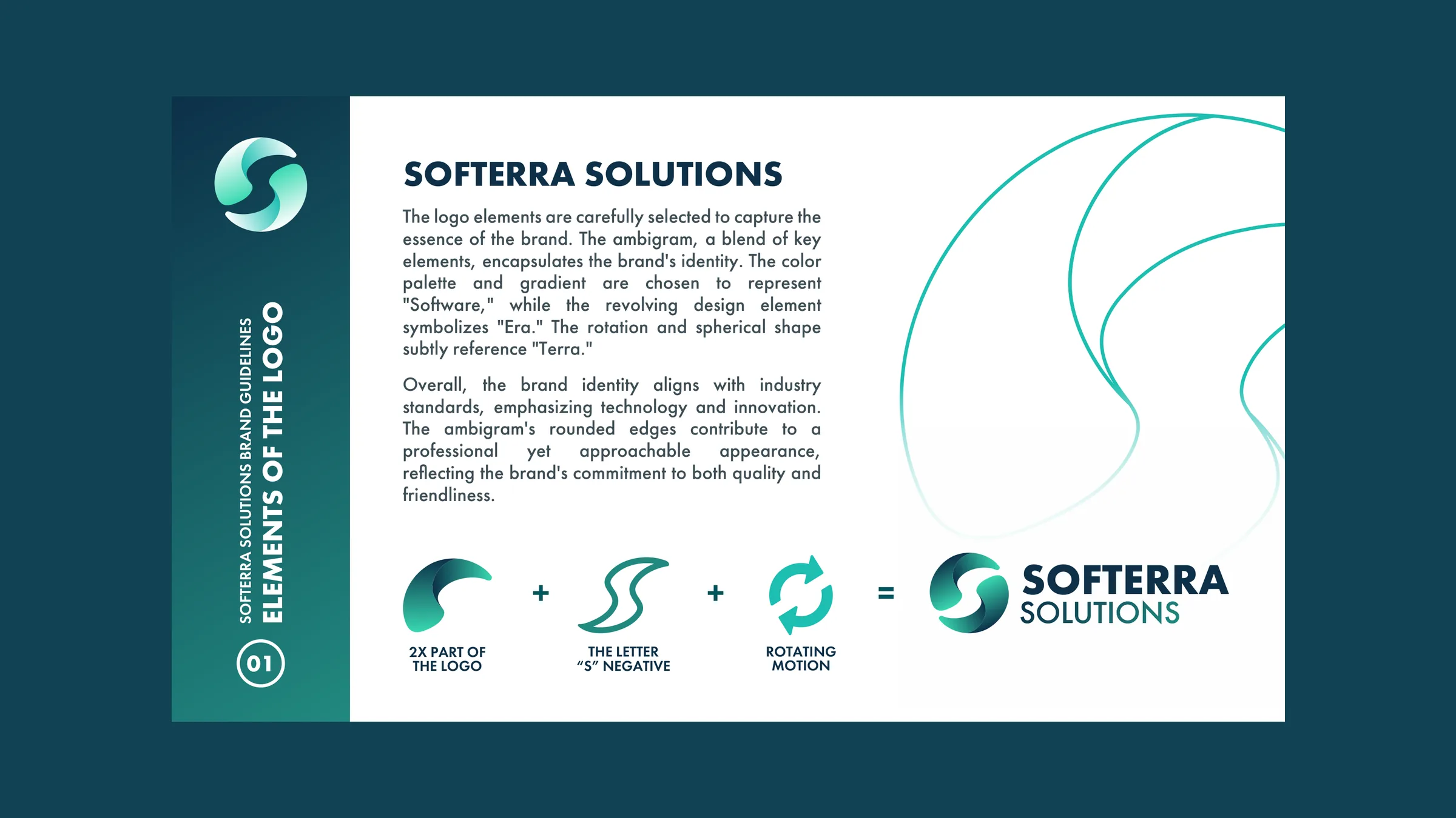
Let the name do the work: Software, Era and Terra fold into one symmetrical S that reads the same from both sides.
The approach
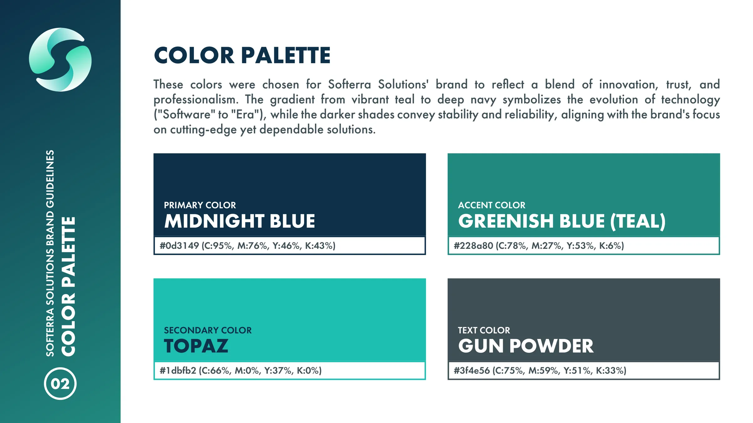
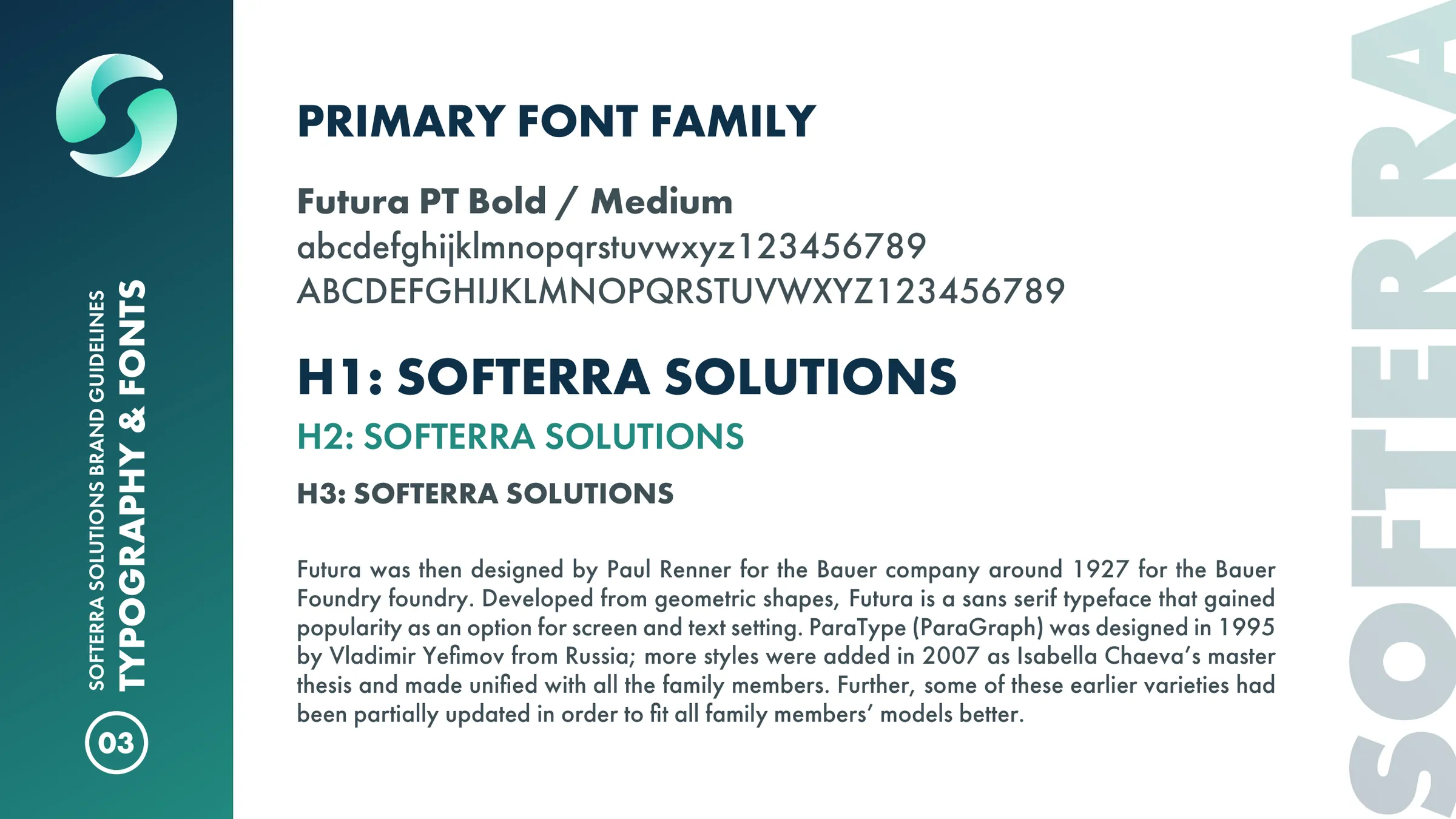
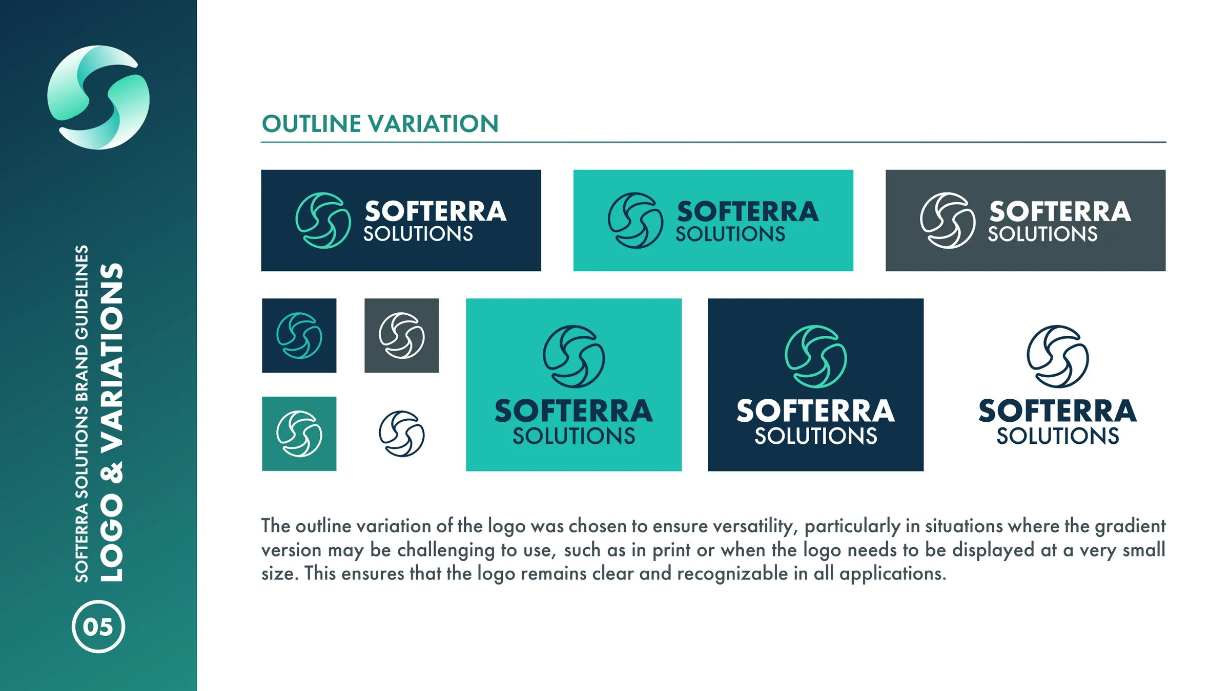
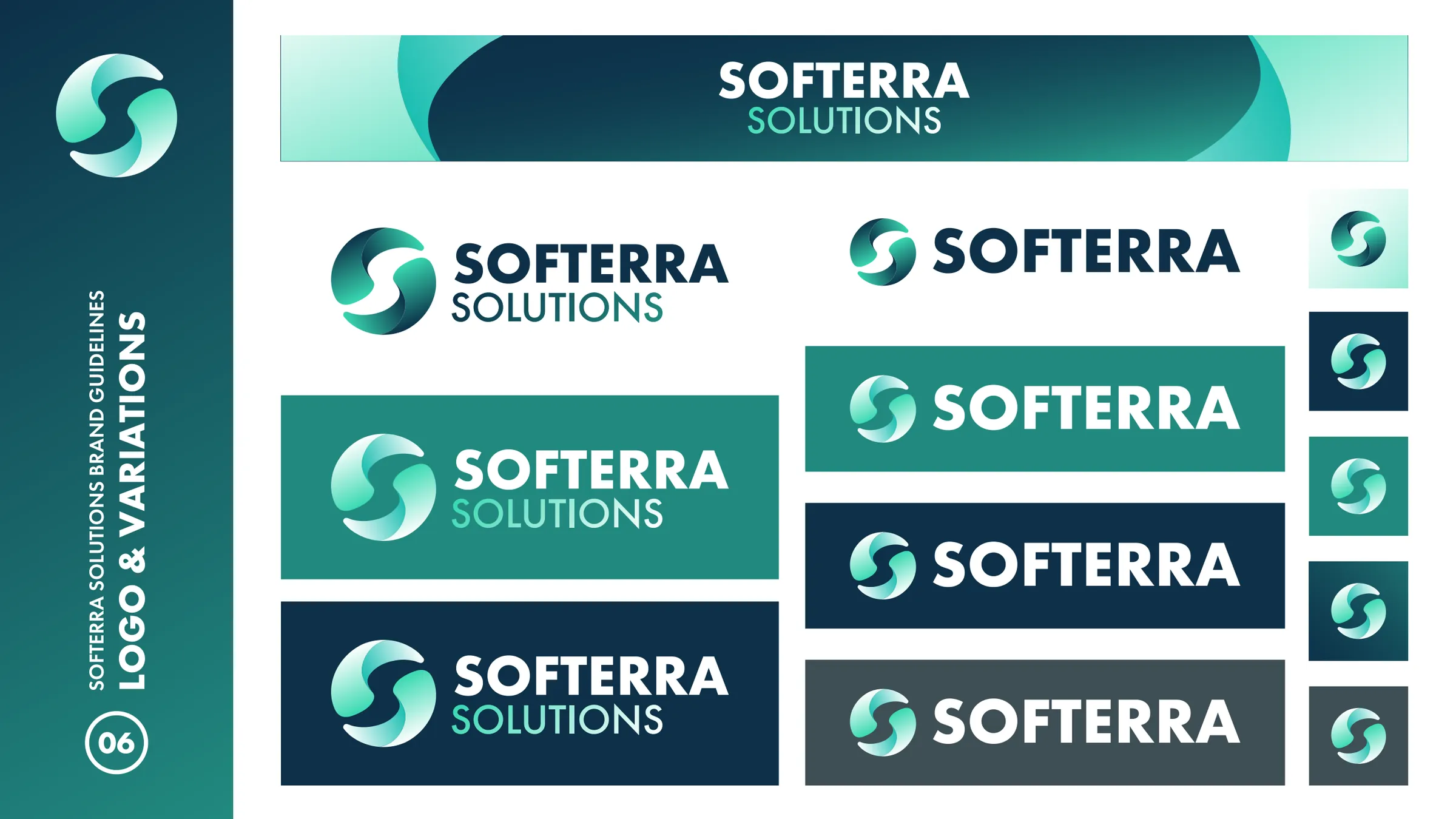
Our designers deconstructed the name into its three ideas and drew a mark that holds all of them, then wrote the rationale straight into the guidelines: palette of midnight blue, teal and topaz, Futura PT hierarchy, clear-space rules, vertical and outline versions. Business cards, a key visual and a website asset kit for every service page followed, with a further round of logo variations as the brand settled in.
The project
A concept-led identity for a software company: an ambigram S built from its own name, brand guidelines, print and a full website asset kit.
What we delivered
- Ambigram logo and logo variations
- Brand guidelines
- Business cards, print-ready
- Key visual and hero background
- Website assets: hero video, service images, icons, tech-stack logos, favicons
- Industry visuals for the website
Define — Name deconstruction
Software for the craft, Era for a revolving element, Terra for the sphere. The three ideas became the brief for one mark.
Concept page from the brand guidelines
Design — System and applications
Palette, Futura PT hierarchy, clear-space rules, vertical and outline versions, then business cards and a website kit for web, mobile and software services.
Business cards and key visual
Results
What it added up to.
Softerra came out of the project with a complete identity system: a mark with a story behind it, a palette of midnight blue, teal and topaz, Futura PT throughout, and a website kit ready for every service page. A young studio now presents itself with the confidence of an established one.
The outcome
What the work changed.
Softerra came out of the project with a complete identity system: a mark with a story behind it, a palette of midnight blue, teal and topaz, Futura PT throughout, and a website kit ready for every service page. A young studio now presents itself with the confidence of an established one.
A note from Alex
Alex Codreanu
Founder and design lead
What the client said
Credits
FA Studios: logo concept, brand guidelines, print, key visuals and website assets.
Related work.
More work in this field, then projects with the same services.









































Want a project like this one?
Tell us what you’re building. You’ll hear back within one business day.
Prefer email? contact@fastudios.co